BA logo review
3.3/5
Logo score
Logo review of

Ba

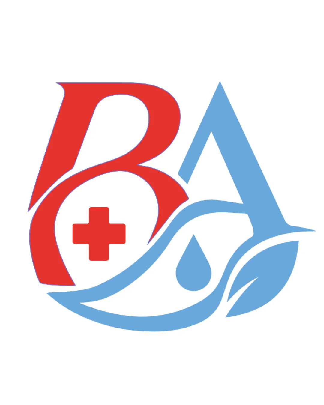
Well intentioned, but over-relies on standard industry symbols and has clutter in the overlapping forms. Refinement of shapes and relationships could raise it above typical healthcare marks.

Combination Mark Modern Healthcare And Eco Motif Healthcare
3.5/5
Legibility
3/5
Originality
4/5
Misread
3/5
Balance
3.5/5
Scale
Action plan

What to fix first

The most important fixes to handle before polishing the full presentation.

1

Refine overlap and silhouette between the 'B', 'A', and symbol elements.

High priority

Simpler relationships and boundaries between forms will make the logo clearer and more scalable.

Impact: Improves Clarity, Legibility, And Cohesion At All Sizes. · Effort: Medium

Detailed review

Logo performance breakdown

3.5/5

Legibility

Checkmark icon 'BA' letters are generally readable.

Warning icon Some overlapping elements reduce clarity, especially in the lower half.

3/5

Originality

Checkmark icon Combined medical and eco symbols within monogram is moderately original.

Warning icon Cross, water, and leaf icons are very common in healthcare branding.

4/5

Color harmony

Checkmark icon Red and blue palette signals healthcare; colors are distinct.

Red
#E53935

Light Blue
#4FC3F7

Your palette is close. Refine the color roles and combinations before updating the logo.

Build brand colors
3/5

Balance alignment

Checkmark icon Overall symmetrical composition.

Warning icon Visual weight is uneven; blue portion feels heavier and more elaborate than red.

logo 200x250 pixels scalability test alignment grid overlay
3.5/5

Scalability

Checkmark icon Main forms remain identifiable at reduced sizes.

Warning icon Detail in the water droplet and leaf could be fragile at very small scale.

logo 200x250 pixels scalability test

200x250 px

logo 100x125 pixels scalability test

100×125 px

logo 50x62 pixels scalability test

50×62 px

4/5

Misinterpretations

Checkmark icon No problematic alternative readings.

Brief match

Checkmark icon Industry Relevance: Symbols and colors fit healthcare/eco-friendly focus.
Checkmark icon Distinctiveness: Combination is unique but relies on conventional healthcare tropes.

Try your own review

Wondering how your logo performs?

Get a clear logo score, key risks, and priority fix ideas before your client or audience sees it.

Review my logo