Wondering how your logo performs? 🧐
Get professional logo reviews in seconds and catch design issues in time.
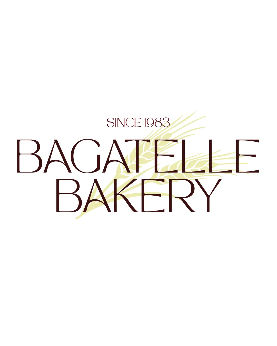
Try it Now!Logo review of BAGATELLE BAKERY, SINCE 1983
 Logo analysis by AI
Logo type:
Style:
Detected symbol:
Detected text:
Business industry:
Review requested by Joe2BA
**If AI can recognize or misinterpret it, so can people.
Structured logo review
Legibility
Main text is clear and uses a sophisticated, elegant typeface.
High contrast between the dark type and bright background increases readability.
Diagonal wheat stalk behind the text creates areas of low contrast and slight interference, especially where stalk crosses lighter thin letterforms.
'SINCE 1983' is much smaller and may become unreadable at small sizes.
Scalability versatility
Simple color scheme supports print and digital versatility.
Logo maintains basic readability at medium sizes, such as packaging or storefronts.
Thin font weight and fine wheat detail risk disappearing or muddling in embroidery or favicon applications.
Small text and background illustration may blur or lose impact when scaled down drastically.

200x250 px

100×125 px

50×62 px
Balance alignment
Type is generally well spaced and centered, creating a feeling of integration.
Wheat symbol is subtle and does not dominate textual hierarchy.
Wheat graphic behind the text is slightly off-balance, with heavier emphasis toward the right and top, causing minor visual weight issues.
Alignment of 'SINCE 1983' could better harmonize with the main wordmark by centering perfectly.


Originality
Wheat stalk subtly references bakery and is contextually relevant.
Elegant serif typography pairs nicely with the food industry.
Wheat as a bakery symbol is highly generic and widely used.
No unique or inventive treatment of the symbol or custom letterform work.
Aesthetic look
Minimalist, elegant color palette exudes an upscale bakery atmosphere.
Font choice complements the brand positioning.
Text and symbol overlay is mildly cluttered, reducing clean aesthetics.
Wheat graphic detail can appear busy on close examination.
Dual meaning and misinterpretations
Logo and graphic are straightforward, with no inappropriate or accidentally suggestive forms.
Color harmony
Good restrained palette with only two accent colors plus white, producing clear, cohesive harmony.
Well-judged use of soft yellow-green in background complements the brown wordmark.
Bordeaux
#491A18
Light Olive
#E8E3B6
White
#FFFFFF

