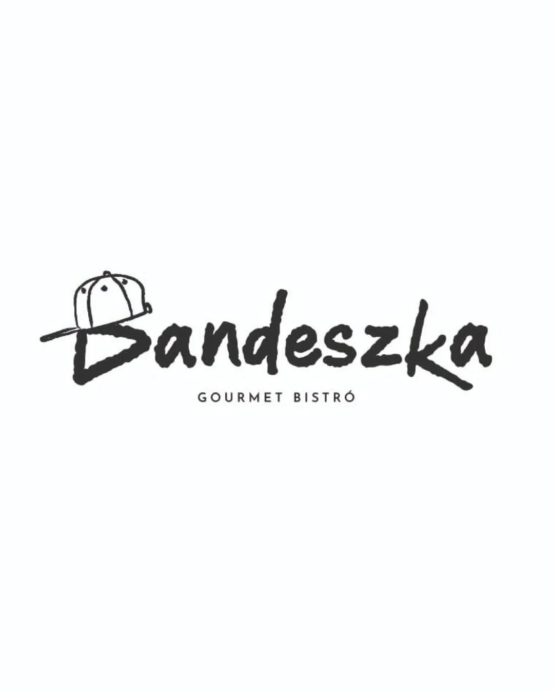
Bandeszka GOURMET BISTRÓ logo review
4/5
Logo score
Logo review of

Bandeszka Gourmet Bistró

A strong, character-rich logo with great street food relevance; only minor cohesion tweaks needed.

Combination Mark Casual Handwritten Wordmark With Playful Mark Street Food / Bistro
4/5
Legibility
4/5
Originality
5/5
Misread
3/5
Balance
4/5
Scale
Your next steps

What to fix first

Focus on the changes that matter. Keep what makes the logo work.

1

placement of cap and letter B

Refine the integration of the cap with the 'B' for a more cohesive silhouette.

Optional refinement Medium priority Medium effort
Area to inspectApproximate location

The cap graphic overlaps the 'B' in a way that interrupts the baseline, which may slightly impact overall harmony.

How to check

Test alternative placements or attachment styles for the cap to see if flow and baseline improve.

See the category review
Detailed review

Logo performance breakdown

4/5

Brief & logo match

Based on your brief
Compared with

Street food

The casual style, streetwear accent, and approachable tone fit street food, with only slight tension in gourmet positioning.

  • Street Food Suitability

    Handwritten style and cap graphic immediately signal casual, urban, and approachable vibes tied to street food culture.

  • Gourmet Positioning

    'GOURMET BISTRÓ' tagline provides a balancing upscale cue, but script style leans more street than refined.

4/5

Legibility

  • Handwritten wordmark is legible
  • Distinct style supports name visibility
4/5

Originality

  • Bold script with cap mark feels personal
  • Casual, urban identity is distinctive
3/5

Balance alignment

  • Cap adds informal character
  • Text is generally balanced
  • The cap graphic overlaps the 'B' in a way that interrupts the baseline, which may slightly impact overall harmony.

    Optional refinement placement of cap and letter B

    Try: Refine the integration of the cap with the 'B' for a more cohesive silhouette.

    Check: Test alternative placements or attachment styles for the cap to see if flow and baseline improve.


    Area to inspectApproximate location
Uploaded logoAlignment guide overlay

Inspect spacing with the guide. Optical balance may differ from geometric centering.

4/5

Scalability

  • Line weight is adequate for most sizes
  • Monochrome design enhances reproduction
Uploaded logo at 200 pixels wide
200 × 250 px
Uploaded logo at 100 pixels wide
100 × 125 px
Uploaded logo at 50 pixels wide
50 × 63 px

Compare the detail at different sizes. Labels show the full image dimensions.

5/5

Misinterpretations

  • No unintended or problematic readings evident
4/5

Symbol & text fit

  • Cap accent complements handwritten style
  • Both elements suggest street food persona

Black & white

Does the shape still work without color?

These tests are available only for logos uploaded in vector (SVG) format.

Background contrast

Find the surfaces where your logo stays clear.

These tests are available only for logos uploaded in vector (SVG) format.

Blur & silhouette

A 3px blur softens fine details so you can check whether the overall shape stays recognizable. If key gaps close or elements merge, the logo may rely too heavily on detail.

These tests are available only for logos uploaded in vector (SVG) format.

Try your own review

Wondering how your logo performs?

Get a clear logo score, key risks, and priority fix ideas before your client or audience sees it.

Review my logo