What to preserve
Luxurious, traditional emblem with stylized central 'S' communicates premium Sri Lankan origin and authenticity fitting a specialty black pepper brand.
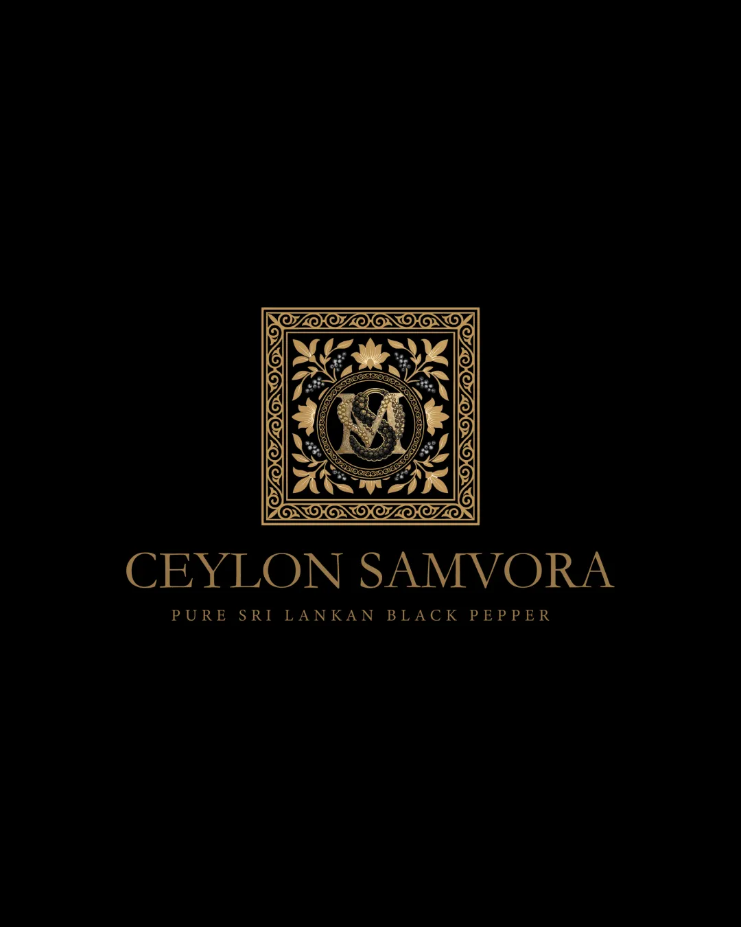
A sophisticated and strongly themed logo that signals heritage and quality, with one practical risk in emblem scalability at small sizes.
This emblem shows strong execution, supported by text readability and distinctive construction; improving clarity at smaller sizes is the clearest next step.
Focus on the changes that matter. Keep what makes the logo work.
Luxurious, traditional emblem with stylized central 'S' communicates premium Sri Lankan origin and authenticity fitting a specialty black pepper brand.
Logo preview unavailable. The written feedback is still available on this card.
emblem (band 0)
The intricate floral and geometric details in the emblem may lose clarity or merge at small sizes, especially the small leaf clusters and inner border.
See the category reviewThe ornate gold emblem and elegant serif wordmark convincingly communicate premium, authentic Sri Lankan black pepper for a local and international audience; main caution is emblem clarity at small sizes.
Estimated colors. Use the original design file for exact values.
Create a full color palette using these colors
Create new paletteGenerous spacing between name and tagline aids clarity, but the gap could be optically reduced for tighter cohesion between brand and descriptor without crowding.

Inspect spacing with the guide. Optical balance may differ from geometric centering.
The intricate floral and geometric details in the emblem may lose clarity or merge at small sizes, especially the small leaf clusters and inner border.
Try: Test emblem at scaled-down sizes and consider a simplified alternate version for packaging or digital use.
Logo preview unavailable. The written feedback is still available on this card.
Get a clear logo score, key risks, and priority fix ideas before your client or audience sees it.
More credits needed
Add credits to continue without losing your work.
Then $7/month. Cancel anytime.
Essential logo review with AI
Estimated progress