AGAZ abstract monogram logo logo review
4.2/5
Logo score Monogram category

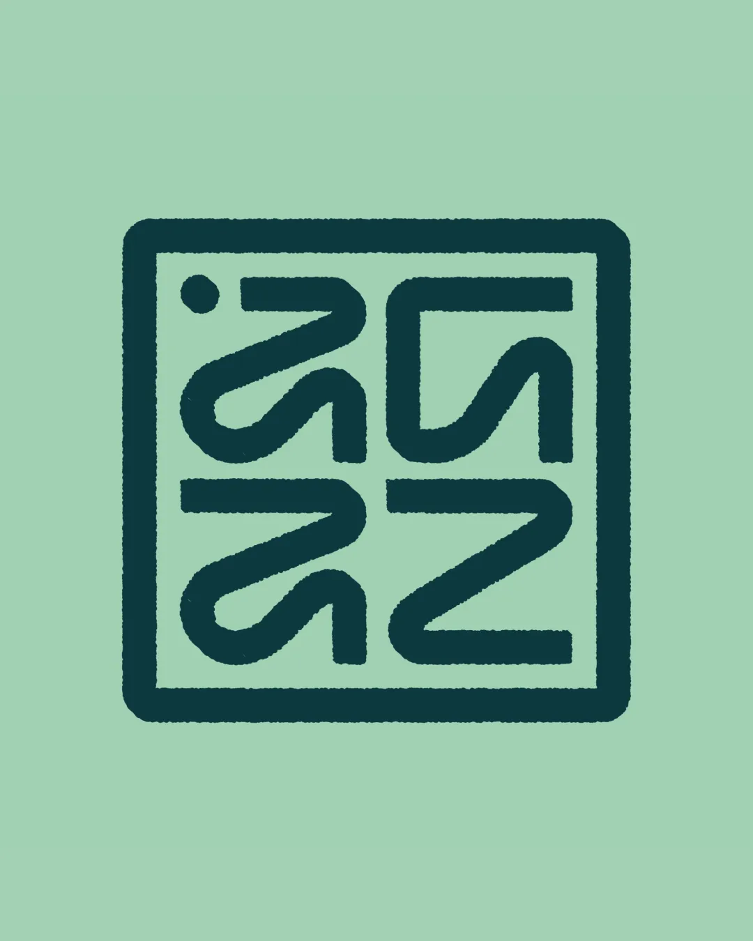
AGAZ abstract monogram logo

scoes Essential logo review

A striking, highly original monogram with excellent balance and contemporary energy but significant legibility limitations that could undermine brand recognition without supporting wordmark or user familiarity.

This monogram shows strong execution, supported by distinctive construction and clarity at smaller sizes; improving letter recognition is the clearest next step.

Symbols recognized:
A stylized square mark composed of rounded geometric lines segmented to form abstract shapes, potentially referencing the name AGAZ.
Legible text:
unclear; ambiguous
Monogram Geometric, Abstract, Modular Sports Nutrition
2/5
Legibility
5/5
Originality
4/5
Balance
4/5
Scale
Your next steps

What to fix first

Focus on the changes that matter. Keep what makes the logo work.

What to preserve

The concept leverages a bold, modular, monogram structure to evoke energy, dynamism, and a sense of movement appropriate for a modern sports nutrition brand.

Spelling & grammar

Confirm the wording

The monogram is heavily abstracted, and it's unclear if it directly reads as AGAZ or another sequence.

1

entire monogram

Test audience recognition of the letterforms; consider minor adjustment to clarify the 'A' and 'Z' if confusion persists.

High priority Visible issue Medium effort

The abstraction of the letterforms makes it challenging to discern the intended 'AGAZ' without context, reducing immediate brand recognition.

See the category review
Detailed review

Logo performance breakdown

4/5

Brief & logo match

The abstract monogram conveys the bold, modern, and high-energy focus for a sports nutrition brand, but the obscured name reading could challenge the clear accessibility emphasized in the brief.

5/5

Originality

  • Striking geometric abstraction distinguished from standard sports nutrition marks.
  • The modular, geometric pattern is a distinctive contemporary take, supporting the 'active, modern, and bold' positioning in the brief.

    Optional refinement entire monogram
5/5

Misinterpretations

  • No obvious negative interpretations or inappropriate associations.
4/5

Balance alignment

  • Monogram is symmetrically balanced within the square; stroke weights are consistent.
Uploaded logoAlignment guide overlay

Inspect spacing with the guide. Optical balance may differ from geometric centering.

4/5

Scalability

  • Bold forms likely to reproduce well in most sizes.
  • Inner line spaces are moderate but at very small applications or on textured backgrounds, fine gaps and corners may blur or merge.

    Worth testing fine details, especially monogram corners
2/5

Legibility

  • The abstraction of the letterforms makes it challenging to discern the intended 'AGAZ' without context, reducing immediate brand recognition.

    Visible issue entire monogram

    Try: Test audience recognition of the letterforms; consider minor adjustment to clarify the 'A' and 'Z' if confusion persists.

Try your own review

Wondering how your logo performs?

Get a clear logo score, key risks, and priority fix ideas before your client or audience sees it.

Review my logo