What to preserve
The logo successfully combines an elegant, botanical-inspired symbol with a sophisticated serif wordmark to create an inviting, zen ambiance fitting for a beauty or wellness brand.
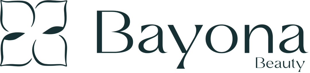
A strong, elegant logo concept that combines natural calm and beauty well, with minor adjustments needed for optimal integration and typographic polish.
This logo lockup shows solid execution, supported by text readability and clarity at smaller sizes; improving visual balance is the clearest next step.
Focus on the changes that matter. Keep what makes the logo work.
The logo successfully combines an elegant, botanical-inspired symbol with a sophisticated serif wordmark to create an inviting, zen ambiance fitting for a beauty or wellness brand.
arrangement (symbol and type relation)
The visual weight of the symbol is heavier than that of the thin, refined wordmark, creating mild imbalance and a sense of separation.
Assess the mark/wordmark balance at different scales.
The logo expresses the desired zen spiritual and beauty values through a calm, botanical symbol and refined typography, though the mark/wordmark balance could better reflect premium unity.
Symbol 3/5 · Wordmark 3/5 · Layout 3/5
The spacing between some letters (notably 'B' and 'a', and 'y' and 'o') appears marginally inconsistent, affecting typographic polish.
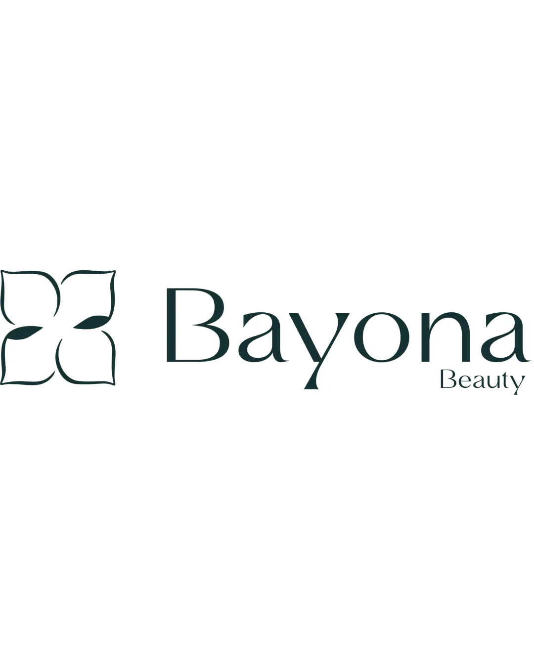

Inspect spacing with the guide. Optical balance may differ from geometric centering.
The visual weight of the symbol is heavier than that of the thin, refined wordmark, creating mild imbalance and a sense of separation.
Try: Consider reducing the mark's size relative to the wordmark or increasing the wordmark's weight slightly to enhance unity.
Check: Assess the mark/wordmark balance at different scales.
Symbol 4/5 · Wordmark 3/5
Symbol 4/5 · Wordmark 4/5 · Layout 4/5
Wordmark 5/5 · Layout 4/5
Get a clear logo score, key risks, and priority fix ideas before your client or audience sees it.
More credits needed
Add credits to continue without losing your work.
Then $7/month. Cancel anytime.
Essential logo review
Usually takes under a minute