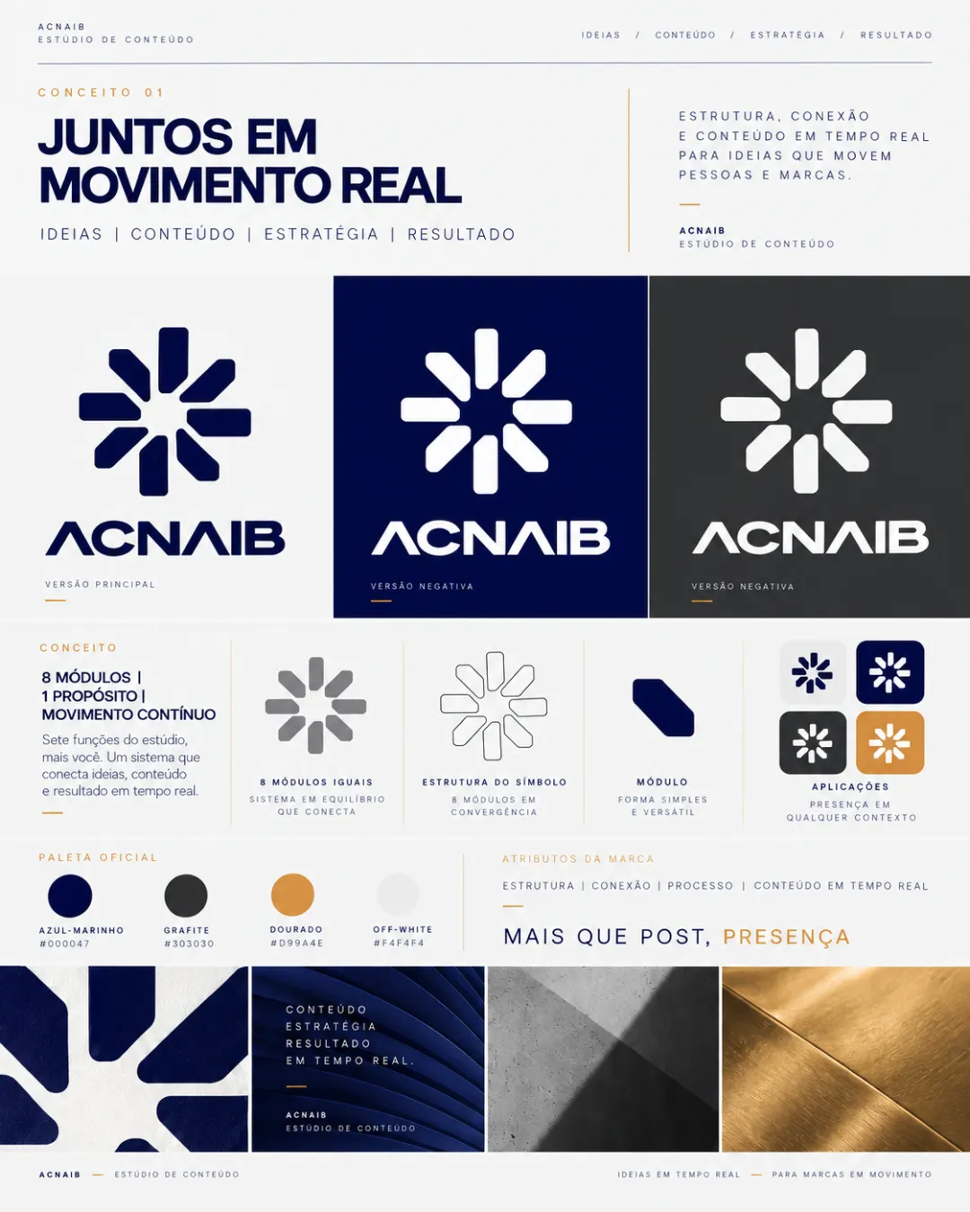
primary lockup
Adjust the size, placement, or weight of the tagline for greater visual harmony.
Logo preview unavailable. The written feedback is still available on this card.
There is an imbalance between the boldness and visual weight of 'BE' and the lighter, smaller secondary text, making the tagline feel disconnected.
How to check
See the category review View the logo at various sizes and check for better integration between elements.