 View review
Logo score
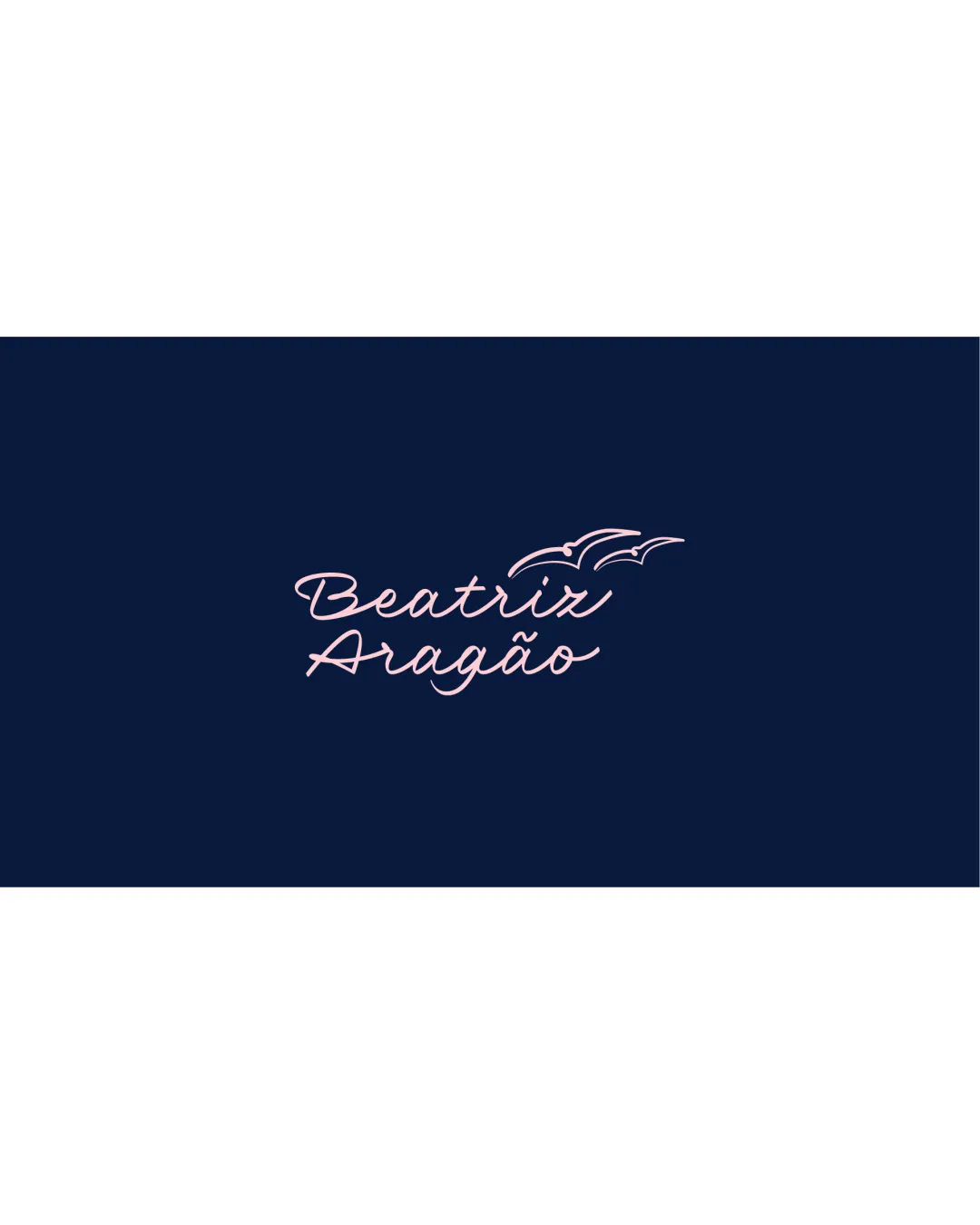
Logo review ofBeatrix Aragão
Review the detailed scores below to see what is working and what should be refined first.
Legibility
Originality
Misread
Balance
Scale
Detailed review
Logo performance breakdown
Legibility
![]() Handwritten script style is distinct and clear at moderate sizes.
Handwritten script style is distinct and clear at moderate sizes.![]() High contrast between text color and background aids readability.
High contrast between text color and background aids readability.
![]() Swash style and fine lines may reduce legibility at small sizes or when printed with lower quality.
Swash style and fine lines may reduce legibility at small sizes or when printed with lower quality.![]() The underline and accent marks might merge with text at smaller scales.
The underline and accent marks might merge with text at smaller scales.
Originality
![]() Handwritten script personalizes the logo.
Handwritten script personalizes the logo.![]() Minimalist bird element adds a thematic touch.
Minimalist bird element adds a thematic touch.
![]() Birds in flight are a common generic motif, which reduces the uniqueness.
Birds in flight are a common generic motif, which reduces the uniqueness.![]() No standout or unexpected creative features in symbol or typography.
No standout or unexpected creative features in symbol or typography.
Color harmony
![]() Restrained palette feels modern and harmonious.
Restrained palette feels modern and harmonious.![]() Excellent foreground-background contrast.
Excellent foreground-background contrast.
Catalina Blue
#0C1C40
Light Pink
#F7CBD9
Balance alignment
![]() Visual weight is relatively centered with the text and bird icon forming a cohesive unit.
Visual weight is relatively centered with the text and bird icon forming a cohesive unit.![]() Bird symbol above the text creates a clear focal point.
Bird symbol above the text creates a clear focal point.
![]() Birds are slightly detached from the text and might feel unanchored, creating mild imbalance.
Birds are slightly detached from the text and might feel unanchored, creating mild imbalance.![]() Spacing between name lines could use refinement for tighter visual unity.
Spacing between name lines could use refinement for tighter visual unity.

Scalability
![]() Simple graphic elements facilitate scaling in most digital contexts.
Simple graphic elements facilitate scaling in most digital contexts.![]() Works well on social media headers, website banners, larger print collateral.
Works well on social media headers, website banners, larger print collateral.
![]() Thin script font and delicate lines could be lost on business cards, embroidery, or as a small icon.
Thin script font and delicate lines could be lost on business cards, embroidery, or as a small icon.![]() The script may lose clarity when reduced to favicon or app icon size.
The script may lose clarity when reduced to favicon or app icon size.
200x250 px
100×125 px
50×62 px
Misinterpretations
![]() No inappropriate or confusing symbolism detected.
No inappropriate or confusing symbolism detected.![]() Birds and script communicate lightness and freedom as intended.
Birds and script communicate lightness and freedom as intended.
Symbol & text fit
![]() Birds and script style complement each other in fluidity and minimalism.
Birds and script style complement each other in fluidity and minimalism.
![]() Colors and line weights are consistent between the icon and wordmark.
Colors and line weights are consistent between the icon and wordmark.
![]() Bird mark could be more integrated with the text for stronger cohesion.
Bird mark could be more integrated with the text for stronger cohesion.
Try your own review
Review my logo
Wondering how your logo performs?
Get a clear logo score, key risks, and priority fix ideas before your client or audience sees it.
Keep exploring


