 View review
Logo score
Logo review of
Benchboyz
Review the detailed scores below to see what is working and what should be refined first.
Objective AI feedback. Your creative decision.
Legibility
Originality
Misread
Balance
Scale
Detailed review
Logo performance breakdown
Legibility
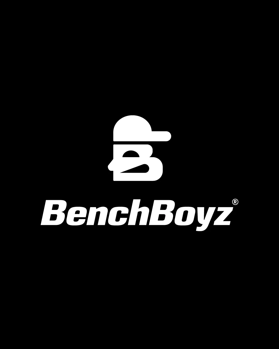
 Text is highly readable due to bold, clean font. High contrast between white text/logo and black background.
Originality
Creative integration of a cap and face into the letter 'B' gives character and uniqueness. Monogram approach is less common in sports than mascots or literal icons.
 ‘Boy with cap’ silhouette is not a completely groundbreaking theme for sports-related brands.
Color harmony
Monochrome palette ensures universal applicability and high contrast. Easy to invert or overlay on various media.
White
#FFFFFF
Black
#000000
Balance alignment
The logomark is visually centered above the wordmark, creating a solid vertical alignment. Both the symbol and wordmark have compatible visual weights.
Minor imbalance due to the cap’s brim extending right, giving a slight right-heaviness.

Scalability
Strong, simple shapes allow for scaling down without loss of clarity. Design would work well on merchandise, jerseys, and digital applications.
Slight risk of detail loss in the logomark facial features when scaled very small (e.g., favicons or embroidery).
200x250 px
100×125 px
50×62 px
Misinterpretations
No unintended inappropriate or confusing symbols detected.
Symbol & text fit
Logomark style and bold typeface are harmonious.
Visual language is cohesive, matching energy and demographics.
Try your own review
Review my logo
Wondering how your logo performs?
Get a clear logo score, key risks, and priority fix ideas before your client or audience sees it.
Keep exploring