Wondering how your logo performs? 🧐
Get professional logo reviews in seconds and catch design issues in time.
Try it Now!Logo review of BEYOND THE GIFT
Logo analysis by AI
Logo type:
Style:
Detected text:
Business industry:
Review requested by Lapidoco
**If AI can recognize or misinterpret it, so can people.
Structured logo review
Legibility
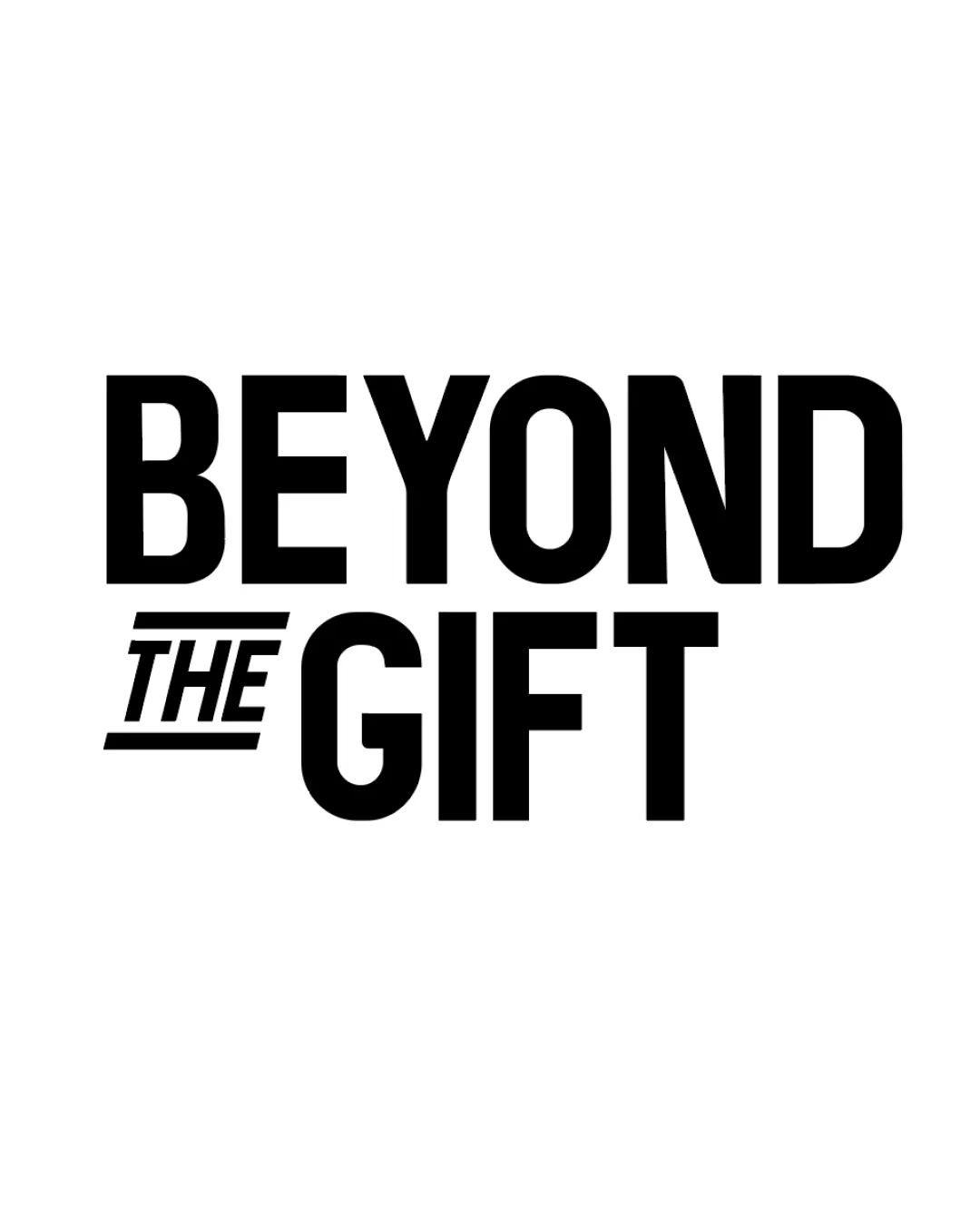
All uppercase letters ensure maximum clarity and readability.
High contrast between black text and white background promotes excellent legibility.
Large, bold font enhances recognition from a distance.
Scalability versatility
Simple, strong typography maintains legibility at small sizes.
Minimalist design works across a variety of formats and backgrounds.
No thin lines or intricate details that could get lost when scaled.
The length of the phrase in wordmark format may reduce impact/ease of application on small merchandise or social media profile icons.
Horizontal arrangement can make usage on narrow vertical applications more difficult.
200x250 px
100×125 px
50×62 px
Balance alignment
Text is visually aligned, clean, and feels evenly weighted.
Any differentiation (italicization and underline on 'THE') maintains overall balance.
'THE' being underlined and italicized adds a different visual rhythm, which could cause mild imbalance if not standardized throughout wordmark variations.
Originality
Underline and italic effect on 'THE' adds some uniqueness to the otherwise standard wordmark.
Overall execution is quite generic, relying on classic bold sans-serif with minimal creative distinction.
No unique symbol, icon, or negative space feature to elevate brand memorability.
Aesthetic look
Minimal and bold aesthetics are visually contemporary and clean.
Monochrome color palette gives it a versatile, upscale look.
All-caps treatment can appear aggressive or shouty for certain brands, lacking warmth or approachability.
Design may feel uninspired compared to competitors with more unique typography or graphic elements.
Dual meaning and misinterpretations
No inappropriate or unintended imagery present in either the arrangement or letterforms.
Color harmony
Single color application with high contrast ensures strong readability and visual impact.
Monochrome approach maximizes versatility for print and digital.
Black
#000000
White
#FFFFFF