bino logo review
4.4 / 5
Logo score

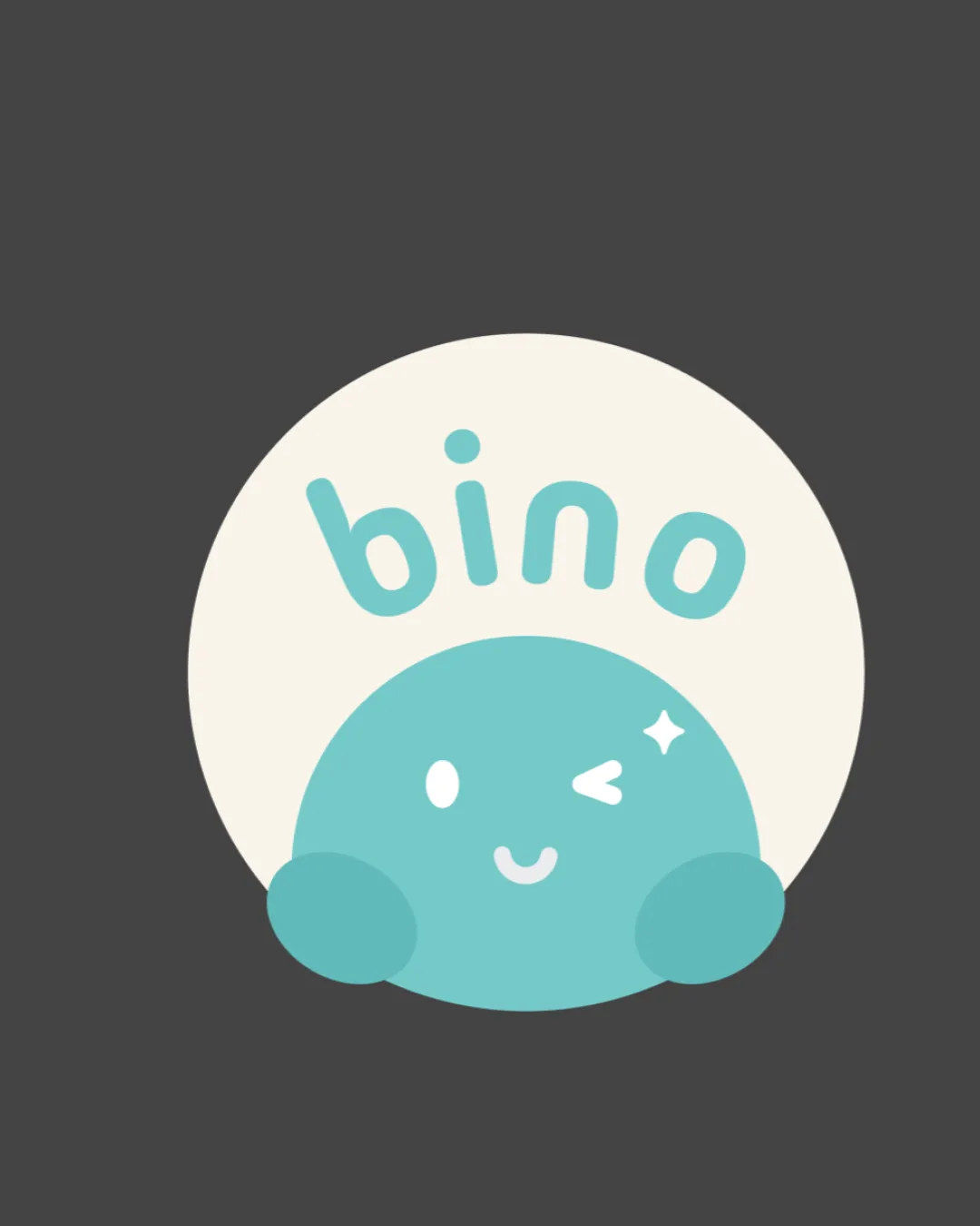
Logo review ofBino

Strong concept and fit for its industry; minor refinements recommended for maximum versatility and polish.

Combination Mark Playful Hand-drawn Children/entertainment
4.5/5
Legibility
4/5
Originality
5/5
Misread
4.5/5
Balance
4/5
Scale
Review next
Action plan

What to fix first

The most important fixes to handle before polishing the full presentation.

1

Increase visibility and clarity of the facial details (wink/star) for better small-scale performance.

Medium priority

Ensures mascot's expression is recognizable at all sizes.

Impact: Improves Scalability And Versatility · Effort: Low

2

Slightly adjust text arc centering and spacing to perfect optical balance above the mascot.

Low priority

Improves polish and perceived quality for clients.

Impact: Enhances Overall Harmony And Professionalism · Effort: Low

Detailed review

Logo performance breakdown

4.5/5

Legibility

Checkmark icon Text 'bino' is clear and easily readable
Checkmark icon Rounded font suits playful theme

Warning icon Letter 'n' could be slightly misread as 'u' due to its shape

4/5

Originality

Checkmark icon Playful character strengthens memorability
Checkmark icon Distinct hand-drawn style

Warning icon Circular mascot concept is somewhat common in kid-focused design

4.5/5

Color harmony

Checkmark icon Limited palette provides contrast and unity
Checkmark icon Pastel tones are appealing and gentle

Warning icon Low contrast between cyan and ivory may reduce impact on white backgrounds

Soft Cyan
#99D9D9

Ivory
#F7F5EC

Charcoal
#474747

Your palette is close. Explore sharper color combinations with Colorfly.design before updating the logo.

Explore palettes
4.5/5

Balance alignment

Checkmark icon Well-balanced composition between text and mark
Checkmark icon Character centered within background circle

Warning icon Text arc could be centered more precisely relative to the mascot

logo 200x250 pixels scalability test alignment grid overlay
4/5

Scalability

Checkmark icon Simple, bold shapes hold up at smaller sizes

Warning icon Small facial elements (wink/star) may lose clarity at tiny scale

logo 200x250 pixels scalability test

200x250 px

logo 100x125 pixels scalability test

100×125 px

logo 50x62 pixels scalability test

50×62 px

5/5

Misinterpretations

Checkmark icon No inappropriate or confusing misreads observed

5 / 5

Logo structure & brief match

Checkmark icon Text and mark are stylistically cohesive
Checkmark icon Playful curves unify the elements

Checkmark icon Industry Fit: Playful character and rounded font are well-suited for a children's brand or entertainment context.

Try your own review

Wondering how your logo performs?

Get a clear logo score, key risks, and priority fix ideas before your client or audience sees it.

Review my logo