Wondering how your logo performs? 🧐
Get professional logo reviews in seconds and catch design issues in time.
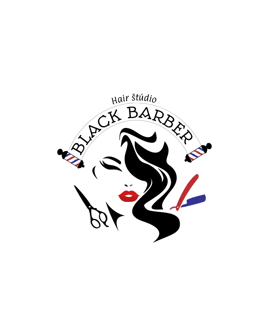
Try it Now!Logo review of BLACK BARBER, Hair štúdio
 Logo analysis by AI
Logo type:
Style:
Detected symbol:
Detected text:
Business industry:
Review requested by Branka.stojanovic-32
**If AI can recognize or misinterpret it, so can people.
Structured logo review
Legibility
![]() The main business name 'BLACK BARBER' is fairly readable and well-positioned in the arch.
The main business name 'BLACK BARBER' is fairly readable and well-positioned in the arch.![]() Supportive text 'Hair štúdio' is simple and in a contrasting color.
Supportive text 'Hair štúdio' is simple and in a contrasting color.
![]() Legibility decreases due to the curved layout and the small size of 'Hair štúdio.'
Legibility decreases due to the curved layout and the small size of 'Hair štúdio.'![]() Font choice for the arch is decorative and not the most straightforward, especially at small sizes.
Font choice for the arch is decorative and not the most straightforward, especially at small sizes.
Scalability versatility
![]() Strong, simple black shapes of the hair could scale decently on some merchandise.
Strong, simple black shapes of the hair could scale decently on some merchandise.![]() Could work on larger signage where details will be visible.
Could work on larger signage where details will be visible.
![]() Multiple small elements (scissors, razor, barbershop poles, fine text) will lose clarity at small sizes.
Multiple small elements (scissors, razor, barbershop poles, fine text) will lose clarity at small sizes.![]() Complexity and color details make it less effective on very small applications like favicons or embroidery.
Complexity and color details make it less effective on very small applications like favicons or embroidery.![]() Too many graphical elements crowd the logo, further reducing clarity at smaller sizes.
Too many graphical elements crowd the logo, further reducing clarity at smaller sizes.
200x250 px
100×125 px
50×62 px
Balance alignment
![]() The arch attempts to balance the lower illustration and the side icons.
The arch attempts to balance the lower illustration and the side icons.![]() Visual weight of the hair is offset by tools, creating a rough symmetry.
Visual weight of the hair is offset by tools, creating a rough symmetry.
![]() Abundance of separate icons (scissors, razor, poles, face) creates a visually busy and slightly unbalanced feel.
Abundance of separate icons (scissors, razor, poles, face) creates a visually busy and slightly unbalanced feel.![]() Graphic elements feel loosely connected rather than unified as a single entity.
Graphic elements feel loosely connected rather than unified as a single entity.

Originality
![]() Using a woman's face and flowing hair is common but at least links directly to the service.
Using a woman's face and flowing hair is common but at least links directly to the service.![]() Red lips add a slight memorable detail.
Red lips add a slight memorable detail.
![]() Heavily relies on generic barber/beauty symbols (scissors, razor, barbershop poles, face), offering little uniqueness or creativity.
Heavily relies on generic barber/beauty symbols (scissors, razor, barbershop poles, face), offering little uniqueness or creativity.![]() No clever twist or use of negative space, and the composition is formulaic for the industry.
No clever twist or use of negative space, and the composition is formulaic for the industry.
Logomark wordmark fit
![]() Both logomark and wordmark share a bold black color palette, providing some cohesion.
Both logomark and wordmark share a bold black color palette, providing some cohesion.
![]() The illustrative feel of the logomark doesn't fully harmonize with the traditional/serif wordmark style.
The illustrative feel of the logomark doesn't fully harmonize with the traditional/serif wordmark style.![]() Decorative flourishes and style differences create a slightly disjointed brand impression.
Decorative flourishes and style differences create a slightly disjointed brand impression.
Aesthetic look
![]() Individual illustrations are clean and eye-catching.
Individual illustrations are clean and eye-catching.![]() Red lips provide a vibrant pop of color.
Red lips provide a vibrant pop of color.
![]() Overall look is busy and lacks professional simplicity.
Overall look is busy and lacks professional simplicity.![]() Combination of multiple industry clichés (scissors, razor, poles, face) creates visual clutter and feels uninspired.
Combination of multiple industry clichés (scissors, razor, poles, face) creates visual clutter and feels uninspired.![]() Misuse of multiple illustration styles and symbols makes it feel outdated and generic.
Misuse of multiple illustration styles and symbols makes it feel outdated and generic.
Dual meaning and misinterpretations
![]() No inappropriate or confusing imagery detected, and the subject is very clear.
No inappropriate or confusing imagery detected, and the subject is very clear.
Color harmony
![]() Core black-and-white palette is strong and fits the industry.
Core black-and-white palette is strong and fits the industry.![]() Red and blue are consistent with classic barber cues.
Red and blue are consistent with classic barber cues.
![]() Color application feels a bit scattered across multiple symbols.
Color application feels a bit scattered across multiple symbols.![]() Four distinct accent colors risk overwhelming the primary logo and could complicate reproduction across media.
Four distinct accent colors risk overwhelming the primary logo and could complicate reproduction across media.
Black
#000000
Red
#FF0000
White
#FFFFFF
Blue
#0000FF