Consider small refinements to the block letter spacing (especially 'K') for optimal legibility.
Helps avoid minor readability hesitations, especially from distance or at speed.
Improves quick recognition at a glance.
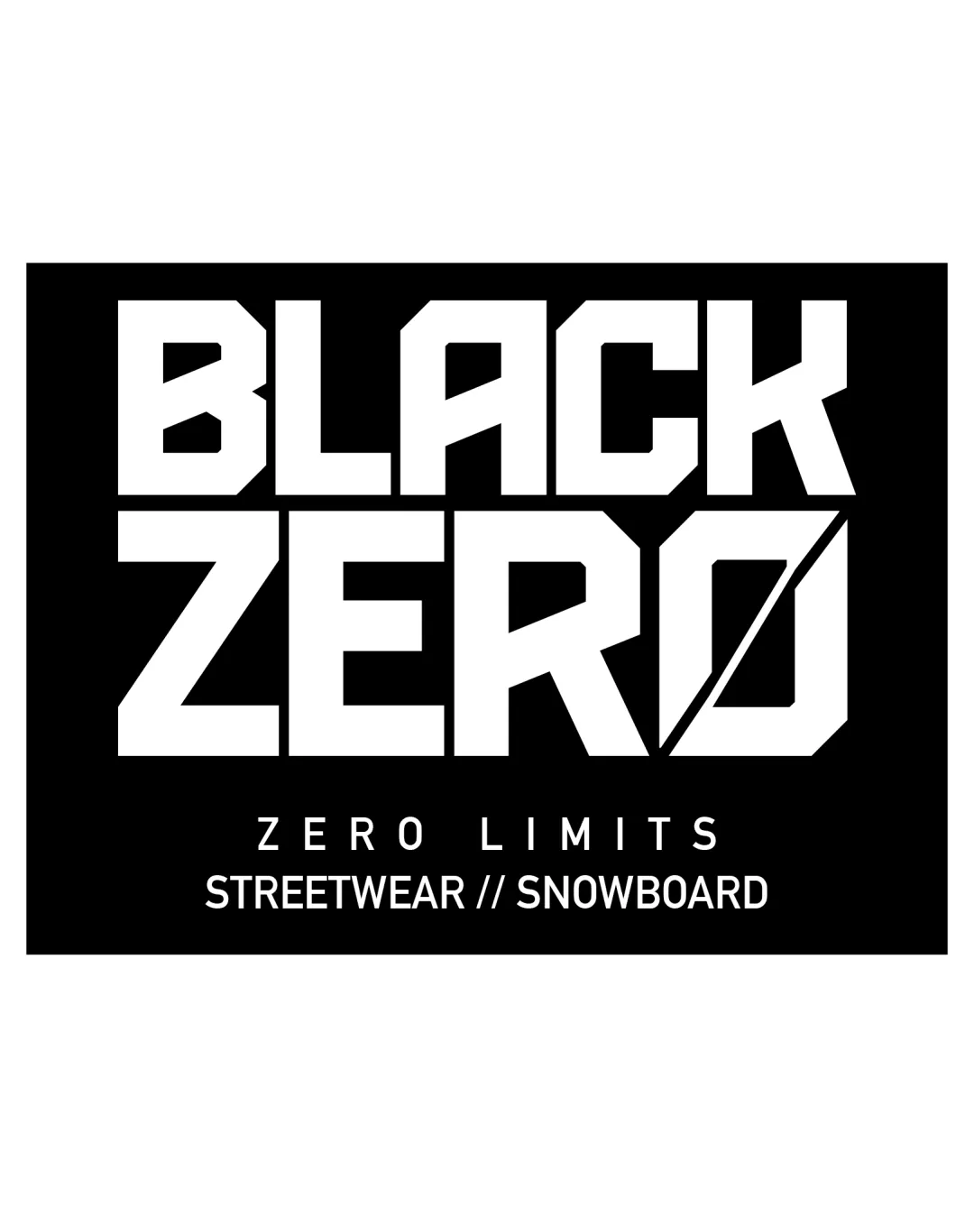
A bold, fitting streetwear/snowboard logo with strong geometry and confident presence, held back only by ordinary tagline scaling and subtle spacing tweaks.
Focus on the changes that matter. Keep what makes the logo work.
Helps avoid minor readability hesitations, especially from distance or at speed.
Improves quick recognition at a glance.
Tagline becomes hard to read at minimal sizes; a responsive version or omission could help.
Ensures full brand communication at all scales if tagline must remain visible.
Typography feels modern and energized; slashed 'O' suits snowboarding influence.
High contrast, rectangular form fits industry expectation and context.

Inspect spacing with the guide. Optical balance may differ from geometric centering.
Compare the detail at different sizes. Labels show the full image dimensions.
Does the shape still work without color?
Find the surfaces where your logo stays clear.
A 3px blur softens fine details so you can check whether the overall shape stays recognizable. If key gaps close or elements merge, the logo may rely too heavily on detail.
Get a clear logo score, key risks, and priority fix ideas before your client or audience sees it.
More credits needed
Add credits to continue without losing your work.
Then $7/month. Cancel anytime.