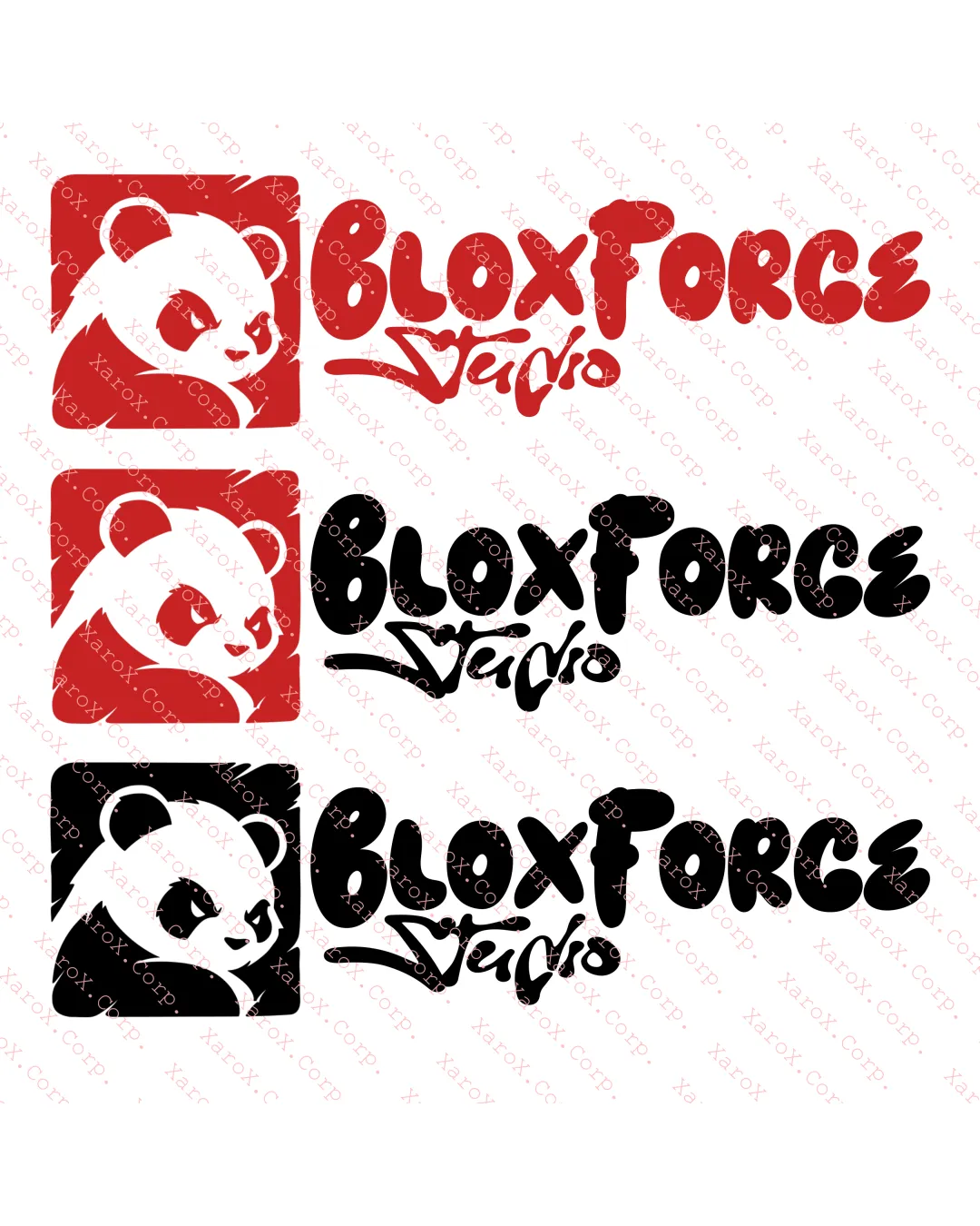
BloxForce Studio logo review
3.5/5
Logo score
Logo review of

Bloxforce Studio

Energetic and appealing combination mark with strong branding potential, but needs script refinement and spacing adjustments to reach a fully professional standard.

Combination Mark Cartoonish, Youthful, Bold Entertainment/gaming
3.5/5
Legibility
4/5
Originality
4.5/5
Misread
3.5/5
Balance
3/5
Scale
Action plan

What to fix first

The most important fixes to handle before polishing the full presentation.

1

Refine 'Studio' script for improved legibility and better fit with wordmark.

High priority

Current script is hard to read at small sizes and stylistically mismatched with 'BloxForce'.

Impact: Improves Readability And Cohesion. · Effort: Medium

2

Tweak kerning in 'Force' and reassess element spacing for cleaner balance.

Medium priority

Tighter spacing causes minor readability issues and slight crowding.

Impact: Enhances Overall Visual Harmony. · Effort: Low

Detailed review

Logo performance breakdown

3.5/5

Legibility

Checkmark icon 'BloxForce' is bold and mostly readable at mid-to-large sizes.

Warning icon 'Studio' script is less legible, especially at small sizes.
Warning icon Letter spacing in 'Force' slightly cramped.

4/5

Originality

Checkmark icon Distinctive panda character and playful graffiti style show personality.

Warning icon Panda as a mascot is a familiar trope in entertainment, slightly reducing uniqueness.

3.5/5

Color harmony

Checkmark icon Strong contrast in both color and black versions; palette is energetic.

Warning icon Red version is visually aggressive; lacks subtlety or secondary accent.

Red
#E53935

Black
#000000

White
#FFFFFF

Your palette is close. Refine the color roles and combinations before updating the logo.

Build brand colors
3.5/5

Balance alignment

Checkmark icon Panda mark balances the wordmark, solid left-anchoring.

Warning icon 'Studio' placement and style create visual imbalance and crowding.

logo 200x250 pixels scalability test alignment grid overlay
3/5

Scalability

Checkmark icon Bold panda icon maintains identity at smaller sizes.

Warning icon 'Studio' text risks illegibility at small scale; thin script and complex curves.

logo 200x250 pixels scalability test

200x250 px

logo 100x125 pixels scalability test

100×125 px

logo 50x62 pixels scalability test

50×62 px

4.5/5

Misinterpretations

Checkmark icon No negative or confusing alternate readings.

4/5

Logo structure & brief match

Checkmark icon Both elements feel part of a cohesive, energetic style.

Warning icon 'Studio' differs in script style, causing mild discord with the blocky main wordmark.

Checkmark icon Target Audience: Playful and energetic, suitable for youth/gaming sector.
Checkmark icon Brand Personality: Conveys friendly, creative, and bold impression.

Try your own review

Wondering how your logo performs?

Get a clear logo score, key risks, and priority fix ideas before your client or audience sees it.

Review my logo