What to preserve
The logo effectively symbolizes global connectivity and trade through an abstract globe motif, supporting the theme of industry-spanning connections.
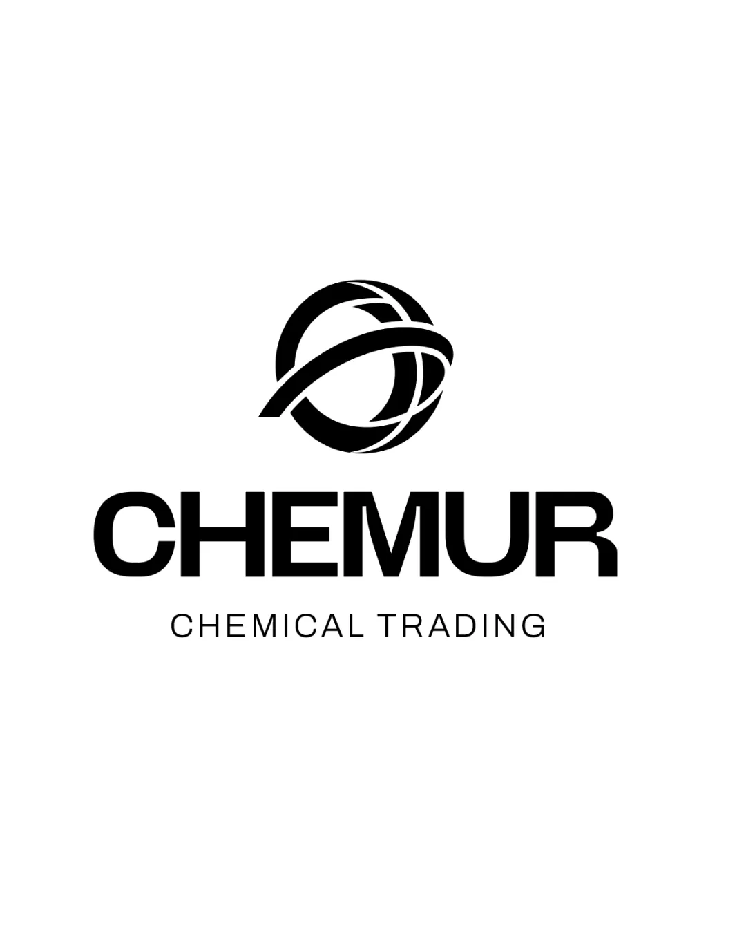
A visually distinctive and relevant identity, clearly communicating connection and industrial commerce for a chemical trading brand.
This logo lockup shows strong execution, supported by visual balance and text readability; improving distinctiveness is the clearest next step.
Focus on the changes that matter. Keep what makes the logo work.
The logo effectively symbolizes global connectivity and trade through an abstract globe motif, supporting the theme of industry-spanning connections.
Logo preview unavailable. The written feedback is still available on this card.
Standalone mark
The intersecting swooping bands in the abstract globe design may merge or lose clarity at small sizes.
See the category reviewThe abstract globe symbol with dynamic bands clearly represents Chemur's focus on business-enabling connections and international trading, matching the brand's core purpose and positioning.
Wordmark 5/5 · Layout 5/5
Symbol 4/5 · Wordmark 5/5 · Layout 4/5
The intersecting swooping bands in the abstract globe design may merge or lose clarity at small sizes.
Try: Test the standalone mark at small scales to ensure inner details remain crisp and recognizable.
Logo preview unavailable. The written feedback is still available on this card.
Symbol 4/5 · Wordmark 4/5 · Layout 4/5
The symbol's leftward projection is slightly more dominant, which might create a subtle visual pull away from the wordmark's center.

Inspect spacing with the guide. Optical balance may differ from geometric centering.
Symbol and wordmark use different densities and geometric distances, yet share a sense of precision and modernity. Integration is solid but not fully unified visually.
Symbol 4/5 · Wordmark 3/5
Get a clear logo score, key risks, and priority fix ideas before your client or audience sees it.
More credits needed
Add credits to continue without losing your work.
Then $7/month. Cancel anytime.
Essential logo review with AI
Estimated progress