the blue kite logo review
4.2/5
Logo score
Logo review of

The Blue Kite

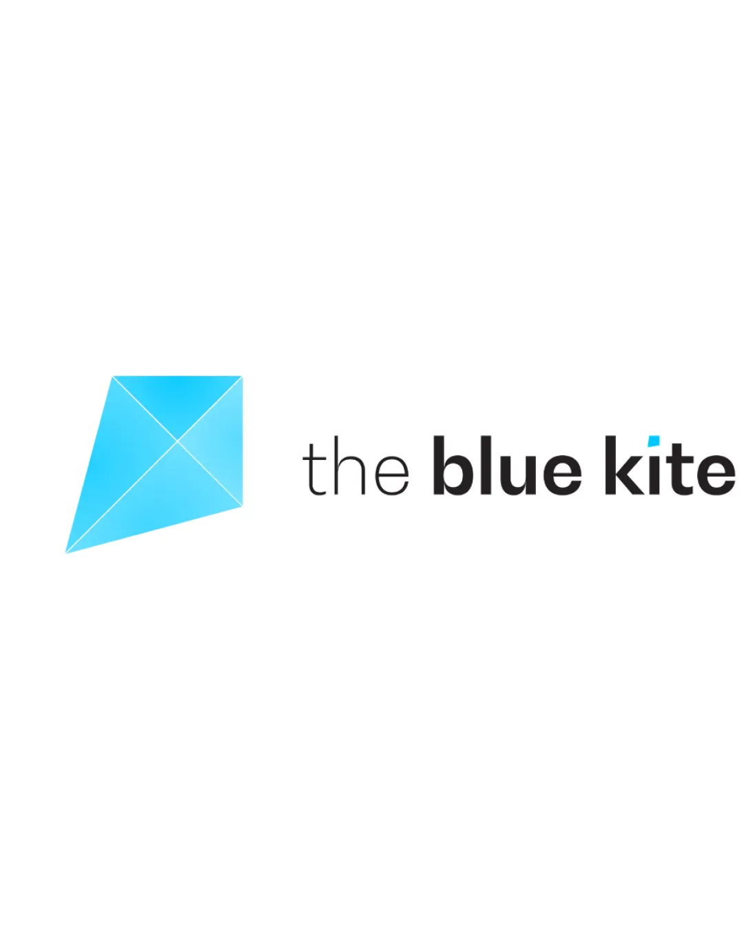
A strong, relevant combination mark with clear link to brand values. Subtle tweaks could further improve distinction and robustness.

Combination Mark Clean Geometric Contemporary Real Estate / Hospitality
5/5
Legibility
3.5/5
Originality
5/5
Misread
4/5
Balance
4/5
Scale
Action plan

What to fix first

The most important fixes to handle before polishing the full presentation.

1

Thicken internal kite lines slightly for micro sizes or consider a simplified micro version

Medium priority

Prevents internal lines from vanishing at small scale.

Impact: Ensures Mark Remains Clear At All Sizes And In Low-res Usage · Effort: Low

2

Explore a more distinctive take on the kite shape or subtle custom tweaks to wordmark

Low priority

Adds brand ownability while retaining current strengths.

Impact: Helps Further Differentiate Logo In The Real Estate And Rentals Space · Effort: Medium

Detailed review

Logo performance breakdown

5/5

Legibility

Checkmark icon All words are clearly readable
Checkmark icon Contrasting weights for hierarchy

3.5/5

Originality

Checkmark icon Friendly and fresh use of kite illustration
Checkmark icon Wordmark has a subtle distinguishing accent on 'i'

Warning icon Geometric kite motif is somewhat familiar, not highly unique

4/5

Color harmony

Checkmark icon Blue is fresh and calm; black text is clean and modern

Warning icon May want to test contrast of blue accent on various backgrounds

Light Blue
#29B6F6

Black
#000000

White
#FFFFFF

Your palette is close. Refine the color roles and combinations before updating the logo.

Build brand colors
4/5

Balance alignment

Checkmark icon Balanced composition between mark and wordmark
Checkmark icon Cohesive spacing and alignment

Warning icon Slight size/weight contrast between mark and text might need fine-tuning at all sizes

logo 200x250 pixels scalability test alignment grid overlay
4/5

Scalability

Checkmark icon Simple shapes scale well
Checkmark icon Minimal fine details

Warning icon Kite lines may thin at very small sizes

logo 200x250 pixels scalability test

200x250 px

logo 100x125 pixels scalability test

100×125 px

logo 50x62 pixels scalability test

50×62 px

5/5

Misinterpretations

Checkmark icon No evident negative or confusing secondary meanings

4.5/5

Logo structure & brief match

Checkmark icon Visual and thematic link between mark and name
Checkmark icon Blue accent on 'i' ties wordmark to logomark

Checkmark icon Openness/Transparency: The open geometric kite shape reinforces the idea of openness and trust.
Checkmark icon Reliability/Customer Service: The precise construction and clean style suggest reliability and professionalism.
Checkmark icon Approachability: Use of a playful, universally understood symbol and rounded type creates a welcoming feel.

Try your own review

Wondering how your logo performs?

Get a clear logo score, key risks, and priority fix ideas before your client or audience sees it.

Review my logo