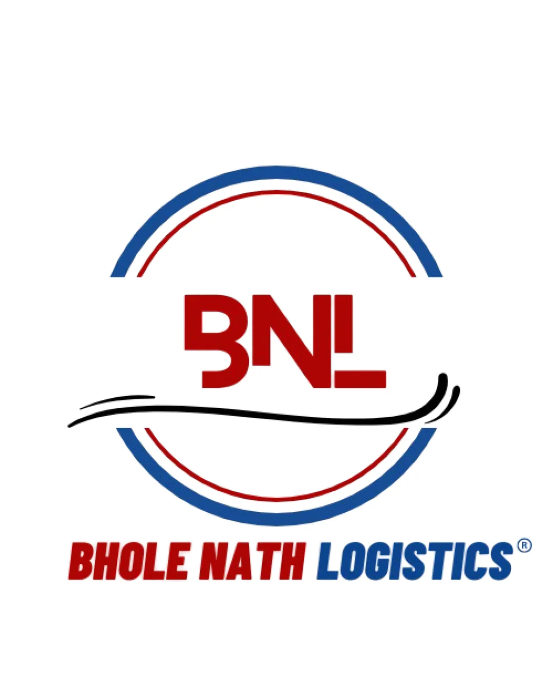
BNL, Bhole Nath Logistics logo review
4.3/5
Logo score

BNL, Bhole Nath Logistics

Review the detailed scores below to see what is working and what should be refined first.

Combination Mark Modern, Professional Logistics
5/5
Legibility
3/5
Originality
4/5
Balance
4/5
Scale
Detailed review

Logo performance breakdown

5/5

Legibility

  • The text is clear and legible.
3/5

Originality

  • Incorporates a swoosh element creatively.
  • The circular design and swoosh are quite common.
5/5

Color harmony

  • The color scheme is balanced and aligns with the industry.
4/5

Balance alignment

  • The design elements are mostly balanced.
  • The swoosh might seem slightly off balance.
Uploaded logoAlignment guide overlay

Inspect spacing with the guide. Optical balance may differ from geometric centering.

4/5

Scalability

  • The logo is versatile and scalable.
  • Fine details might not be as clear on very small applications.
Try your own review

Wondering how your logo performs?

Get a clear logo score, key risks, and priority fix ideas before your client or audience sees it.

Review my logo