 View review
Logo score
Logo review of
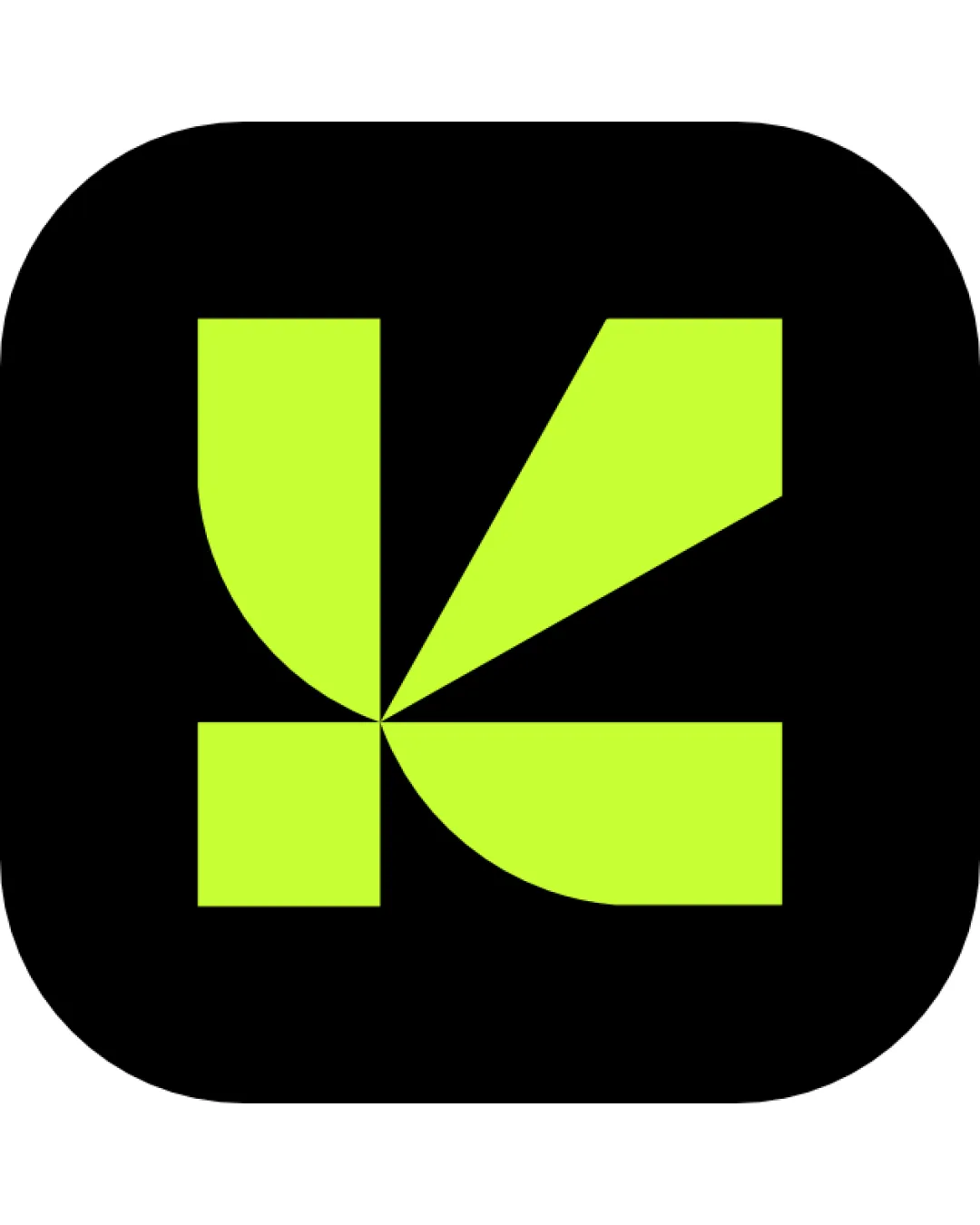
Geometric, Abstract 'k' Letterform
A striking, modern monogram that balances bold originality with practical versatility—minor refinements could further improve clarity.
Objective AI feedback. Your creative decision.
Legibility
Originality
Misread
Balance
Scale
Action plan
What to fix first
The most important fixes to handle before polishing the full presentation.
1
Enhance immediate 'K' recognition with subtle refinement to left-side curves or angles.
Medium priorityCurrently, new viewers may need a moment to identify the letter.
Impact: Moderate—better Clarity Broadens Audience Comprehension. · Effort: Medium
Detailed review
Logo performance breakdown
Legibility
 Abstract but recognizable as a 'K' after brief inspection.
 The abstraction may delay immediate recognition for first-time viewers.
Originality
Distinctive geometric construction sets it apart from typical letter monograms.
Some resemblance to abstracted arrow or blade icons in modern tech apps.
Color harmony
High-impact, modern lime on black offers excellent contrast.
Single-color palette can feel limiting or harsh depending on application.
Lime
#d6ff33
Black
#000000
Your palette is close. Refine the color roles and combinations before updating the logo.
Build brand colorsBalance alignment
Excellent symmetry and optical balance. All elements align precisely around a consistent center point.

Scalability
Bold, simple shapes scale exceptionally well. No internal details are lost at small sizes.
Complex negative space relationships may blur on extreme reductions.
200x250 px
100×125 px
50×62 px
Misinterpretations
No clear risk of negative or unintended secondary readings.
Beta
Possible AI design signals
Some AI-associated visual traits are present
Some visible traits are commonly associated with AI-generated artwork, but they are not conclusive.
- Geometric symmetry, high color contrast
Visual assessment; not definitive proof of authorship.
Try your own review
Review my logo
Wondering how your logo performs?
Get a clear logo score, key risks, and priority fix ideas before your client or audience sees it.
Keep exploring