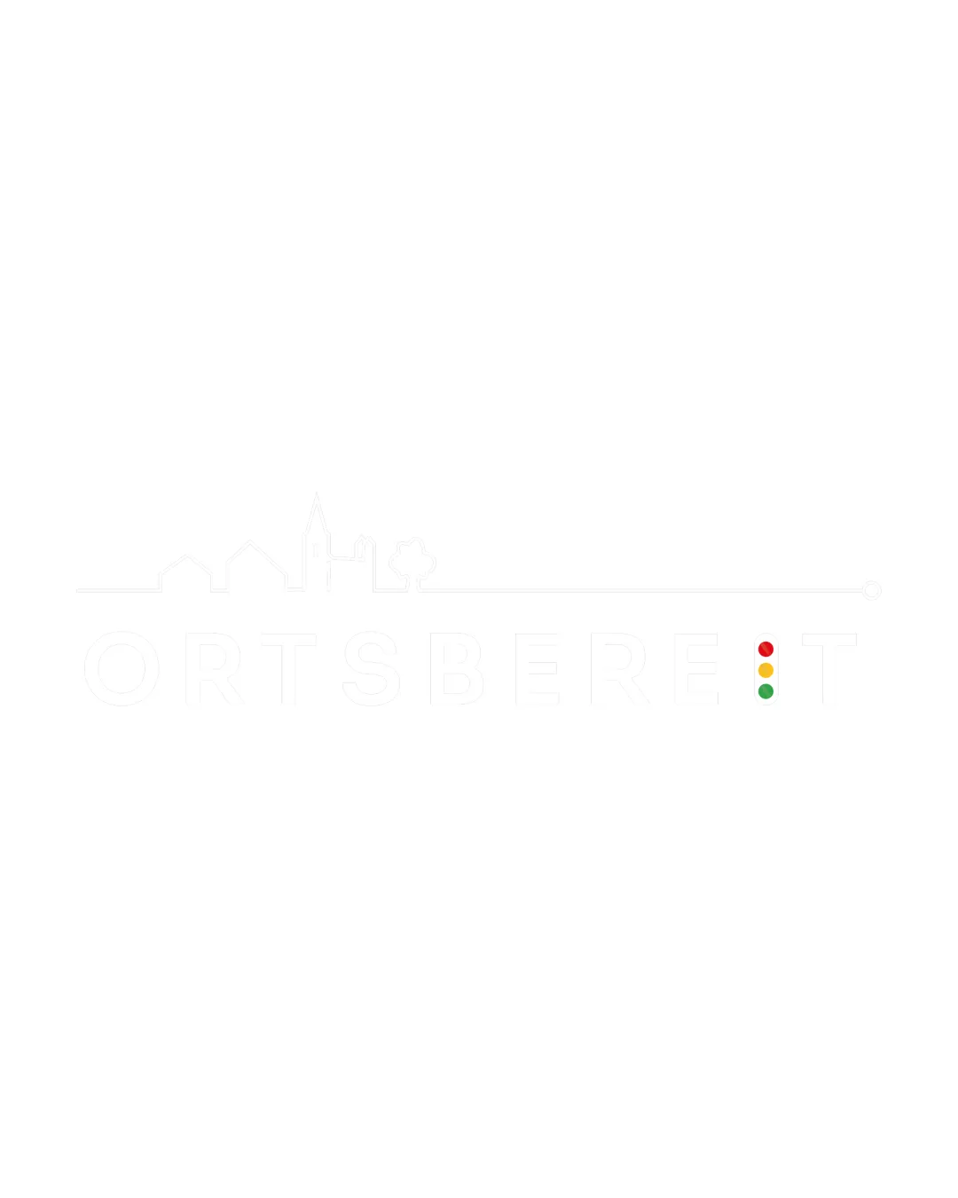
ORTSBEREIT logo review
2.2 / 5
Logo score
Logo review of

Ortsbereit

A conceptually solid community logo undermined by extremely weak contrast and poor legibility—needs substantial adjustment to be suitable for real-world use.

Objective AI feedback. Your creative decision.

Combination Mark Minimal Urban Outline With Geometric Accent Local Community
1.5/5
Legibility
3/5
Originality
3.5/5
Misread
3/5
Balance
2/5
Scale
Action plan

What to fix first

The most important fixes to handle before polishing the full presentation.

1

Fix possible misinterpretation

High priority

Traffic light as 'I' may not immediately read for all viewers.

Impact: High · Effort: Medium

2

Increase wordmark contrast significantly (e.g., dark outline or fill) against white.

High priority

Current design is almost invisible except for the colored dots.

Impact: Drastically Improves Legibility And Usability · Effort: Low

3

Consider modifying or outlining the skyline and traffic light for greater clarity at small sizes.

Medium priority

Fine detail and thin lines risk disappearing, especially when reduced.

Impact: Enhances Scalability And Recognition. · Effort: Medium

Detailed review

Logo performance breakdown

1.5/5

Legibility

Checkmark icon Basic text structure is discernible.

Warning icon Extremely poor contrast makes the wordmark almost unreadable on white background.
Warning icon Letter separation is weak; traffic light as 'I' is confusing without color contrast.

3/5

Originality

Checkmark icon Traffic light for 'I' is a novel twist.
Checkmark icon Town outline adds character.

Warning icon Skyline concept is relatively generic.
Warning icon Traffic light as letter device is clever but not unique.

2.5/5

Color harmony

Checkmark icon Traffic light colors add visual interest.

Warning icon Dominant use of white makes design impractical on white backgrounds and easily lost.

White
#FFFFFF

Red
#FF0000

Yellow
#FFD600

Green
#4CAF50

Color may be holding this logo back. Build a stronger strategic palette before updating the logo.

Build brand colors
3/5

Balance alignment

Checkmark icon Skyline aligns with top of the wordmark; composition is horizontally coherent.

Warning icon Traffic light as 'I' disrupts end balance.
Warning icon Skyline lacks boldness and fades next to colored dot detail.

logo 200x250 pixels scalability test alignment grid overlay
2/5

Scalability

Checkmark icon Simple lines and minimal detail.
Checkmark icon Scalable as a vector concept.

Warning icon Thin lines and pale coloring collapse at small sizes or on light backgrounds.

logo 200x250 pixels scalability test

200x250 px

logo 100x125 pixels scalability test

100×125 px

logo 50x62 pixels scalability test

50×62 px

3.5/5

Misinterpretations

Checkmark icon No suggestive or offensive shapes evident.

Warning icon Traffic light as 'I' may not immediately read for all viewers.

Beta

No obvious AI design signals

No visible generative artifacts detected

No obvious visual artifacts associated with AI generation were detected.

  • Very subtle text hierarchy; colored dot as typographic element

Visual assessment; not definitive proof of authorship.

3 / 5

Logo structure & brief match

Checkmark icon Skyline integrates contextually with identity.

Warning icon Traffic light interrupts flow, reducing cohesion.

Checkmark icon Local/municipal Identity: Skyline and wordmark with traffic light reinforce local and community focus, but legibility severely impacts practical use.

Try your own review

Wondering how your logo performs?

Get a clear logo score, key risks, and priority fix ideas before your client or audience sees it.

Review my logo