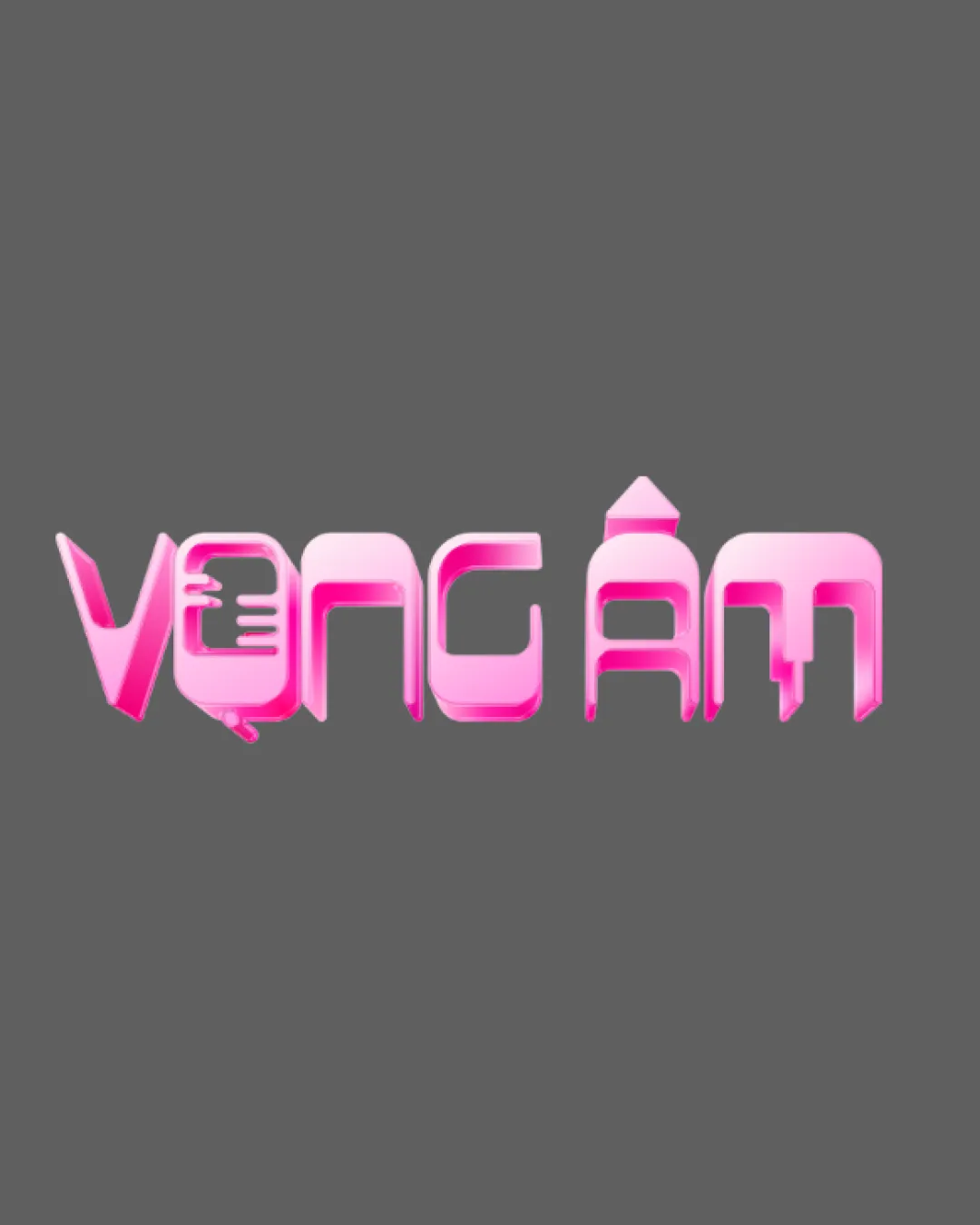
VONG ÁM logo review
2.7 / 5
Logo score
Logo review of

Vong Ám

Recognizable as a custom wordmark but compromises clarity and versatility due to overly stylized letterforms and dated effects.

Objective AI feedback. Your creative decision.

Wordmark Futuristic Glossy Gradient Entertainment
2.5/5
Legibility
3/5
Originality
4/5
Misread
3/5
Balance
3/5
Scale
Action plan

What to fix first

The most important fixes to handle before polishing the full presentation.

1

Refine the stylization for greater word legibility, especially clarifying ambiguous letterforms.

High priority

Current letter shapes hinder immediate recognition.

Impact: Improves Usability And Brand Recognition. · Effort: Medium

2

Simplify color and effects for better scalability and a more contemporary look.

Medium priority

Glossy effect feels outdated and complicates small usage.

Impact: Enhances Versatility And Modernity. · Effort: Medium

Detailed review

Logo performance breakdown

2.5/5

Legibility

Checkmark icon Characters are mostly distinguishable with effort.

Warning icon Highly stylized forms impede quick reading.
Warning icon Some letters (like 'G', 'M') are hard to recognize at a glance.

3/5

Originality

Checkmark icon Custom letterforms and stylization show creative intent.

Warning icon The overall sci-fi/3D wordmark style is somewhat generic in digital entertainment contexts.

3/5

Color harmony

Checkmark icon Color palette is playful and fits an entertainment context.

Warning icon Heavy gradient and shine feel dated; lacks sophistication.

Pink
#FF69B4

White
#FFFFFF

Grey (background)
#808080

Color may be holding this logo back. Build a stronger strategic palette before updating the logo.

Build brand colors
3/5

Balance alignment

Checkmark icon Consistent baseline and sizing across letters.

Warning icon Inconsistent negative space between letters.
Warning icon Some letter connections feel awkward or uneven.

logo 200x250 pixels scalability test alignment grid overlay
3/5

Scalability

Checkmark icon Simple wordmark structure supports basic scalability.

Warning icon Gloss and gradient effects may lose impact when reduced in size.

logo 200x250 pixels scalability test

200x250 px

logo 100x125 pixels scalability test

100×125 px

logo 50x62 pixels scalability test

50×62 px

4/5

Misinterpretations

Checkmark icon No obvious adult or confusing secondary readings.

Beta

Possible AI design signals

Some AI-associated visual traits are present

Some visible traits are commonly associated with AI-generated artwork, but they are not conclusive.

  • Synthetic glossy gradient over stylized text
  • Futuristic type effect with abstract features

Visual assessment; not definitive proof of authorship.

Try your own review

Wondering how your logo performs?

Get a clear logo score, key risks, and priority fix ideas before your client or audience sees it.

Review my logo