What to preserve
A dynamic eagle holding a football in front of a rising sun connects speed, power, and aspiration to a football club identity.
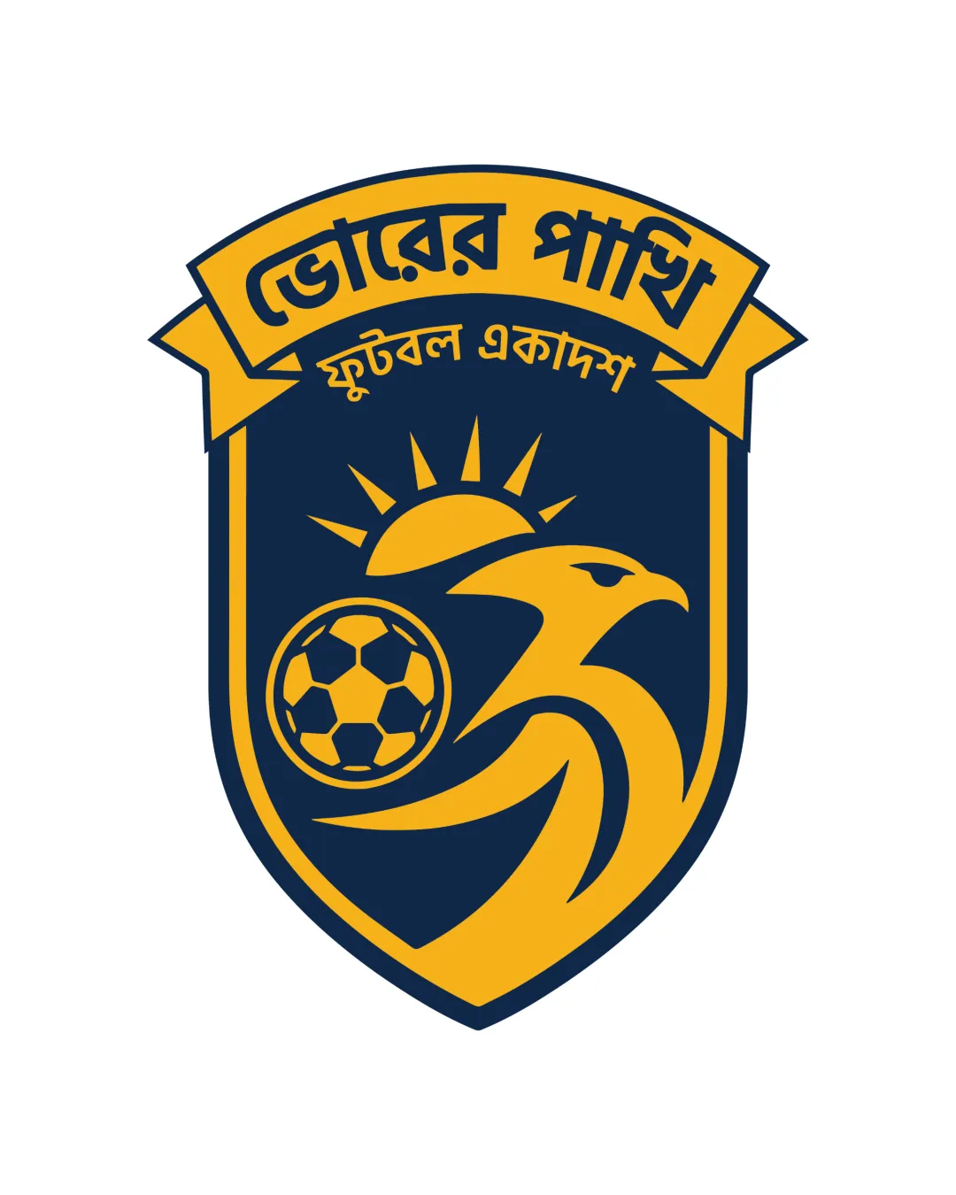
A dynamic, balanced, and clearly branded football club emblem with strong concept and color presence; minimal refinements could further enhance clarity at small scale.
This emblem shows strong execution, supported by distinctive construction and clarity at smaller sizes.
Focus on the changes that matter. Keep what makes the logo work.
A dynamic eagle holding a football in front of a rising sun connects speed, power, and aspiration to a football club identity.
Logo preview unavailable. The written feedback is still available on this card.
emblem details
Small shapes (soccer ball patches, eagle’s beak and eye lines) may merge or blur at very small sizes, potentially reducing clarity in reduced applications.
See the category reviewThe emblem strongly and distinctively expresses a football club identity, uniting athletic symbolism and bold style.
Estimated colors. Use the original design file for exact values.
Create a full color palette using these colors
Create new paletteWide, symmetrical shield with banner forms a visually stable foundation appropriate for a sports emblem. Minor refinement could optimize spacing between banner text and shield rim for enhanced clarity.

Inspect spacing with the guide. Optical balance may differ from geometric centering.
Small shapes (soccer ball patches, eagle’s beak and eye lines) may merge or blur at very small sizes, potentially reducing clarity in reduced applications.
Try: Test at icon and patch scales; consider simplification for small versions.
Logo preview unavailable. The written feedback is still available on this card.
Get a clear logo score, key risks, and priority fix ideas before your client or audience sees it.
More credits needed
Add credits to continue without losing your work.
Then $7/month. Cancel anytime.
Essential logo review with AI
Estimated progress