What to preserve
A cheerful space cat mascot combines task completion, achievement, and cosmic themes to gamify and motivate productivity in a highly engaging and memorable way.
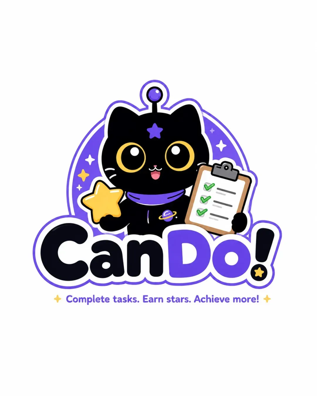
A highly original and engaging mascot emblem with playful, clear typography and an excellently integrated theme; minor scalability adjustments could optimize its versatility.
This emblem shows strong execution, supported by distinctive construction and text readability; improving clarity at smaller sizes is the clearest next step.
Focus on the changes that matter. Keep what makes the logo work.
A cheerful space cat mascot combines task completion, achievement, and cosmic themes to gamify and motivate productivity in a highly engaging and memorable way.
Logo preview unavailable. The written feedback is still available on this card.
emblem (mascot, stars, background)
The mascot emblem uses small details (star, facial features, checklist marks, collar planet) that may merge or lose clarity at very small sizes.
See the category reviewThe logo excels in expressing a fun, motivational productivity or educational app through its cosmic cat mascot and clear gamification symbolism, with the only caveat being minor scale-related detail risks at tiny sizes.
Estimated colors. Use the original design file for exact values.
Create a full color palette using these colors
Create new paletteThe emblem sits above the wordmark, and while they are cohesive in style, the clipboard slightly overlaps the letters, creating a playful sense of depth; overall balance is strong but could be tweaked by tightening the vertical spacing for more compactness in smaller applications.

Inspect spacing with the guide. Optical balance may differ from geometric centering.
The mascot emblem uses small details (star, facial features, checklist marks, collar planet) that may merge or lose clarity at very small sizes.
Try: Test for clarity at smaller scales and consider simplifying tiny details if used as an app icon or favicon.
Logo preview unavailable. The written feedback is still available on this card.
Get a clear logo score, key risks, and priority fix ideas before your client or audience sees it.
More credits needed
Add credits to continue without losing your work.
Then $7/month. Cancel anytime.
Essential logo review with AI
Estimated progress