What to preserve
The logo cleverly merges the visual motifs of a blooming flower and an open book, suggesting growth, knowledge, or a love for reading.
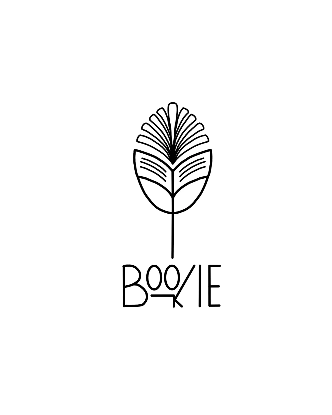
Visually inventive, but refinement of the wordmark's construction and mark's line thickness is needed for professional applications.
This logo lockup has a workable foundation; improving visual balance is the clearest next step.
Focus on the changes that matter. Keep what makes the logo work.
The logo cleverly merges the visual motifs of a blooming flower and an open book, suggesting growth, knowledge, or a love for reading.
Logo preview unavailable. The written feedback is still available on this card.
wordmark
The wordmark's uneven stroke weights and spacing, especially the overlapping 'K' and 'I', cause structural imbalance and reduce polish.
See the category reviewCleverly conveys a literature or book-related brand through a unique and memorable symbol, though the wordmark needs structural refinement for optimal clarity and balance.
This review includes a score but no supporting explanation for this category.
Symbol 4/5 · Wordmark 3/5
Wordmark 3/5 · Layout 4/5
The highly stylized letterforms (notably the 'K' merging with the 'I' and nonstandard 'B') may cause brief legibility hesitation at small sizes or for unfamiliar viewers.
Symbol 3/5 · Wordmark 3/5 · Layout 3/5
The fine lines of the mark may risk detail loss at smaller scales or in low-resolution media.
Symbol 3/5 · Wordmark 2/5 · Layout 3/5
The wordmark's uneven stroke weights and spacing, especially the overlapping 'K' and 'I', cause structural imbalance and reduce polish.
Try: Refine letter construction and spacing to improve wordmark balance and harmony with the mark.
Logo preview unavailable. The written feedback is still available on this card.

Inspect spacing with the guide. Optical balance may differ from geometric centering.
Get a clear logo score, key risks, and priority fix ideas before your client or audience sees it.
More credits needed
Add credits to continue without losing your work.
Then $7/month. Cancel anytime.
Essential logo review with AI
Estimated progress