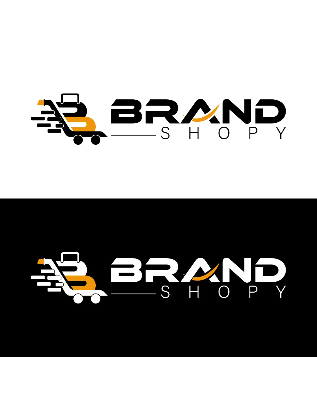
BRAND SHOP logo review
4.0 / 5
Logo score
Logo review of

Brand Shop

Review the detailed scores below to see what is working and what should be refined first.

Combination Mark Modern, Semi-abstract Retail
5/5
Legibility
2/5
Originality
5/5
Misread
4/5
Balance
3/5
Scale
Detailed review

Logo performance breakdown

5/5

Legibility

Checkmark icon Text is highly legible and clean.
Checkmark icon Ample spacing between characters ensures readability even at smaller sizes.
2/5

Originality

Checkmark icon Letter B integrated as a shopping cart shows an attempt at creative combination.

Warning icon Shopping cart icons and motion lines are highly generic and overused for e-commerce or retail brands.
Warning icon The combination of B and cart is not particularly unique or memorable.

5/5

Color harmony

Checkmark icon Good contrast between black, white, and orange.
Checkmark icon Color usage is consistent and not overwhelming.

Orange
#F59C13

Black
#000000

White
#FFFFFF

4/5

Balance alignment

Checkmark icon Combination between symbol and wordmark is aligned horizontally.
Checkmark icon Weight between the symbol and text is generally balanced.

Warning icon The motion lines on the left feel heavier visually, making the left side more visually prominent than the right.

logo 200x250 pixels scalability test alignment grid overlay
3/5

Scalability

Checkmark icon Simple color palette helps with print adaptability.
Checkmark icon Design remains recognizable on both light and dark backgrounds.

Warning icon The detailed shopping cart with motion lines and letter B could lose clarity at small sizes, such as on favicons or embroidery.
Warning icon Thin lines in the cart handle and motion marks may disappear or blur in reduced formats.

logo 200x250 pixels scalability test

200x250 px

logo 100x125 pixels scalability test

100×125 px

logo 50x62 pixels scalability test

50×62 px

5/5

Misinterpretations

Checkmark icon No inappropriate or confusing secondary meanings detected.

4 / 5

Symbol & text fit

Checkmark icon Both logomark and wordmark share a modern, geometric style.
Checkmark icon Styles are visually compatible.

Warning icon The thickness of lines in the logomark vs wordmark could be slightly better matched for even greater cohesion.

Try your own review

Wondering how your logo performs?

Get a clear logo score, key risks, and priority fix ideas before your client or audience sees it.

Review my logo