 View review
Logo score
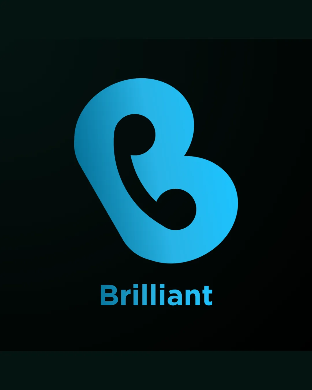
Logo review ofBrilliant
Solid, functional logo but not highly unique; consider enhancing the mark for stronger brand ownership.
Legibility
Originality
Misread
Balance
Scale
Action plan
What to fix first
The most important fixes to handle before polishing the full presentation.
1
Increase distinctly unique characteristics in the symbol to further distance from generic B-mark usage.
High priorityElevating originality will make the brand more memorable and less easily confused with competitors.
Impact: High · Effort: Medium
2
Adjust gradient and consider flat-color options for maximum print and digital versatility.
Medium priorityEnsuring strong performance in single color boosts overall logo utility.
Impact: Medium · Effort: Low
Detailed review
Logo performance breakdown
Legibility
![]() Text 'Brilliant' is clear and uses a clean sans-serif font.
Text 'Brilliant' is clear and uses a clean sans-serif font.
Originality
![]() Contemporary look with some ownable aspects.
Contemporary look with some ownable aspects.
![]() Generic stylized B is somewhat common and lacks a unique twist.
Generic stylized B is somewhat common and lacks a unique twist.
Color harmony
![]() Limited color palette with nice blue gradient effect.
Limited color palette with nice blue gradient effect.
![]() Gradient may present issues in single-color or print applications.
Gradient may present issues in single-color or print applications.
VividSkyBlue
#1EC6FF
Gunmetal
#12171D
Your palette is close. Explore sharper color combinations with Colorfly.design before updating the logo.
Explore palettesBalance alignment
![]() Logo and wordmark are well centered and proportioned.
Logo and wordmark are well centered and proportioned.
![]() Mark feels slightly top-heavy due to weight distribution.
Mark feels slightly top-heavy due to weight distribution.

Scalability
![]() Simple bold mark allows for small and large use cases.
Simple bold mark allows for small and large use cases.
![]() Slight inner detail may lose some clarity at very small sizes.
Slight inner detail may lose some clarity at very small sizes.
200x250 px
100×125 px
50×62 px
Misinterpretations
![]() No inappropriate or confusing visual readings detected.
No inappropriate or confusing visual readings detected.
Logo structure & brief match
![]() Mark and font style are both geometric and modern.
Mark and font style are both geometric and modern.
![]() Visual connection between mark shape and wordmark is minimal.
Visual connection between mark shape and wordmark is minimal.
![]() Detected Industry: The modern, sleek appearance suits a technology or digital brand.
Detected Industry: The modern, sleek appearance suits a technology or digital brand.
Try your own review
Review my logo
Wondering how your logo performs?
Get a clear logo score, key risks, and priority fix ideas before your client or audience sees it.
Keep exploring


