 View review
Logo score
Logo review of
Brown Boy Hair Salon
Review the detailed scores below to see what is working and what should be refined first.
Objective AI feedback. Your creative decision.
Legibility
Originality
Misread
Balance
Scale
Detailed review
Logo performance breakdown
Legibility
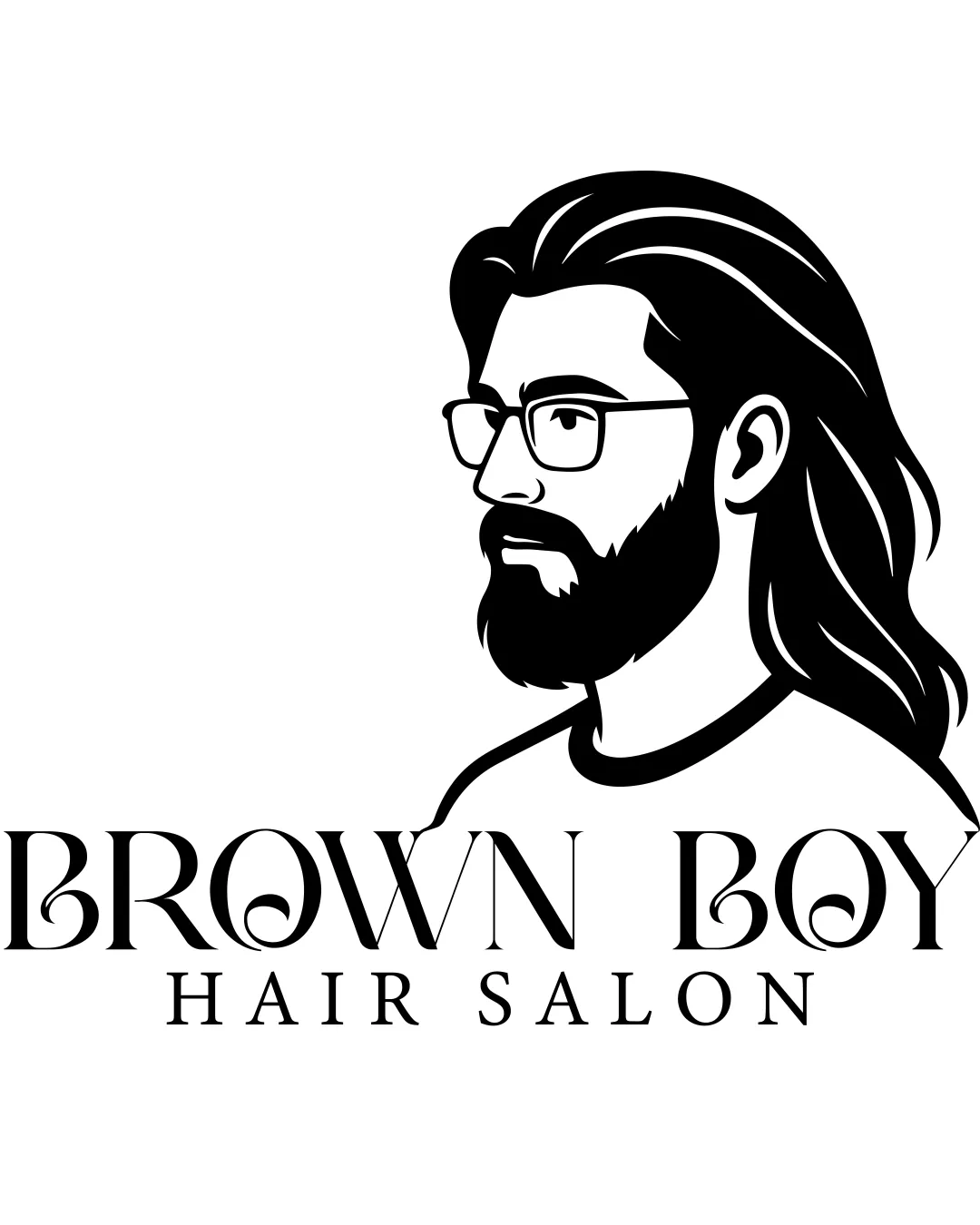
 Main business name 'BROWN BOY' is large and clear. Secondary text 'HAIR SALON' is simple and easy to read.
 Slight decorative flourishes on the 'O's and 'B' in the primary type may slightly impact instant readability, especially at smaller sizes.
Originality
Custom illustration of a man with contemporary style is somewhat unique in the salon industry.
Profile illustration of a bearded man is a recurring motif in barbershop/hair salon logos. Typeface modifications on 'O's are common and do not add strong uniqueness.
Color harmony
Monochrome color palette is clean, timeless, and highly adaptable. Strong contrast ensures visibility.
Black
#000000
White
#FFFFFF
Balance alignment
Text is horizontally aligned under the illustration, providing structural stability.
The heavy, dominant illustration on the right creates an off-balance composition, making the left text feel lightweight by comparison. Wordmark and symbol feel somewhat disconnected due to the size disparity.

Scalability
Illustrative style works well for larger applications such as signage, posters, and shopfront branding.
Detailed illustration will not reproduce well at small sizes—fine lines in the hair, facial features, and glasses will be lost or blurred in business cards, embroidery, or digital favicons. Logo does not translate well to simple icon or social media avatar formats due to the complex mark.
200x250 px
100×125 px
50×62 px
Misinterpretations
No explicit or inappropriate hidden imagery detected. Imagery and name are direct and relevant to the intended audience.
Symbol & text fit
Both logomark and wordmark communicate a stylish/contemporary vibe appropriate to the industry.
Illustration is visually heavier than the light, elegant wordmark—styles do not feel cohesively integrated.
Mark vastly outweighs the wordmark, causing imbalance.
Try your own review
Review my logo
Wondering how your logo performs?
Get a clear logo score, key risks, and priority fix ideas before your client or audience sees it.
Keep exploring


