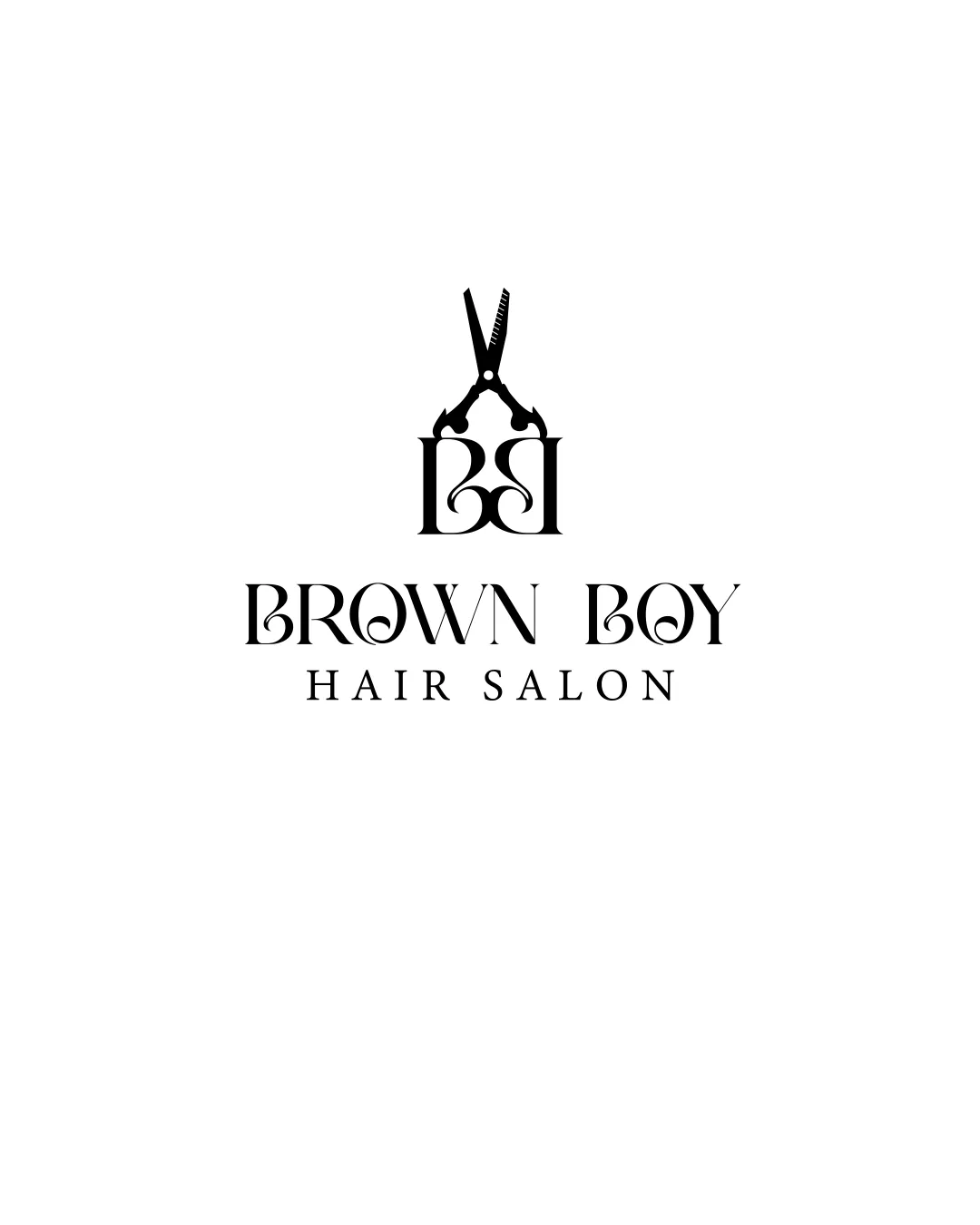
BROWN BOY HAIR SALON logo review
4.1 / 5
Logo score
Logo review of

Brown Boy Hair Salon

Review the detailed scores below to see what is working and what should be refined first.

Objective AI feedback. Your creative decision.

Combination Mark Modern, Decorative, Monogrammatic Beauty
4/5
Legibility
4/5
Originality
5/5
Misread
4/5
Balance
3/5
Scale
Detailed review

Logo performance breakdown

4/5

Legibility

Checkmark icon Primary text ‘BROWN BOY HAIR SALON’ is largely readable.
Checkmark icon Font choice supports the premium/modern vibe.

Warning icon Decorative letterforms, especially the B and O, slightly compromise instant recognition at a glance.
4/5

Originality

Checkmark icon Creative integration of scissors and monogram is visually engaging.
Checkmark icon Industry relevance with the scissors is clear.

Warning icon Scissors are a common hair salon motif; BB monogram adds some uniqueness but the mark itself is not 100% original.

5/5

Color harmony

Checkmark icon Consistent black-and-white palette keeps the identity elegant and versatile.

Black
#000000

White
#FFFFFF

4/5

Balance alignment

Checkmark icon Vertical alignment is well considered.
Checkmark icon Logomark is visually centered over the wordmark.

Warning icon Scissors atop the monogram can feel visually top-heavy, slightly affecting harmony between mark and text.

logo 200x250 pixels scalability test alignment grid overlay
3/5

Scalability

Checkmark icon High contrast and single color support scalability.
Checkmark icon Can work well on certain applications like business cards, salon windows, and product labels.

Warning icon Fine details in the scissor icon and monogram may be lost at small scales or on embroidery.
Warning icon The monogram with scissors might appear cluttered when reduced to favicon size.

logo 200x250 pixels scalability test

200x250 px

logo 100x125 pixels scalability test

100×125 px

logo 50x62 pixels scalability test

50×62 px

5/5

Misinterpretations

Checkmark icon No inappropriate or confusing alternate readings apparent.

4 / 5

Symbol & text fit

Checkmark icon Both logomark and wordmark convey a decorative and stylish character.
Checkmark icon Consistent line weight and theme across elements.

Warning icon Scissors style is literal and could better match the typographic flourish of the monogram or font.

Try your own review

Wondering how your logo performs?

Get a clear logo score, key risks, and priority fix ideas before your client or audience sees it.

Review my logo