Wondering how your logo performs? 🧐
Get professional logo reviews in seconds and catch design issues in time.
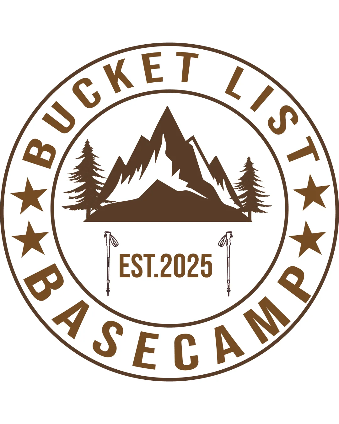
Try it Now!Logo review of BUCKET LIST BASECAMP EST. 2025
 Logo analysis by AI
Logo type:
Style:
Detected symbol:
Detected text:
Business industry:
Review requested by Pixelvalue
**If AI can recognize or misinterpret it, so can people.
Structured logo review
Legibility
![]() Text is clear, bold, and easily readable at all sizes.
Text is clear, bold, and easily readable at all sizes.![]() Simple font ensures strong visibility.
Simple font ensures strong visibility.
Scalability versatility
![]() Works well on large signage and apparel patches.
Works well on large signage and apparel patches.![]() Badge shape is recognizable and natural for stickers.
Badge shape is recognizable and natural for stickers.
![]() Detailed elements like trekking poles and intricate tree lines will blur or disappear at small scales (e.g., on a business card, favicon, or embroidery patch).
Detailed elements like trekking poles and intricate tree lines will blur or disappear at small scales (e.g., on a business card, favicon, or embroidery patch).
200x250 px
100×125 px
50×62 px
Balance alignment
![]() Generally harmonious with a visually centered mountain symbol.
Generally harmonious with a visually centered mountain symbol.![]() Outer text forms a balanced circle.
Outer text forms a balanced circle.
![]() Text and internal elements are tightly packed near edges, causing mild visual crowding.
Text and internal elements are tightly packed near edges, causing mild visual crowding.![]() Bottom ‘BASECAMP’ text feels heavier than the top due to longer word length.
Bottom ‘BASECAMP’ text feels heavier than the top due to longer word length.

Originality
![]() Inclusion of trekking poles is a minor custom touch.
Inclusion of trekking poles is a minor custom touch.
![]() Mountain-and-pine-tree badge emblems are extremely common in the outdoor industry.
Mountain-and-pine-tree badge emblems are extremely common in the outdoor industry.![]() Stars and circular text add to the generic feel—no strong unique twist.
Stars and circular text add to the generic feel—no strong unique twist.
Logomark wordmark fit
![]() Font weight and style match the rugged/outdoor theme of the symbol.
Font weight and style match the rugged/outdoor theme of the symbol.![]() Elements are thematically unified.
Elements are thematically unified.
![]() Arrangement is safe and doesn't innovate in composition or typographic treatment.
Arrangement is safe and doesn't innovate in composition or typographic treatment.
Aesthetic look
![]() Cohesive retro badge look, appropriate for the industry.
Cohesive retro badge look, appropriate for the industry.![]() Brown color gives a natural, earthy vibe.
Brown color gives a natural, earthy vibe.
![]() Overused graphic choices lend a slightly generic and uninspired appearance.
Overused graphic choices lend a slightly generic and uninspired appearance.![]() Interior elements make the layout busy.
Interior elements make the layout busy.
Dual meaning and misinterpretations
![]() No inappropriate or ambiguous imagery detected.
No inappropriate or ambiguous imagery detected.![]() Clear outdoor and adventure message.
Clear outdoor and adventure message.
Color harmony
![]() Limited color palette enhances cohesion and clarity.
Limited color palette enhances cohesion and clarity.![]() Brown and white ensure legibility and fit the natural theme.
Brown and white ensure legibility and fit the natural theme.
Brown
#6B4E27
White
#FFFFFF