 View review
Logo score
Logo review ofByteglow
Review the detailed scores below to see what is working and what should be refined first.
Legibility
Originality
Misread
Balance
Scale
Detailed review
Logo performance breakdown
Legibility
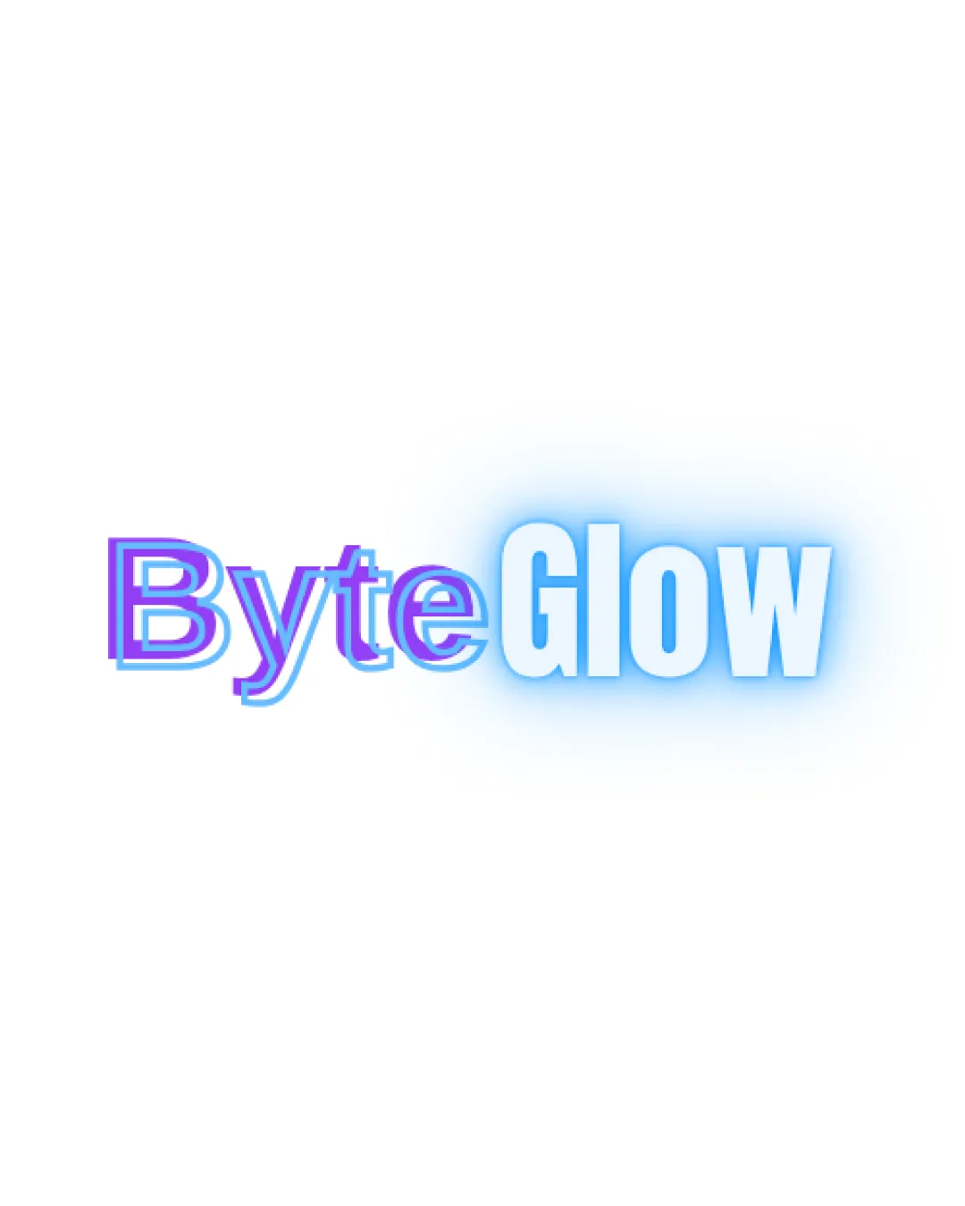
![]() The glow effect reduces legibility, especially with the overlapping colors.
The glow effect reduces legibility, especially with the overlapping colors.
Originality
![]() Unique use of glow to emphasize 'Glow'.
Unique use of glow to emphasize 'Glow'.
![]() Glows and outlines are common effects and may not stand out within the industry.
Glows and outlines are common effects and may not stand out within the industry.
Color harmony
![]() Consistent color theme with blue tones.
Consistent color theme with blue tones.
![]() The combination of blue and pink with a glow can clash. This might overwhelm simpler contexts.
The combination of blue and pink with a glow can clash. This might overwhelm simpler contexts.
Color may be holding this logo back. Explore stronger palette options with Colorfly.design before updating the logo.
Explore palettesBalance alignment
![]() Text is centrally aligned.
Text is centrally aligned.
![]() The glow and outlining make it feel slightly imbalanced.
The glow and outlining make it feel slightly imbalanced.

Scalability
![]() Could look distinctive in digital formats.
Could look distinctive in digital formats.
![]() Glow effect may not reproduce well in small sizes or on print.
Glow effect may not reproduce well in small sizes or on print.![]() Limited versatility in applications like business cards or embroidered merchandise.
Limited versatility in applications like business cards or embroidered merchandise.
200x250 px
100×125 px
50×62 px
Misinterpretations
![]() Clear intention without inappropriate symbolism.
Clear intention without inappropriate symbolism.
Try your own review
Review my logo
Wondering how your logo performs?
Get a clear logo score, key risks, and priority fix ideas before your client or audience sees it.
Keep exploring


