 View review
Logo score
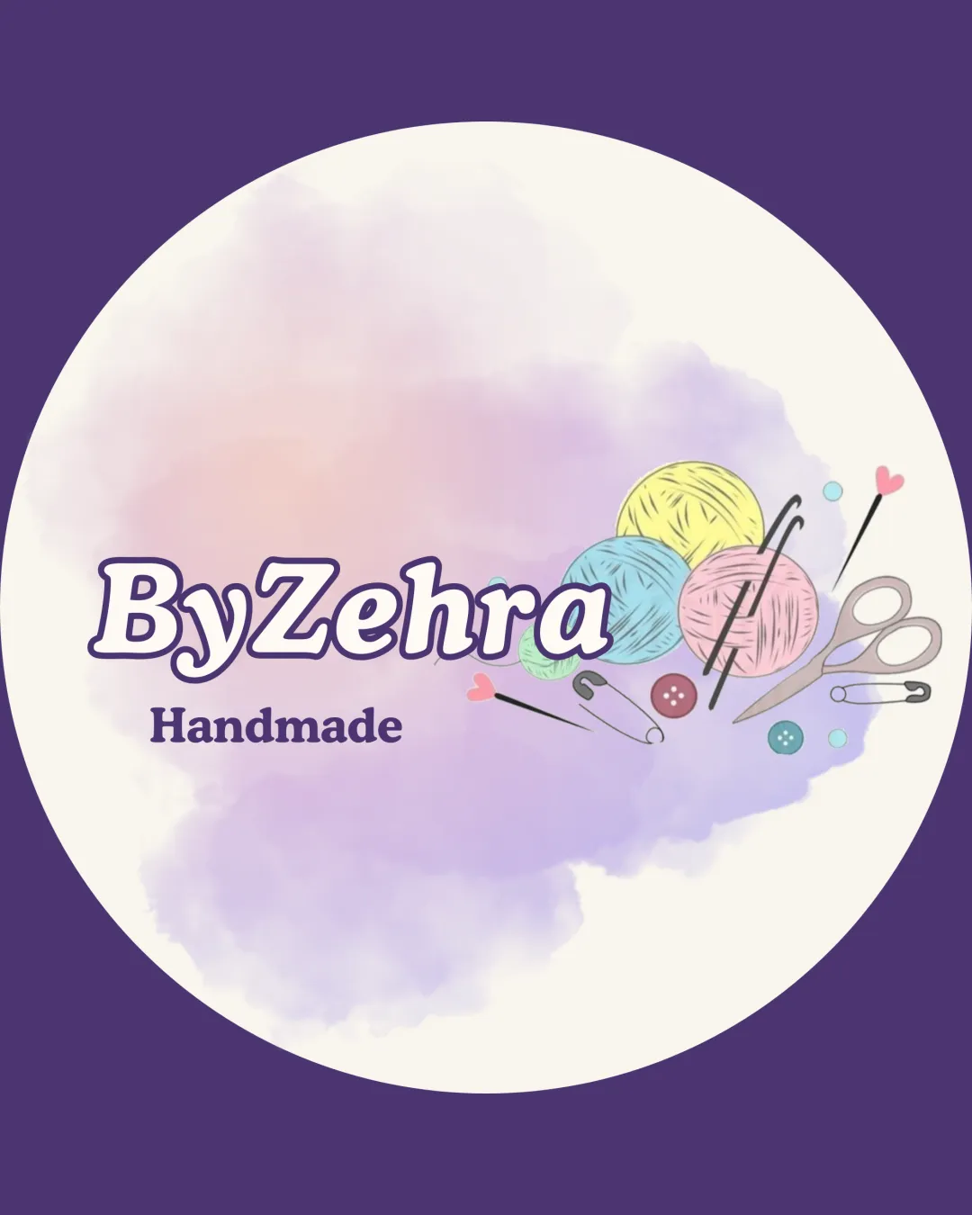
Logo review ofByzehra, Handmade
Review the detailed scores below to see what is working and what should be refined first.
Legibility
Originality
Misread
Balance
Scale
Detailed review
Logo performance breakdown
Legibility
![]() Main brand name 'ByZehra' is clearly readable with sufficient contrast against the background.
Main brand name 'ByZehra' is clearly readable with sufficient contrast against the background.![]() 'Handmade' tagline uses a legible serif font.
'Handmade' tagline uses a legible serif font.
![]() Slight softness in the tagline due to watercolor background may reduce clarity on small screens.
Slight softness in the tagline due to watercolor background may reduce clarity on small screens.![]() Multiple font sizes and boldnesses can create minor distraction.
Multiple font sizes and boldnesses can create minor distraction.
Originality
![]() Personalized illustration fitting for a handmade crafts brand.
Personalized illustration fitting for a handmade crafts brand.![]() Soft pastel palette and watercolor texture are distinctive touches.
Soft pastel palette and watercolor texture are distinctive touches.
![]() Use of yarn, knitting/crochet tools, and buttons is common in craft industry logos and does not feel highly unique.
Use of yarn, knitting/crochet tools, and buttons is common in craft industry logos and does not feel highly unique.![]() No creative negative space usage or highly memorable mark present.
No creative negative space usage or highly memorable mark present.
Color harmony
![]() Pastel color palette is visually pleasing and reflects handmade, soft tone.
Pastel color palette is visually pleasing and reflects handmade, soft tone.
![]() Range of colors is extensive (yellow, blue, pink, green, violet) and could hinder brand recognition.
Range of colors is extensive (yellow, blue, pink, green, violet) and could hinder brand recognition.![]() Light gradients and multiple hues reduce logo effectiveness in monochrome situations.
Light gradients and multiple hues reduce logo effectiveness in monochrome situations.
Deep Violet
#5F4B8B
Light Yellow
#F6E3B4
Light Blue
#A3D4ED
Light Pink
#D6B7C8
White
#FFFFFF
Purple
#9086C5
Color may be holding this logo back. Explore stronger palette options with Colorfly.design before updating the logo.
Explore palettesBalance alignment
![]() Text and illustration are aligned horizontally with sufficient whitespace.
Text and illustration are aligned horizontally with sufficient whitespace.
![]() The illustrated elements weigh down the right side, causing slight imbalance compared to the lighter text area on the left.
The illustrated elements weigh down the right side, causing slight imbalance compared to the lighter text area on the left.![]() Logo feels busy due to scattered elements and lack of clear central focus.
Logo feels busy due to scattered elements and lack of clear central focus.

Scalability
![]() Colorful and lively illustration supports online and social media use.
Colorful and lively illustration supports online and social media use.![]() Looks appealing for craft fair signage and labels.
Looks appealing for craft fair signage and labels.
![]() Complex illustration with small elements (needles, safety pins, buttons) will lose clarity at small scales, e.g., business cards, embroidery, favicon.
Complex illustration with small elements (needles, safety pins, buttons) will lose clarity at small scales, e.g., business cards, embroidery, favicon.![]() Watercolor effect and pastel gradients can be hard to print and reproduce consistently across various mediums.
Watercolor effect and pastel gradients can be hard to print and reproduce consistently across various mediums.
200x250 px
100×125 px
50×62 px
Misinterpretations
![]() No inappropriate hidden imagery or accidental symbolism detected.
No inappropriate hidden imagery or accidental symbolism detected.![]() Craft symbols are clear and straightforward.
Craft symbols are clear and straightforward.
Symbol & text fit
![]() Illustrative style matches the friendly, soft text treatment.
Illustrative style matches the friendly, soft text treatment.
![]() Illustration feels somewhat disconnected from the typography due to spatial separation and style variance.
Illustration feels somewhat disconnected from the typography due to spatial separation and style variance.
![]() Symbol complexity juxtaposed with bold text lessens integration.
Symbol complexity juxtaposed with bold text lessens integration.
Try your own review
Review my logo
Wondering how your logo performs?
Get a clear logo score, key risks, and priority fix ideas before your client or audience sees it.
Keep exploring


