 View review
Logo score
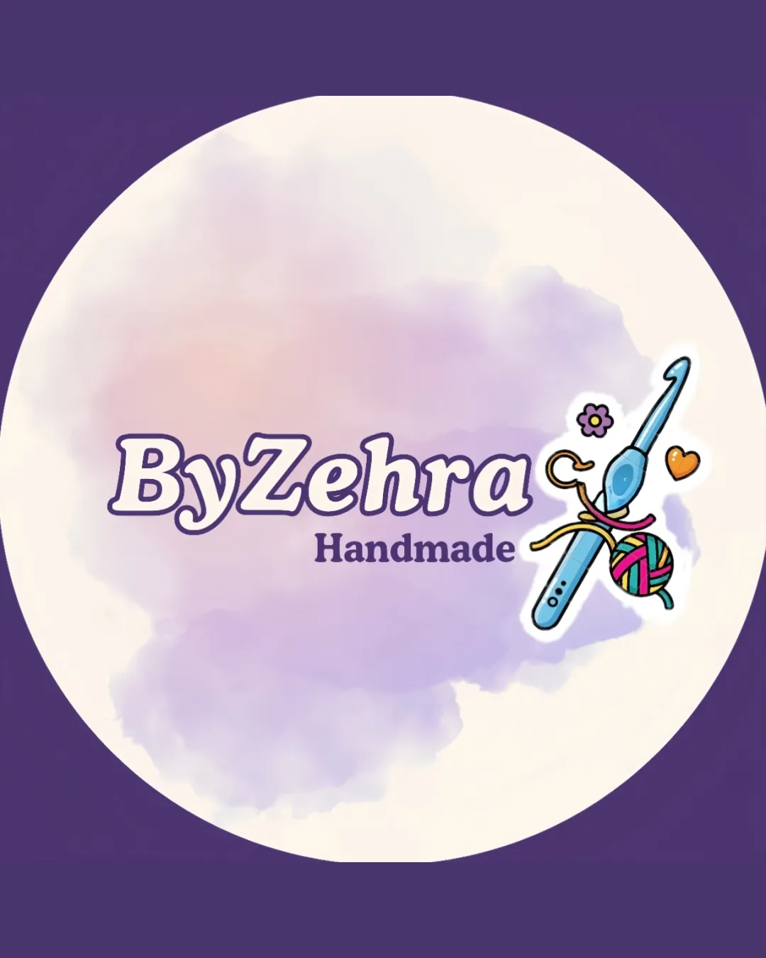
Logo review ofByzehra Handmade
Review the detailed scores below to see what is working and what should be refined first.
Legibility
Originality
Misread
Balance
Scale
Detailed review
Logo performance breakdown
Legibility
![]() The main brand name 'ByZehra' uses a rounded, friendly typeface that is easy to read.
The main brand name 'ByZehra' uses a rounded, friendly typeface that is easy to read.![]() The color contrast between text and background is sufficiently strong for clarity.
The color contrast between text and background is sufficiently strong for clarity.
![]() The lighter 'Handmade' subtitle is slightly smaller and may become less readable at smaller sizes or on colored backgrounds.
The lighter 'Handmade' subtitle is slightly smaller and may become less readable at smaller sizes or on colored backgrounds.
Originality
![]() The illustrated approach and playful doodle give the logo a personalized and handmade feel suitable for crafts.
The illustrated approach and playful doodle give the logo a personalized and handmade feel suitable for crafts.![]() Custom arrangement of needle, yarn, and smaller icons adds a touch of uniqueness compared to generic craft logos.
Custom arrangement of needle, yarn, and smaller icons adds a touch of uniqueness compared to generic craft logos.
![]() The use of a crochet hook, yarn, and a heart is common in the craft industry, making the central motif borderline generic.
The use of a crochet hook, yarn, and a heart is common in the craft industry, making the central motif borderline generic.![]() No truly innovative or distinctive conceptual twist.
No truly innovative or distinctive conceptual twist.
Color harmony
![]() Colors are well-coordinated for a playful, inviting brand personality.
Colors are well-coordinated for a playful, inviting brand personality.![]() No major clashing of hues.
No major clashing of hues.
![]() Too many colors and gradients are present which could affect reproduction versatility.
Too many colors and gradients are present which could affect reproduction versatility.![]() Multiple accent colors within small details reduce the logo's visual clarity at smaller sizes.
Multiple accent colors within small details reduce the logo's visual clarity at smaller sizes.
Purple
#5a417d
Lavender
#bfc2e1
Orange
#f6be79
Teal
#7bc0ad
Pink
#e65582
Color may be holding this logo back. Explore stronger palette options with Colorfly.design before updating the logo.
Explore palettesBalance alignment
![]() Text and illustration are visually grouped, creating a friendly brand image.
Text and illustration are visually grouped, creating a friendly brand image.
![]() The symbol is noticeably right-heavy, making the logo feel off-balance.
The symbol is noticeably right-heavy, making the logo feel off-balance.![]() The colorful yarn and elements draw the eye away from the wordmark, decreasing harmony.
The colorful yarn and elements draw the eye away from the wordmark, decreasing harmony.

Scalability
![]() Logo is detailed and colorful, which may appeal to craft audiences for online and print banners.
Logo is detailed and colorful, which may appeal to craft audiences for online and print banners.![]() Combination mark allows for some flexibility in use where only text or the icon could be used.
Combination mark allows for some flexibility in use where only text or the icon could be used.
![]() The symbol contains thin outlines and multiple small decorative elements (flower, heart, intricate yarn lines) that will not scale well for small applications like embroidery, favicons, or business cards.
The symbol contains thin outlines and multiple small decorative elements (flower, heart, intricate yarn lines) that will not scale well for small applications like embroidery, favicons, or business cards.![]() The watercolor background may get lost at smaller sizes and add unnecessary detail.
The watercolor background may get lost at smaller sizes and add unnecessary detail.
200x250 px
100×125 px
50×62 px
Misinterpretations
![]() No inappropriate or unintended visual meanings detected.
No inappropriate or unintended visual meanings detected.
Symbol & text fit
![]() Both logomark and wordmark share a playful, friendly aesthetic.
Both logomark and wordmark share a playful, friendly aesthetic.
![]() The illustration is richer and visually stronger than the text, causing a minor mismatch in emphasis.
The illustration is richer and visually stronger than the text, causing a minor mismatch in emphasis.
![]() Slight size imbalance between the mark and the wordmark.
Slight size imbalance between the mark and the wordmark.
Try your own review
Review my logo
Wondering how your logo performs?
Get a clear logo score, key risks, and priority fix ideas before your client or audience sees it.
Keep exploring


