View review
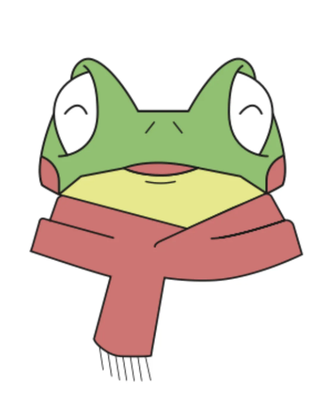
Logo review ofCartoon Frog Head Wearing A Scarf
Review the detailed scores below to see what is working and what should be refined first.
Logo performance breakdown
Originality
Combination of a frog with a scarf is unique, standing out from generic animal logos.
Expressive, playful eyes add charm and personality.
Cartoon animal mascots are common; the core concept is not extraordinary despite the added scarf.
Color harmony
Muted color palette is cohesive and gentle on the eyes.
No overwhelming color choices; tones complement each other.
Red and green combination could be inadvertently associated with holidays in certain cultures.
Outline (black) could conflict with color harmony when placed on dark backgrounds.
Green
#8FBF6B
Light Red
#E1998C
Light Yellow
#F2EDA3
White
#FFFFFF
Black
#000000
Your palette is close. Explore sharper color combinations with Colorfly.design before updating the logo.
Explore palettesBalance alignment
Symmetrical head design contributes to overall balance.
Central placement is visually stable.
Scarf’s asymmetrical form tilts visual weight downward and left, causing minor imbalance.
The top-heavy nature could make applications on horizontal surfaces look awkward.
Scalability
Distinct frog character could be memorable in larger print or digital formats.
Thin lines and fine details on the scarf and face may get lost at smaller sizes such as business cards or favicons.
Complexity makes it less suitable for embroidery and very small-scale reproduction.
Works best as a mascot or sticker, not as a universal logo for all applications.
200x250 px
100×125 px
50×62 px
Misinterpretations
No inappropriate or unintended symbols detected. Frog and scarf motif is clear.
Wondering how your logo performs?
Get a clear logo score, key risks, and priority fix ideas before your client or audience sees it.