What to preserve
The logo unites bold, technical monogram initials with a clear, modern wordmark, evoking reliability and mechanical expertise.
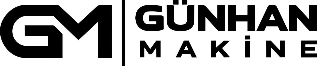
This is a strong, clearly structured industrial logo with excellent legibility and a distinctive, technical visual character; minor enhancements to monogram flow and separator balance could further optimize versatility and visual hierarchy.
This logo lockup shows strong execution, supported by visual balance and text readability; improving distinctiveness is the clearest next step.
Focus on the changes that matter. Keep what makes the logo work.
The logo unites bold, technical monogram initials with a clear, modern wordmark, evoking reliability and mechanical expertise.
Logo preview unavailable. The written feedback is still available on this card.
overall lockup
The detailed wordmark stack and monogram separation might lose clarity at very small sizes, especially the space between letters and the identity line.
See the category reviewThe bold, technical monogram and precise wordmark lockup directly express the brand's engineering expertise and industrial focus, closely matching the brief's emphasis on mechanical service and reliability.
Monogram 5/5 · Wordmark 5/5 · Layout 5/5
Monogram 4/5 · Wordmark 4/5 · Layout 4/5
The inner white stroke of the 'G' leads directly into the vertical 'M', but forms a sharp corner, breaking some flow at the intersection.

Inspect spacing with the guide. Optical balance may differ from geometric centering.
Monogram 4/5 · Wordmark 4/5 · Layout 4/5
The detailed wordmark stack and monogram separation might lose clarity at very small sizes, especially the space between letters and the identity line.
Try: Check small-scale reproduction for wordmark and monogram separation clarity.
Logo preview unavailable. The written feedback is still available on this card.
The vertical separator is visually heavy, slightly dominating the space between the monogram and wordmark.
Monogram 4/5 · Wordmark 3/5
Does the shape still work without color?
Find the surfaces where your logo stays clear.
Compare the mark and lettering on each surface.
Shows the lower-contrast areas of the logo (5th percentile). Tiny details may have lower contrast. Good ≥ 4.5:1 · Medium ≥ 3:1 · Bad < 3:1. A visual guide, not an accessibility rating.
A 3px blur softens fine details so you can check whether the overall shape stays recognizable. If key gaps close or elements merge, the logo may rely too heavily on detail.
Look for clear separation between shapes and a distinctive outline.
Get a clear logo score, key risks, and priority fix ideas before your client or audience sees it.
More credits needed
Add credits to continue without losing your work.
Then $7/month. Cancel anytime.
Essential logo review with AI
Estimated progress