Concept & direction
A bold, geometric monogram forms the letters 'GDi' in a tightly integrated, high-contrast way, emphasizing modernity and memorability.
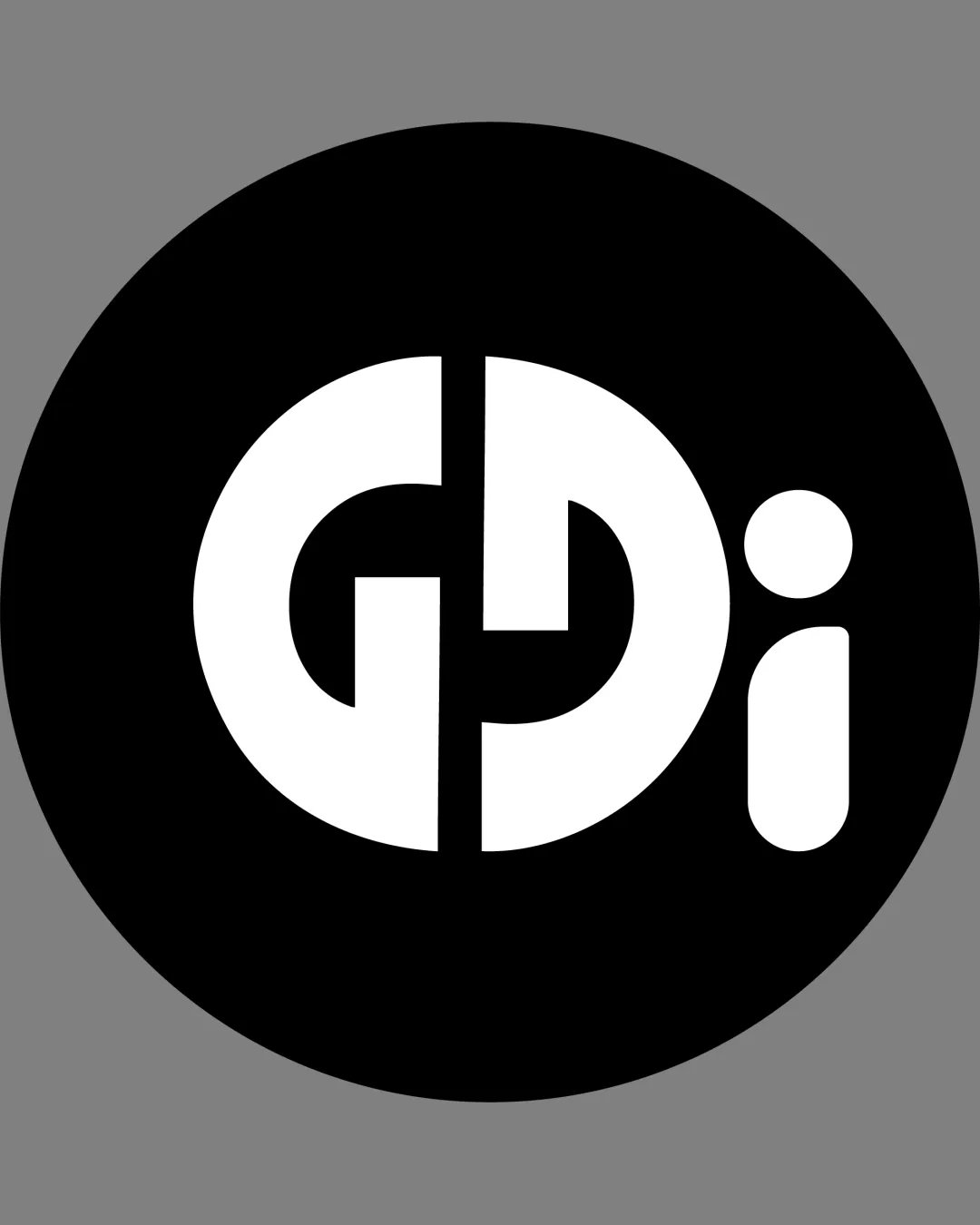
A bold, memorable geometric monogram with good scalability and distinctive style, though the legibility of the letterforms—particularly 'G' and 'D'—should be validated through user testing.
This monogram shows solid execution, supported by distinctive construction and clarity at smaller sizes; improving visual balance is the clearest next step.
Focus on the changes that matter. Keep what makes the logo work.
A bold, geometric monogram forms the letters 'GDi' in a tightly integrated, high-contrast way, emphasizing modernity and memorability.
entire monogram
The abstraction of 'G', 'D', and 'i' through geometric splitting is visually striking but may cause initial hesitancy in reading, especially the left elements forming 'G'.
See the category reviewThere isn't enough brand context to assess the match.
The abstraction of 'G', 'D', and 'i' through geometric splitting is visually striking but may cause initial hesitancy in reading, especially the left elements forming 'G'.
Try: Test legibility among unfamiliar viewers to ensure all letterforms are correctly identified.
The 'i' is visually disconnected from the central circular motif, which introduces more empty space on the right, causing slight imbalance in the otherwise tightly unified design.

Inspect spacing with the guide. Optical balance may differ from geometric centering.
Get a clear logo score, key risks, and priority fix ideas before your client or audience sees it.
More credits needed
Add credits to continue without losing your work.
Then $7/month. Cancel anytime.
Essential logo review with AI
Estimated progress