1
Category Fit
Good fitSolid for technology, especially AI/conversation platforms.
Meets minimum visual standards for sector.
Strong baseline with clear, readable layout and good balance, but lacking a signature detail to set it apart from competitors.
The most important fixes to handle before polishing the full presentation.
Current symbol risks blending with generic tech motifs.
Impact: Adds Originality And Memorability. · Effort: Medium
Inner line separation may blur at small sizes.
Impact: Ensures Versatility At Smallest Digital Scales. · Effort: Low
Ensures resilience in monochrome or less ideal color contexts.
Impact: Expands Functional Versatility For Print And Non-digital Environments. · Effort: Low
 Text is clear and fully readable Good contrast between text and background
Geometric knot is visually engaging
 Interwoven geometric shapes are common in tech, moderate risk of generic appearance
Simple palette with strong contrast Fits tech and modern aesthetic
Limited color exploration, reliance on standard tech palette
Green
#36B287
White
#FFFFFF
Your palette is close. Refine the color roles and combinations before updating the logo.
Build brand colors Mark and wordmark are vertically centered Good visual weight balance

Bold lines allow for reduction in size Minimal detail supports easy adaptation
Interwoven mark may lose fine separation at very small sizes
200x250 px
100×125 px
50×62 px
No inappropriate or confusing alternate readings detected
Mark and wordmark feel cohesive and unified in style
Technology Association: Geometric and modern language visually supports a technology platform.
Clarity And Approachability: Rounded forms and simple typography contribute to a friendly, modern impression.
Moderate category fit but risks blending in.
Logo style and mark are appropriate for tech but lack uniqueness required for strong brand separation.
Solid for technology, especially AI/conversation platforms.
Meets minimum visual standards for sector.
Similar geometrics found in tech/AI space.
Could be confused with category peers using similar knot or network motifs.
Modern, reliable, professional.
Sends appropriate cues for tech, but not highly memorable.
Where the logo is ready to use, where it needs adjustment, and where it may break in real applications.
Clear and balanced for digital mastheads.
Slight simplification may be needed at extreme small sizes.
Ensure clarity and separation in grayscale/monochrome.
Mark stands alone well as avatar.
Bold lines and simple palette perform reliably in print.
A practical checklist of the logo versions to prepare before sending the final files to a client or team.
Main use case for brand presence.
Needed for social icons, app icons.
Useful in constrained or horizontal formats.
Enables flexible application across layouts.
Vital for print, merchandise, and non-RGB reproduction.
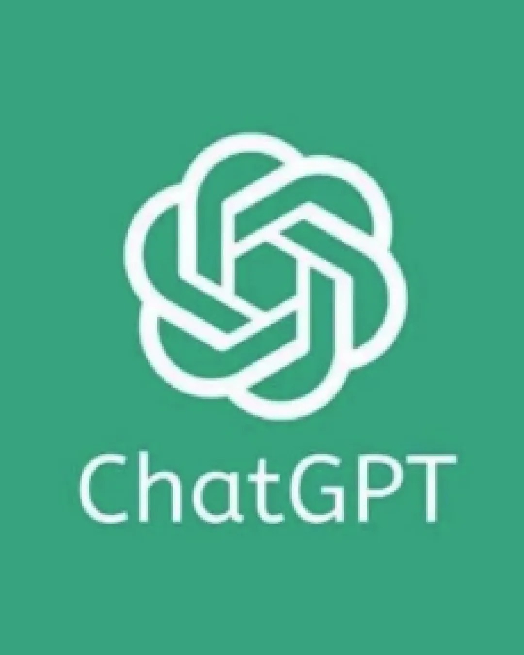
The logo pairs an interwoven geometric knot with clean, rounded sans-serif typography spelling 'ChatGPT' beneath it.
The wordmark uses a modern, geometric sans-serif typeface for high clarity and approachability.
The monogram mark is a stylized knot, drawing on themes of connection, intelligence, and collaboration.
A green (#36B287) field with white elements creates strong contrast and a contemporary tone.
A modern, geometric logo that signals clarity, intelligence, and connection—perfect for a technology-driven conversational platform.
Knot symbol represents interconnectedness and intelligence.
Softly rounded sans-serif maximizes readability and approachability.
Get a clear logo score, key risks, and priority fix ideas before your client or audience sees it.
More credits needed
Add credits to continue without losing your work.