Concept & direction
The mark cleverly combines a stylized 'C' with coffee imagery, integrating the core offering into the brand's initial; the wordmark supports brand readability.
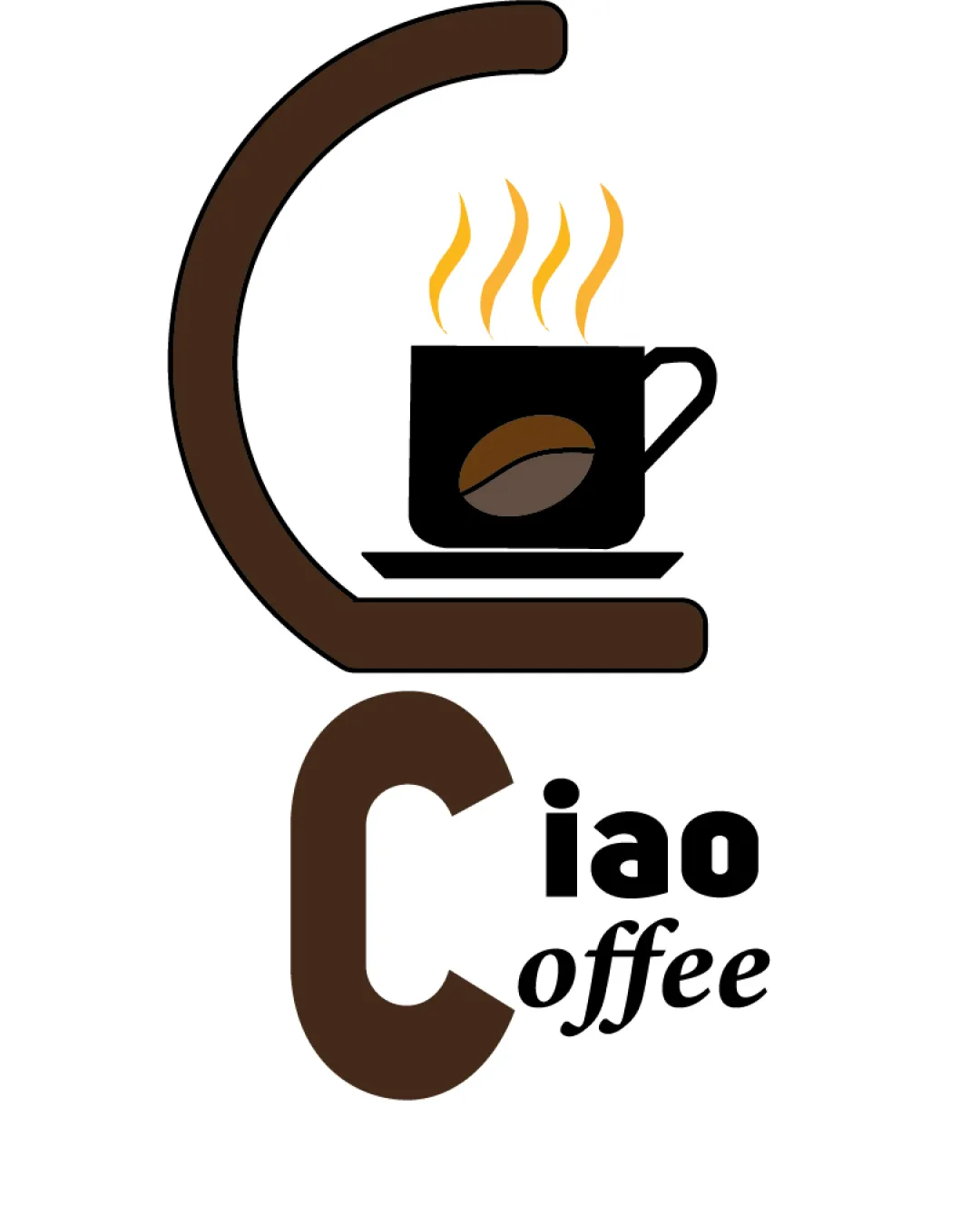
Recognizable and playful, but the execution is generic and font treatment lacks polish. The idea is solid, but refinement is needed for a strong professional impression.
Focus on the changes that matter. Keep what makes the logo work.
The mark cleverly combines a stylized 'C' with coffee imagery, integrating the core offering into the brand's initial; the wordmark supports brand readability.
Current mismatch between bold geometric and script fonts undermines unity.
improves professional finish and legibility
Fine lines may disappear at reduced sizes.
enhances small-scale clarity
The logo clearly signals a café offering and casual atmosphere, but suffers from styling mismatches.
Estimated colors. Use the original design file for exact values.
Create a full color palette using these colors
Create new palette
Inspect spacing with the guide. Optical balance may differ from geometric centering.
Get a clear logo score, key risks, and priority fix ideas before your client or audience sees it.
More credits needed
Add credits to continue without losing your work.
Then $7/month. Cancel anytime.
Essential logo review with AI
Estimated progress