CIFRÃO logo review
3.5/5
Logo score
Logo review of

Cifrão

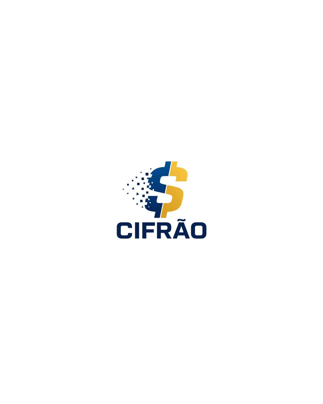
A competent, modern finance logo with room for a more unique visual identity and some refinement for small-scale use.

Combination Modern Digital, Pixel-effect Finance
5/5
Legibility
3/5
Originality
5/5
Misread
4/5
Balance
3/5
Scale
Your next steps

What to fix first

Focus on the changes that matter. Keep what makes the logo work.

1

symbol (pixelated left side)

Simplify or minimize pixelation to enhance clarity when scaled down.

Visible issue High priority Medium effort
Area to inspectApproximate location

The pixelated effect may lose crispness and recognizability at small sizes.

How to check

Test logo at small size to ensure dollar shape is recognizable.

See the category review
2

symbol

Consider a more distinctive approach or unique twist to the mark for stronger memorability.

Optional refinement Medium priority Medium effort
Area to inspectApproximate location

Pixelated split-dollar is a modern touch, but both the dollar sign and pixel-dissolve motif are common in digital finance branding.

How to check

Assess originality versus other digital finance brands.

See the category review
Detailed review

Logo performance breakdown

4/5

Brief & logo match

Based on an inferred industry
Compared with

finance, digital, fintech oriented design inferred from symbol and style

Strong visual fit for a modern finance or fintech brand, though not highly unique.

  • Industry Signaling

    The dollar sign and blue/gold palette clearly indicate finance or fintech.

  • Modern/digital Impression

    The pixel-dissolving effect conveys a digital or tech-oriented brand.

5/5

Legibility

  • Wordmark is clear and well-spaced.
  • Dollar sign shape is readable.
3/5

Originality

  • Pixel effect adds modern character.
  • Pixelated split-dollar is a modern touch, but both the dollar sign and pixel-dissolve motif are common in digital finance branding.

    Optional refinement symbol

    Try: Consider a more distinctive approach or unique twist to the mark for stronger memorability.

    Check: Assess originality versus other digital finance brands.

    Area to inspectApproximate location
4/5

Color harmony

  • Navy and gold combination is attractive and appropriate for finance.
Navy#02306C
Gold#F0B52B

Estimated colors. Use the original design file for exact values.

Create a full color palette using these colors

Create new palette
4/5

Balance alignment

  • Solid text alignment under mark.
  • The split/pixelation leans visual weight left; the right side feels lighter, which may affect the overall optical balance.

    Optional refinement overall logo

    Try: Fine-tune shape or add subtle counterbalance for improved symmetry.

    Check: Visually review for perceived balance with the text and mark together.

Uploaded logoAlignment guide overlay

Inspect spacing with the guide. Optical balance may differ from geometric centering.

3/5

Scalability

  • Strong contrast and shape at medium/large sizes.
  • The pixelated effect may lose crispness and recognizability at small sizes.

    Visible issue symbol (pixelated left side)

    Try: Simplify or minimize pixelation to enhance clarity when scaled down.

    Check: Test logo at small size to ensure dollar shape is recognizable.

    Area to inspectApproximate location
Uploaded logo at 200 pixels wide
200 × 250 px
Uploaded logo at 100 pixels wide
100 × 125 px
Uploaded logo at 50 pixels wide
50 × 63 px

Compare the detail at different sizes. Labels show the full image dimensions.

5/5

Misinterpretations

  • No unintended imagery or confusion.
4/5

Symbol & text fit

  • Mark and text are well-integrated by style and placement.

Black & white

Does the shape still work without color?

These tests are available only for logos uploaded in vector (SVG) format.

Background contrast

Find the surfaces where your logo stays clear.

These tests are available only for logos uploaded in vector (SVG) format.

Blur & silhouette

A 3px blur softens fine details so you can check whether the overall shape stays recognizable. If key gaps close or elements merge, the logo may rely too heavily on detail.

These tests are available only for logos uploaded in vector (SVG) format.

Try your own review

Wondering how your logo performs?

Get a clear logo score, key risks, and priority fix ideas before your client or audience sees it.

Review my logo