View review
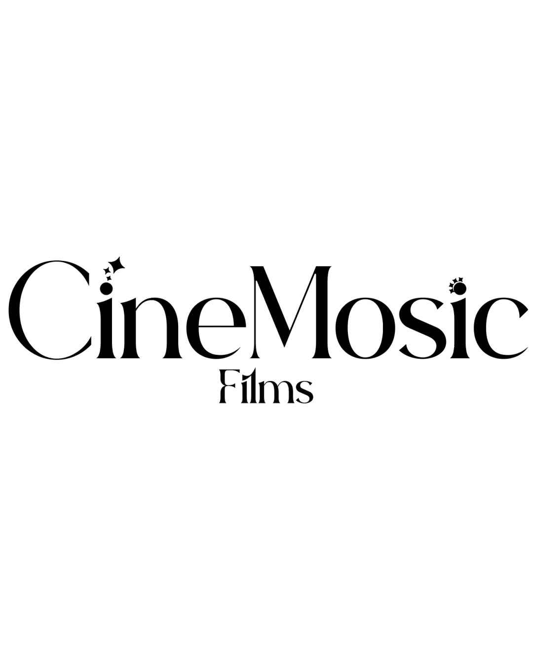
Cinemosaic Films
A polished, elegant film company wordmark with distinctive cinematic motifs. With minor adjustment for small-scale legibility, it's ready for broad application.
What to fix first
The most important fixes to handle before polishing the full presentation.
Increase size/weight or simplify the star and film-reel accents for better small-size reproduction.
High priorityCurrently, small decorative elements may be lost or muddle the form at small scale.
Impact: Improves Clarity In All Uses, Especially Digital And Print At Reduced Sizes. · Effort: Medium
Logo performance breakdown
Legibility
Readability is high for both 'CineMosaic' and 'Films'.
Custom star motifs do not severely disrupt text.
Uppercase/lowercase interplay may slightly slow very quick reads.
Originality
Distinctive integration of cinematic elements into otherwise classic letterforms.
Motif placement (star and reel) is somewhat expected in film-related designs.
Balance alignment
Even wordmark spacing and consistent alignment.
'Films' is well-positioned under the main mark.
Slight tension from the intricate motifs above the 'i' letters.
Scalability
Clean letterforms retain clarity at small sizes.
Monochrome palette aids reproduction.
Small details of star and film-reel accents could be lost at tiny sizes.
200x250 px
100×125 px
50×62 px
Misinterpretations
No confusing or inappropriate secondary readings.
Brief match
Industry Relevance: Stars and reel motifs connect directly to cinematic themes.
Brand Personality: Elegant serif communicates professionalism with playful details showing creativity.
Wondering how your logo performs?
Get a clear logo score, key risks, and priority fix ideas before your client or audience sees it.