Wondering how your logo performs? 🧐
Get professional logo reviews in seconds and catch design issues in time.
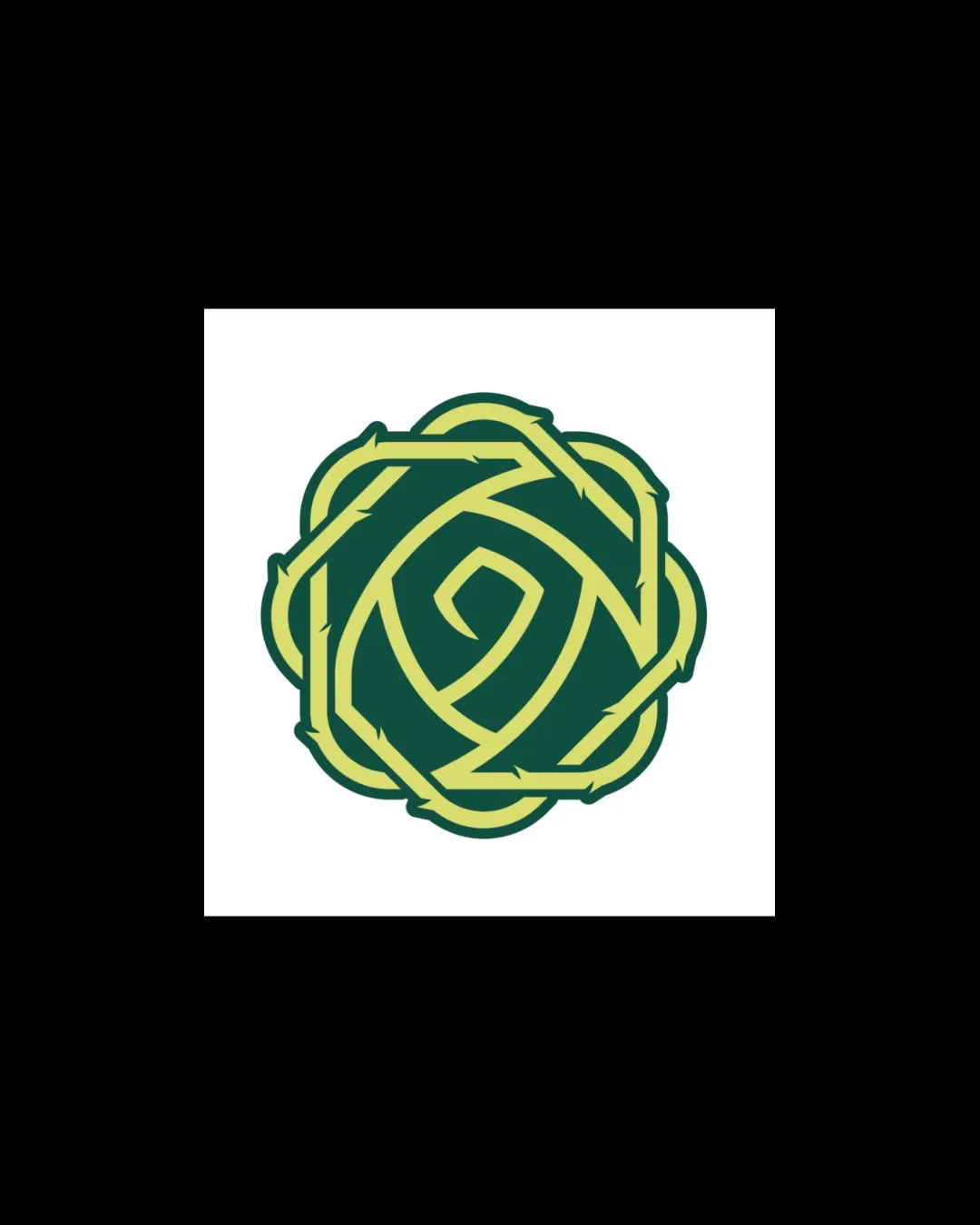
Try it Now!Logo review of circular thorny vine or stylized rose shape
 Logo analysis by AI
Logo type:
Style:
Detected symbol:
Business industry:
Review requested by Leonard
**If AI can recognize or misinterpret it, so can people.
Structured logo review
Scalability versatility
Simple enough to be recognizable at small sizes.
Single logomark can work on social avatars, tags, and stickers.
Minimal color count aids versatility.
Thorn detail may lose definition at very small sizes, such as embroidery or favicons.
No flat one-color version shown, which can hinder application on dark or textured backgrounds.

200x250 px

100×125 px

50×62 px
Balance alignment
Overall balanced circular composition.
Central spiral pulls the eye inward, providing focal harmony.
Outer contours have some visual weight imbalance due to thorn placement, feeling slightly heavy on certain edges.


Originality
Creative use of a thorny vine to form a rose or plant shape.
Distinctive abstract presentation uncommon in most floral logos.
Concept of circular vines or thorns is not novel, but execution elevates it beyond the generic.
Aesthetic look
Aesthetically pleasing, geometric flow.
Good separation of positive and negative space within the mark.
Thorn details verge on overdecoration, risking busyness at small scales.
Dual meaning and misinterpretations
No inappropriate or confusing alternate meanings detected. Symbol remains botanical and abstract.
Color harmony
Limited to two harmonious colors that evoke nature and floral themes.
Contrast between green and yellow provides clarity.
Olive Green
#698834
Straw Yellow
#E4E176
White
#FFFFFF


