Wondering how your logo performs? 🧐
Get professional logo reviews in seconds and catch design issues in time.
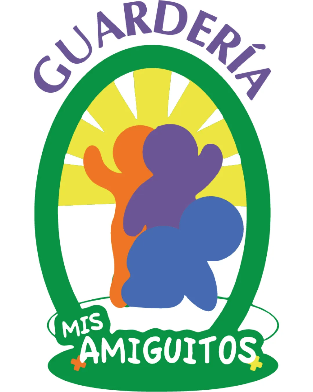
Try it Now!Logo review of GUARDERÍA MIS AMIGUITOS
 Logo analysis by AI
Logo type:
Style:
Detected symbol:
Detected text:
Business industry:
Review requested by Tatoviedo
**If AI can recognize or misinterpret it, so can people.
Structured logo review
Legibility
![]() Main text is generally readable and playful, appropriate for childcare.
Main text is generally readable and playful, appropriate for childcare.![]() Sufficient contrast between most text and background areas.
Sufficient contrast between most text and background areas.
![]() Arched GUARDERÍA text can be less legible at smaller sizes.
Arched GUARDERÍA text can be less legible at smaller sizes.![]() "MIS AMIGUITOS" text has over-decorated edges that can reduce clarity, especially on small formats.
"MIS AMIGUITOS" text has over-decorated edges that can reduce clarity, especially on small formats.
Scalability versatility
![]() Colorful and friendly design is appealing for use in digital and print media.
Colorful and friendly design is appealing for use in digital and print media.![]() Works decently for larger formats such as signage and posters.
Works decently for larger formats such as signage and posters.
![]() Fine details such as rays, text effects, and overlapping shapes will blur or merge at small sizes (e.g., business cards, merchandise tags, app icons).
Fine details such as rays, text effects, and overlapping shapes will blur or merge at small sizes (e.g., business cards, merchandise tags, app icons).![]() Multicolor elements would not translate well to single-color applications like embroidery or monochrome printing.
Multicolor elements would not translate well to single-color applications like embroidery or monochrome printing.
200x250 px
100×125 px
50×62 px
Balance alignment
![]() Centralized composition with symmetrical framing.
Centralized composition with symmetrical framing.![]() Balanced use of color across elements.
Balanced use of color across elements.
![]() The alignment between the text "MIS AMIGUITOS" and the main frame feels off-balance and overly crowded.
The alignment between the text "MIS AMIGUITOS" and the main frame feels off-balance and overly crowded.![]() Child silhouettes overlap in ways that create tangents and visual confusion.
Child silhouettes overlap in ways that create tangents and visual confusion.

Originality
![]() Playful, child-like figures differentiate from rigid or corporate aesthetics.
Playful, child-like figures differentiate from rigid or corporate aesthetics.![]() Sun rays add a hopeful, positive energy relevant to childcare.
Sun rays add a hopeful, positive energy relevant to childcare.
![]() Abstract, blobby child shapes and sunburst are somewhat generic for the daycare/children's segment.
Abstract, blobby child shapes and sunburst are somewhat generic for the daycare/children's segment.![]() The overall approach is recognizable and commonly seen, lacking an ownable, unique twist.
The overall approach is recognizable and commonly seen, lacking an ownable, unique twist.
Aesthetic look
![]() Friendly use of round shapes and bright colors are inviting.
Friendly use of round shapes and bright colors are inviting.![]() Design clearly targets a young or childcare audience.
Design clearly targets a young or childcare audience.
![]() Crowded composition with too many color accents can feel busy or amateurish.
Crowded composition with too many color accents can feel busy or amateurish.![]() Irregular overlap creates some visual noise and lacks refinement.
Irregular overlap creates some visual noise and lacks refinement.
Dual meaning and misinterpretations
![]() No inappropriate or ambiguous shapes detected.
No inappropriate or ambiguous shapes detected.![]() Shapes are clearly identified as playful, child-like figures.
Shapes are clearly identified as playful, child-like figures.
Color harmony
![]() Colors are bright, cheerful, and well-suited for a childcare facility.
Colors are bright, cheerful, and well-suited for a childcare facility.![]() No major clashing or discordant hues.
No major clashing or discordant hues.
![]() There are more than four colors, which reduces brand cohesion and simplicity.
There are more than four colors, which reduces brand cohesion and simplicity.![]() The palette, while child-friendly, could be simplified for better harmony and professionalism.
The palette, while child-friendly, could be simplified for better harmony and professionalism.
Deluge
#7856A3
Chateau Green
#388E46
Gorse
#F3E164
Clementine
#EA7925
Curious Blue
#4282C4
White
#FFFFFF