Wondering how your logo performs? 🧐
Get professional logo reviews in seconds and catch design issues in time.
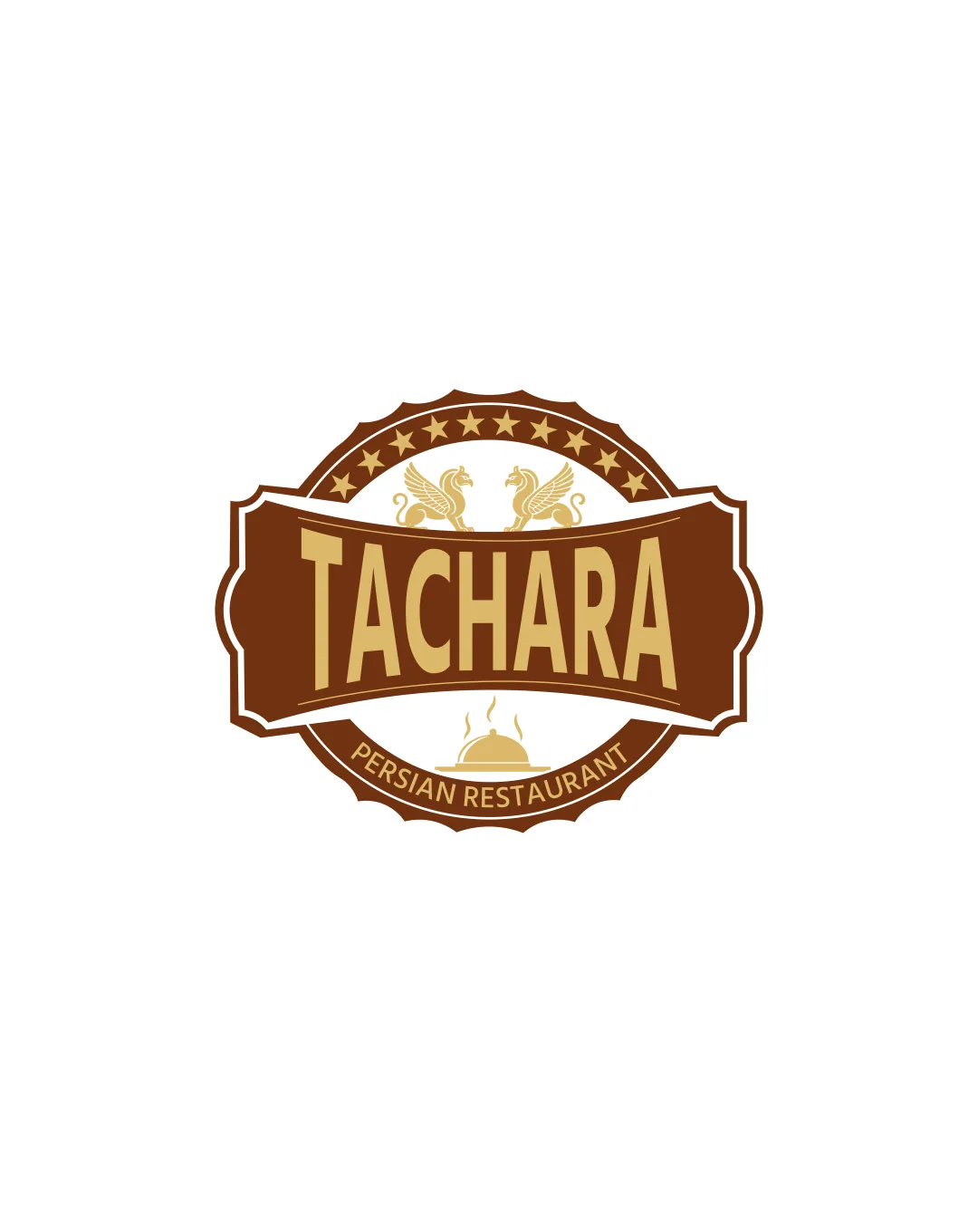
Try it Now!Logo review of TACHARA, PERSIAN RESTAURANT
 Logo analysis by AI
Logo type:
Style:
Detected symbol:
Detected text:
Business industry:
Review requested by Pixelvalue
**If AI can recognize or misinterpret it, so can people.
Structured logo review
Legibility
![]() Main brand name 'TACHARA' is large and clear.
Main brand name 'TACHARA' is large and clear.![]() Contrasting colors between text and background aid overall legibility.
Contrasting colors between text and background aid overall legibility.
![]() 'PERSIAN RESTAURANT' on the banner is considerably smaller and could be hard to read at small sizes.
'PERSIAN RESTAURANT' on the banner is considerably smaller and could be hard to read at small sizes.![]() Decorative badge elements near the text add slight visual busyness.
Decorative badge elements near the text add slight visual busyness.
Scalability versatility
![]() Logo works well for menus, signage, and web headers due to its strong presence.
Logo works well for menus, signage, and web headers due to its strong presence.
![]() Ornate details like the griffins, stars, and steam cloche will lose clarity and definition at small sizes such as business cards or social icons.
Ornate details like the griffins, stars, and steam cloche will lose clarity and definition at small sizes such as business cards or social icons.![]() The emblem shape with text on curved paths will not reproduce well as embroidery, stamps, or small merchandise icons.
The emblem shape with text on curved paths will not reproduce well as embroidery, stamps, or small merchandise icons.
200x250 px
100×125 px
50×62 px
Balance alignment
![]() Logo is generally symmetrical with a well-centered main wordmark.
Logo is generally symmetrical with a well-centered main wordmark.![]() Visual weight is balanced between top and bottom decorative elements.
Visual weight is balanced between top and bottom decorative elements.
![]() The inner curve and banner orientation create some mismatch with the outer badge perimeter, causing minor visual tension.
The inner curve and banner orientation create some mismatch with the outer badge perimeter, causing minor visual tension.![]() Star and griffin placement could be slightly tweaked for perfect optical centering.
Star and griffin placement could be slightly tweaked for perfect optical centering.

Originality
![]() Griffin elements and Persian dome hint at cultural specificity.
Griffin elements and Persian dome hint at cultural specificity.![]() Custom badge shape and use of two supporting icons are a distinct combination.
Custom badge shape and use of two supporting icons are a distinct combination.
![]() Badge/emblem style is commonly used in restaurant logos, especially those referencing heritage or authenticity.
Badge/emblem style is commonly used in restaurant logos, especially those referencing heritage or authenticity.![]() Stars and dome cloche are somewhat generic visual cues in the food/restaurant space.
Stars and dome cloche are somewhat generic visual cues in the food/restaurant space.![]() No unique twist or clever negative space application detected.
No unique twist or clever negative space application detected.
Logomark wordmark fit
![]() Wordmark is well-integrated with supporting logomark elements inside the badge.
Wordmark is well-integrated with supporting logomark elements inside the badge.![]() Color palette is consistently applied across wordmark and logomark.
Color palette is consistently applied across wordmark and logomark.
![]() Some minor disconnect between the more traditional griffin/dome symbols and the modern geometric letterforms.
Some minor disconnect between the more traditional griffin/dome symbols and the modern geometric letterforms.![]() The lower banner arc may feel visually cramped under the large straight wordmark.
The lower banner arc may feel visually cramped under the large straight wordmark.
Aesthetic look
![]() Overall aesthetic feels cohesive and inviting, with a professional vintage touch.
Overall aesthetic feels cohesive and inviting, with a professional vintage touch.![]() Color palette reinforces warmth and authenticity.
Color palette reinforces warmth and authenticity.
![]() Busy composition—multiple symbolic elements crowd the badge, detracting from simplicity.
Busy composition—multiple symbolic elements crowd the badge, detracting from simplicity.![]() Inner arcs and star band add slight excess to the design.
Inner arcs and star band add slight excess to the design.
Dual meaning and misinterpretations
![]() No inappropriate or confusing symbols detected; the meaning is culturally and contextually suitable.
No inappropriate or confusing symbols detected; the meaning is culturally and contextually suitable.
Color harmony
![]() Limited, harmonious palette with good contrast between primary and accent colors.
Limited, harmonious palette with good contrast between primary and accent colors.![]() Color choices enhance the traditional, authentic vibe.
Color choices enhance the traditional, authentic vibe.
Mocha
#7D4C21
Tussock
#B5914C
White
#FFFFFF


