View review
Clariss Kloučková Photography
Review the detailed scores below to see what is working and what should be refined first.
Objective AI feedback. Your creative decision.
Logo performance breakdown
Legibility
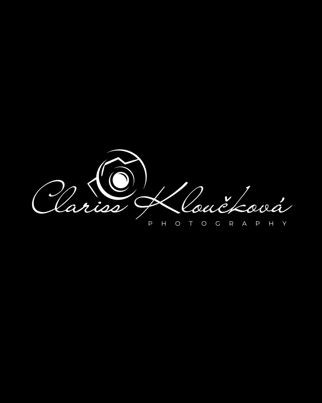
The sans-serif 'PHOTOGRAPHY' text is clear and easily readable.
Contrast between text and background is strong due to the white-on-black palette.
The script font for the main name is ornate and may be difficult to read at a smaller size or from a distance, especially for audiences unfamiliar with such scripts.
Characters with flourishes (e.g., 'K') may be especially hard to distinguish.

Originality
Uses a hand-lettered script for a personal touch.
Camera/aperture symbol is extremely common in photography logos, offering little originality.
Script-name-plus-camera symbol is a cliché approach in the industry.
Color harmony
Monochrome palette ensures easy reproduction and strong visual unity.
White
#FFFFFF
Black
#000000
Balance alignment
The logomark is visually connected to the script portion of the name, creating a focal area.
Spacing between the logomark and the script name feels slightly congested.
Overall layout feels stretched horizontally, making it less versatile for vertical or square lockups.
The very thin curves of the script throw off optical weight balance compared to the strong geometric mark.
Scalability
Simple color palette aids reproduction on dark or light backgrounds.
Thin lines in both the camera symbol and the script font are at risk of disappearing at small sizes (e.g., business cards, favicons, embroidery).
Script font and intricate logomark reduce legibility for small applications and some print processes.
May not be suitable for engraving or single-color applications without loss of detail.
200x250 px
100×125 px
50×62 px
Misinterpretations
No unintended or inappropriate symbols detected. Camera/aperture symbol is clear.
Symbol & text fit
Effort made to integrate symbol and text; overlapping feels intentional.
Stylistic gap between geometric logomark and a flowing script; visual harmony between elements could be improved.
Logomark feels slightly disjointed from the style of the script, making the two parts look designed separately.
Wondering how your logo performs?
Get a clear logo score, key risks, and priority fix ideas before your client or audience sees it.



