Wondering how your logo performs? 🧐
Get professional logo reviews in seconds and catch design issues in time.
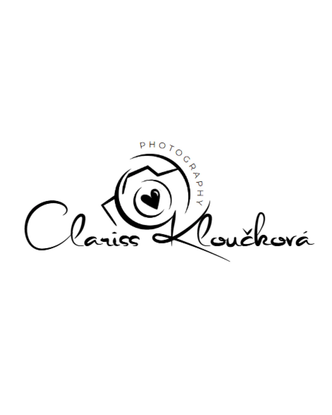
Try it Now!Logo review of Clariss Kloučková PHOTOGRAPHY
 Logo analysis by AI
Logo type:
Style:
Detected symbol:
Negative space:
Detected text:
Business industry:
Review requested by Bloom
**If AI can recognize or misinterpret it, so can people.
Structured logo review
Legibility
 Main text is generally readable. Contrast between black text and white background aids in legibility.
 Highly stylized script font compromises quick readability from a distance. Capital 'K' and some lowercase letters may be difficult to read at smaller sizes. The word 'PHOTOGRAPHY' is very small and thin, which may become illegible when scaled down.
Scalability versatility
Simple color scheme translates well for single-color uses. Basic silhouette of the camera and heart is distinguishable at moderate sizes.
Fine details and thin lines (especially in the 'PHOTOGRAPHY' text and script font) will be lost at small scales, such as favicons or embroidery. Signature-style name may blur or be unreadable on small digital displays or business cards. Script logotype makes it less adaptable for use on busy photo backgrounds or as a watermark.
200x250 px
100×125 px
50×62 px
Balance alignment
Central placement of the circular camera symbol attracts attention and acts as a visual anchor. Visual flow from left to right is maintained.
The oversized 'K' and its intersecting stroke unbalance the composition, drawing undue attention and making the right side visually heavier. Wordmark baseline becomes chaotic due to inconsistent ascender/descender lengths, affecting harmony.

Originality
The heart within the camera aperture is a creative and personal touch, adding distinctiveness. Scripted, handwritten signature-style font gives a personalized, bespoke impression suitable for a sole entrepreneur.
Camera aperture + heart is a common trope in photography branding, though the execution is somewhat unique.
Logomark wordmark fit
Both logomark and wordmark exhibit a sense of fluidity and softness. The logomark is visually intertwined with the wordmark, helping cohesion.
The hand-drawn feel of the logomark and the digital script font do not perfectly match stylistically. Size of the camera symbol relative to the text is slightly overpowering.
Aesthetic look
Feminine and contemporary aesthetic aligns with personal/artistiс brands. Minimal color usage keeps the design clean.
Chaotic letter shapes in the script reduce visual elegance. Script style may appear dated or overused if not carefully modernized.
Dual meaning and misinterpretations
No inappropriate shapes or accidental offensive symbolism detected. Heart conveys positive emotion appropriate for wedding/family photography.
Color harmony
Simple monochrome palette ensures easy application on various backgrounds. Strong contrast between black and white.
Black
#000000
White
#FFFFFF