1
Category Fit
Good fitClear fit for tech, productivity, or creative fields
Visual shorthand aligns with industry expectations.
Solid execution with strong fundamentals; needs a more unique symbol for stronger market presence.
The most important fixes to handle before polishing the full presentation.
The current starburst/asterisk is common and does not differentiate the brand visually.
Impact: High · Effort: Medium
Fine lines in the icon may blur or disappear at very small scales.
Impact: Medium · Effort: Low
Balancing symbol and wordmark will enhance professional polish.
Impact: Low · Effort: Low
 Wordmark uses a strong, readable serif font High contrast between text and background
Wordmark serif font adds character
 Starburst/asterisk symbol is somewhat generic and widely used
Warm accent color pairs well with simple black wordmark
Limited palette; symbol might lack impact against certain backgrounds
Peru
#C97B4C
Black
#181715
White
#FFFFFF
Your palette is close. Refine the color roles and combinations before updating the logo.
Build brand colors Solid left mark and right wordmark alignment Good margin and spacing between elements
Slight optical imbalance due to symbol visual weight vs. the serif wordmark

Simple lines and clear shapes scale well Minimalist mark maintains integrity at small sizes
Thin spokes in the symbol may lose detail at very small scales
200x250 px
100×125 px
50×62 px
No inappropriate or confusing visual misreadings observed
Symbol and wordmark comfortably paired in size and style
Stylistic contrast between geometric symbol and classic serif wordmark
Industry Fit: Logo's minimalism and geometric symbol align with tech, creative, or productivity tool brands
Moderately distinctive for its category, but risks blending in.
While the wordmark has elegance, the symbol is generic and might get lost among similar tech brands using asterisk/starburst motifs.
Clear fit for tech, productivity, or creative fields
Visual shorthand aligns with industry expectations.
Moderate
Mark may not stand out among competitors using similar elements.
Professional but not highly memorable
Reliable and approachable, but lacks iconic status.
Where the logo is ready to use, where it needs adjustment, and where it may break in real applications.
Clean and readable at large and mid sizes.
Thin spokes might blur at 16x16px; simplify or bolden mark.
Design is effective in monochrome.
Symbol alone is barely distinct; consider thickening lines.
Simple shapes and bold font translate well to print.
A practical checklist of the logo versions to prepare before sending the final files to a client or team.
Main usage for web and presentation.
Critical for print, fax, or limited color environments.
Needed for avatars, favicons, and small-scale uses.
Could benefit banners or wide web headers.
Useful if symbol is omitted in certain contexts.
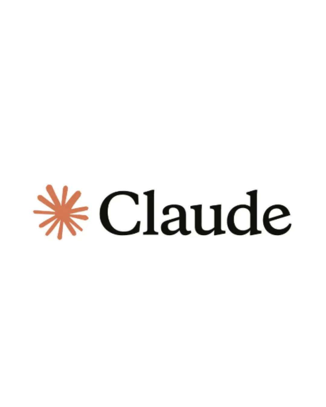
The logo combines a warm, geometric starburst symbol to the left of a classic serif wordmark, creating a clean and memorable mark.
Set in a strong, traditional serif font, the 'Claude' wordmark is instantly readable, evoking trust and professionalism.
The starburst/asterisk mark uses radiating lines in a muted orange tone, conveying energy and a spark of creativity against a minimalist backdrop.
A sophisticated, minimalist logo that balances classic typography with a modern, energetic symbol.
Wordmark in serif conveys reliability and authority.
Starburst/asterisk mark signals innovation, spark, or productivity.
Get a clear logo score, key risks, and priority fix ideas before your client or audience sees it.
More credits needed
Add credits to continue without losing your work.