Cloudberry logo review
4/5
Logo score
Logo review of

Cloudberry

A playful and relevant logo with a literal concept and strong synergy, but needs simplification for full practical use.

Combination Ornamental, Modern Illustrative
4/5
Legibility
4/5
Originality
5/5
Misread
4/5
Balance
3/5
Scale
Your next steps

What to fix first

Focus on the changes that matter. Keep what makes the logo work.

1

Standalone mark

Test simplified or single-color versions for clarity at small sizes.

Visible issue High priority Medium effort
Area to inspectApproximate location

The cloud and berry mark contains fine details and gradients that may not scale well to smaller sizes or monochrome applications.

How to check

Verify legibility and impact at reduced scale and without gradients.

See the category review
2

wordmark

Slightly refine space between flourishes, sparkles, and wordmark for improved clarity.

Optional refinement Medium priority Low effort

The flourish under 'Cloudberry' and stars add vibrance but can crowd the wordmark, especially near the descender of 'y'.

How to check

Ensure clear separation especially in lower-resolution uses.

See the category review
Detailed review

Logo performance breakdown

4/5

Brief & logo match

Based on an inferred industry
Compared with

No brand context provided; logo appears aimed at a technology, food, or creative brand using a compound wordmark.

Logo is visually and conceptually well-matched to the inferred name and approachable market category.

  • Name-literal Concept

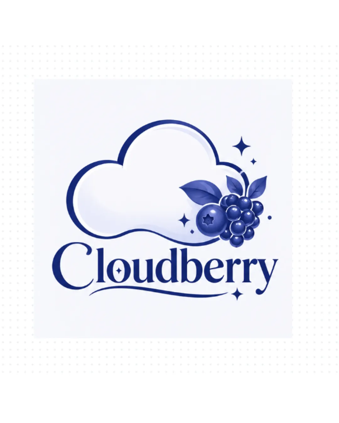
    Logo expresses 'Cloudberry' directly by fusing a cloud and a berry cluster.

  • Fresh, Approachable Tone

    Playful details like sparkles and curvy lines give a friendly, contemporary feel.

4/5

Legibility

  • Distinctive, readable serif wordmark.
  • Creative use of negative space and flourishes.
4/5

Originality

  • Cloud/berry hybrid is visually inventive.
  • Integration of sparkles enhances character.
4/5

Color harmony

  • Elegant use of blue tones gives cohesion.
Indigo#25336A
Light Blue#B2C0E6

Estimated colors. Use the original design file for exact values.

Create a full color palette using these colors

Create new palette
4/5

Balance alignment

  • Harmonious typographic composition.
  • Visual weight is well distributed.
  • The flourish under 'Cloudberry' and stars add vibrance but can crowd the wordmark, especially near the descender of 'y'.

    Optional refinement wordmark

    Try: Slightly refine space between flourishes, sparkles, and wordmark for improved clarity.

    Check: Ensure clear separation especially in lower-resolution uses.

Uploaded logoAlignment guide overlay

Inspect spacing with the guide. Optical balance may differ from geometric centering.

3/5

Scalability

  • Mark is clear at moderate sizes.
  • The cloud and berry mark contains fine details and gradients that may not scale well to smaller sizes or monochrome applications.

    Visible issue Standalone mark

    Try: Test simplified or single-color versions for clarity at small sizes.

    Check: Verify legibility and impact at reduced scale and without gradients.
    Area to inspectApproximate location
Uploaded logo at 200 pixels wide
200 × 250 px
Uploaded logo at 100 pixels wide
100 × 125 px
Uploaded logo at 50 pixels wide
50 × 63 px

Compare the detail at different sizes. Labels show the full image dimensions.

5/5

Misinterpretations

  • No inappropriate or misleading secondary imagery detected.
5/5

Symbol & text fit

  • Symbol and wordmark are conceptually and stylistically united.

Black & white

Does the shape still work without color?

These tests are available only for logos uploaded in vector (SVG) format.

Background contrast

Find the surfaces where your logo stays clear.

These tests are available only for logos uploaded in vector (SVG) format.

Blur & silhouette

A 3px blur softens fine details so you can check whether the overall shape stays recognizable. If key gaps close or elements merge, the logo may rely too heavily on detail.

These tests are available only for logos uploaded in vector (SVG) format.

Try your own review

Wondering how your logo performs?

Get a clear logo score, key risks, and priority fix ideas before your client or audience sees it.

Review my logo