 View review
Logo score
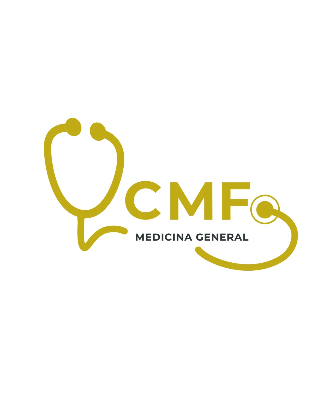
Logo review ofCmf Medicina General
Strong, recognizable medical logo—minor adjustments will enhance polish and application versatility.
Legibility
Originality
Misread
Balance
Scale
Action plan
What to fix first
The most important fixes to handle before polishing the full presentation.
1
Refine transitions where stethoscope integrates into the C and where the tubing ends to improve fluidity and symmetry.
Medium priorityCurrent transition causes mild asymmetry and could be smoother.
Impact: Increases Visual Coherence And Perceived Quality. · Effort: Medium
2
Test the logo at small scales and adjust line thickness in the stethoscope if readability suffers.
Medium prioritySome thin curves may disappear at reduced size.
Impact: Ensures Legibility For Print And Digital Icons. · Effort: Low
Detailed review
Logo performance breakdown
Legibility
![]() All text is highly legible with clear typeface contrast.
All text is highly legible with clear typeface contrast.
Originality
![]() Creative integration of stethoscope with type.
Creative integration of stethoscope with type.
![]() Stethoscope motif is a common symbol in medical logos.
Stethoscope motif is a common symbol in medical logos.
Color harmony
![]() Gold/olive and black offer professional contrast.
Gold/olive and black offer professional contrast.
![]() Single accent color limits emotional tone flexibility.
Single accent color limits emotional tone flexibility.
Olive
#B79C19
Charcoal
#222223
Your palette is close. Explore sharper color combinations with Colorfly.design before updating the logo.
Explore palettesBalance alignment
![]() Visual weight is balanced between symbol and text.
Visual weight is balanced between symbol and text.![]() Stethoscope integration unifies the design.
Stethoscope integration unifies the design.
![]() Slight tension where the tube meets 'C' and 'O', creating mild asymmetry.
Slight tension where the tube meets 'C' and 'O', creating mild asymmetry.

Scalability
![]() Bold lines maintain visibility at small sizes.
Bold lines maintain visibility at small sizes.![]() Simple elements are reproducible in single color.
Simple elements are reproducible in single color.
![]() Some thin stethoscope curves may weaken at tiny scales.
Some thin stethoscope curves may weaken at tiny scales.
200x250 px
100×125 px
50×62 px
Misinterpretations
![]() Shapes are medically relevant and clear.
Shapes are medically relevant and clear.
Logo structure & brief match
![]() Mark and text are cohesively integrated with shared curves.
Mark and text are cohesively integrated with shared curves.
![]() Minor disconnect where stethoscope tube starts and ends at the text, could feel less seamless.
Minor disconnect where stethoscope tube starts and ends at the text, could feel less seamless.
![]() Medical/healthcare Visual Association: Stethoscope and clinical colors strongly communicate general medicine.
Medical/healthcare Visual Association: Stethoscope and clinical colors strongly communicate general medicine.
Try your own review
Review my logo
Wondering how your logo performs?
Get a clear logo score, key risks, and priority fix ideas before your client or audience sees it.
Keep exploring


