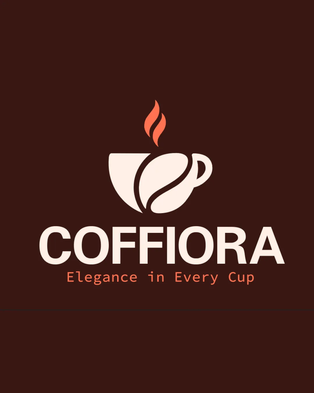
COFFIORA Elegance in Every Cup logo review
4.3 / 5
Logo score
Logo review of

Coffiora Elegance In Every Cup

Distinctive, well-crafted coffee logo with minor polish recommended for tagline contrast.

Objective AI feedback. Your creative decision.

Combination Mark Modern, Minimal Coffee Brand Cafe / Coffee
4.5/5
Legibility
4/5
Originality
5/5
Misread
4.5/5
Balance
4/5
Scale
Action plan

What to fix first

The most important fixes to handle before polishing the full presentation.

1

Enhance tagline contrast for improved accessibility.

Medium priority

Increases legibility for users, especially in small or poor lighting situations.

Impact: Elevates Readability In All Settings. · Effort: Low

Detailed review

Logo performance breakdown

4.5/5

Legibility

Checkmark icon Wordmark is clear, bold, and highly readable.
Checkmark icon Tagline is legible and well-spaced.

Warning icon Minor contrast drop for tagline on dark background.

4/5

Originality

Checkmark icon Cup-bean merge is clever and relevant.
Checkmark icon Not generic, feels tailored for coffee branding.

Warning icon Steam shape is quite standard in coffee logos.

4.5/5

Color harmony

Checkmark icon Earthy palette fits coffee industry well.
Checkmark icon Contrast is strong except for tagline.

Warning icon Tagline color could contrast more for accessibility.

DarkBrown
#3E211A

Cream
#F9E3D5

Orange
#ED805B

Your palette is close. Refine the color roles and combinations before updating the logo.

Build brand colors
4.5/5

Balance alignment

Checkmark icon Mark and wordmark are well-aligned and balanced.
Checkmark icon Visual hierarchy flows logically from mark to text.

logo 200x250 pixels scalability test alignment grid overlay
4/5

Scalability

Checkmark icon Simple forms ensure good scalability.
Checkmark icon Minimal detail makes it versatile across media.

Warning icon Steam/thin elements might lose clarity at tiny sizes.

logo 200x250 pixels scalability test

200x250 px

logo 100x125 pixels scalability test

100×125 px

logo 50x62 pixels scalability test

50×62 px

5/5

Misinterpretations

Checkmark icon No misinterpretation; clear coffee message.

4.5 / 5

Logo structure & brief match

Checkmark icon Mark style and wordmark weight are harmonious.

Checkmark icon Industry Relevance: Combination of cup, bean, and earthy palette make it an excellent fit for a coffee business.
Checkmark icon Positioning: Logo communicates both approachability and elegance, matching the 'Elegance in Every Cup' tagline.

Try your own review

Wondering how your logo performs?

Get a clear logo score, key risks, and priority fix ideas before your client or audience sees it.

Review my logo