main layout (wordmark and tagline)
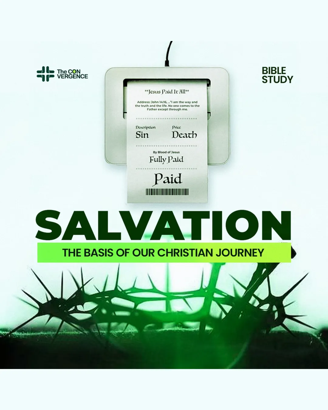
Refine tag placement and spacing under 'SALVATION' to ensure optimal alignment and readability.
Logo preview unavailable. The written feedback is still available on this card.
The tagline below 'SALVATION' appears tightly spaced and slightly off-center compared to the main heading, reducing clarity and visual harmony.
How to check
See the category review Review the tagline's alignment and white space against the main headline for consistent centering and even margins.