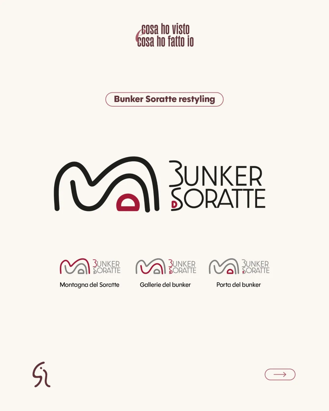
cosa ho visto cosa ho fatto io BUNKER SORATTE Mont.. logo review
3.8/5
Logo score
Logo review of

Cosa Ho Visto Cosa Ho Fatto Io Bunker Soratte Mont..

Distinctive, modern mark legibly expresses the bunker concept, with minor risks for rapid text recognition and very small-scale detail.

Combination Modern Minimalism, Geometric Linework Historical Site / Tourism / Cultural Heritage
3.5/5
Legibility
4/5
Originality
5/5
Misread
3/5
Balance
3/5
Scale
Your next steps

What to fix first

Focus on the changes that matter. Keep what makes the logo work.

1

Primary wordmark (BUNKER SORATTE)

Subtly reinforce the 'D' shape to ensure consistent readability, especially at small sizes or from a distance.

Visible issue High priority Low effort
Area to inspectApproximate location

The integration of the red arch into the 'D' in 'SORATTE' is visually clever but may be initially misread as a separate symbol, slightly impacting instant recognition of the 'D'.

How to check

Test for quick recognition of 'SORATTE' by unfamiliar viewers.

See the category review
2

Standalone mark across miniatures (bottom row)

Evaluate print and digital performance below 1.5cm width; thicken lines if loss is observed.

Worth testing Medium priority Medium effort
Area to inspectApproximate location

Fine line weights in the arch symbol may become thin or fade at very small display sizes or on textured surfaces.

How to check

Compare on merchandise samples at minimum intended print size.

See the category review
Detailed review

Logo performance breakdown

4/5

Brief & logo match

Based on your brief
Compared with

Association with WWII bunker, T-shirts, signage, merchandise usage across scales.

Logo marks the intended historical and iconic association, and scale variants support merch/signage needs.

  • Iconic Association With WWII Nuclear Bunker

    Abstract arch shapes and contained red door strongly reference secure, protected bunker imagery.

  • Versatility For Merchandise And Signage

    Multiple simplified variants and clear silhouette support use at various scales, though line weight may pose limitations for the smallest formats.

3.5/5

Legibility

  • Readable geometric lettering.
  • Clever integration of mark with text.
  • The integration of the red arch into the 'D' in 'SORATTE' is visually clever but may be initially misread as a separate symbol, slightly impacting instant recognition of the 'D'.

    Visible issue Primary wordmark (BUNKER SORATTE)

    Try: Subtly reinforce the 'D' shape to ensure consistent readability, especially at small sizes or from a distance.

    Check: Test for quick recognition of 'SORATTE' by unfamiliar viewers.
    Area to inspectApproximate location
4/5

Originality

  • Distinct arched mark referencing location and purpose.
  • Mark-text integration is unique.
4/5

Color harmony

  • Restrained color palette with good contrast and relevance.
DarkRed#A0183C
DarkGray#3D393B
Cream#EDE9DE

Estimated colors. Use the original design file for exact values.

Create a full color palette using these colors

Create new palette
3/5

Balance alignment

  • Consistent alignment of type and mark.
  • The horizontal lockups of the logo variants show slight crowding between the symbol and text, potentially reducing clarity, especially at scale.

    Optional refinement Horizontal spacing in bottom variants

    Try: Increase spacing between the mark and the wordmark for better visual separation.

    Check: Recheck spacing in export versions for merchandise and signage.

Uploaded logoAlignment guide overlay

Inspect spacing with the guide. Optical balance may differ from geometric centering.

3/5

Scalability

  • Adaptable variants with simplified mark.
  • Fine line weights in the arch symbol may become thin or fade at very small display sizes or on textured surfaces.

    Worth testing Standalone mark across miniatures (bottom row)

    Try: Evaluate print and digital performance below 1.5cm width; thicken lines if loss is observed.

    Check: Compare on merchandise samples at minimum intended print size.

    Area to inspectApproximate location
Uploaded logo at 200 pixels wide
200 × 250 px
Uploaded logo at 100 pixels wide
100 × 125 px
Uploaded logo at 50 pixels wide
50 × 63 px

Compare the detail at different sizes. Labels show the full image dimensions.

5/5

Misinterpretations

  • No evident dual meaning or misreading.
4/5

Symbol & text fit

  • Cohesive visual connection between arch symbol and brand name.

Black & white

Does the shape still work without color?

These tests are available only for logos uploaded in vector (SVG) format.

Background contrast

Find the surfaces where your logo stays clear.

These tests are available only for logos uploaded in vector (SVG) format.

Blur & silhouette

A 3px blur softens fine details so you can check whether the overall shape stays recognizable. If key gaps close or elements merge, the logo may rely too heavily on detail.

These tests are available only for logos uploaded in vector (SVG) format.

Try your own review

Wondering how your logo performs?

Get a clear logo score, key risks, and priority fix ideas before your client or audience sees it.

Review my logo