1
Category Fit
Good fitFits common sports/athlete logo conventions.
Does not feel out of place for the target industry.
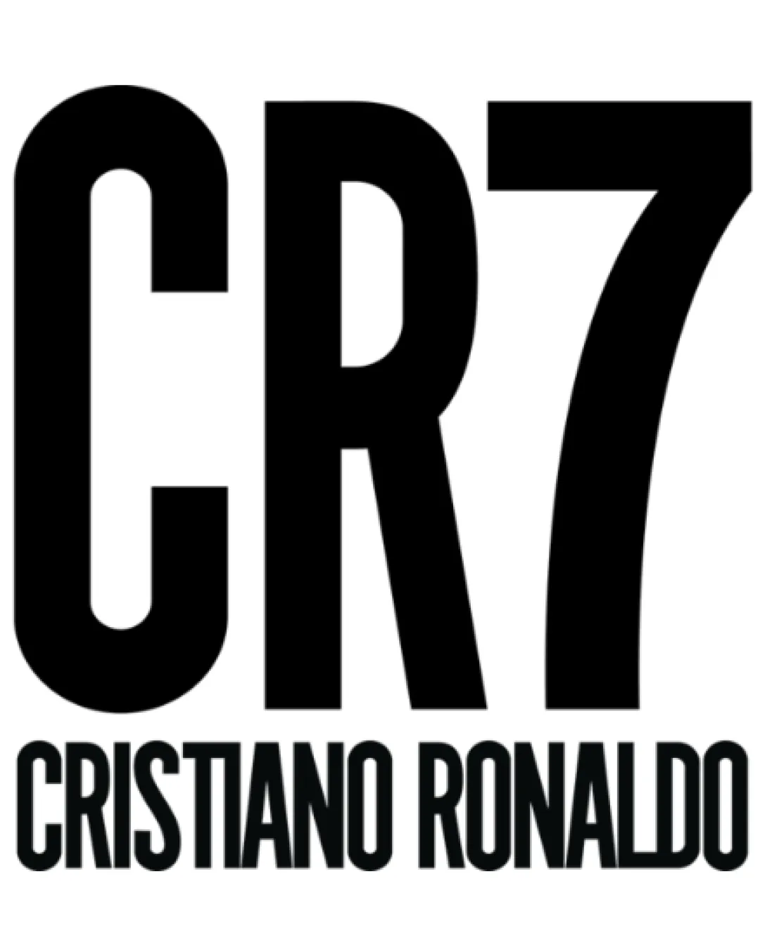
Strong, practical athlete/celebrity brand logo; recommended to add unique visual signature for long-term defensibility.
The most important fixes to handle before polishing the full presentation.
Current format is generic for the industry.
Impact: Increased Originality And Differentiability In A Crowded Sports Market. · Effort: Medium
'CR7' currently overpowers all other elements.
Impact: Improved Overall Visual Balance And Cohesion, Particularly For Horizontal Lockups Or Digital Avatars. · Effort: Low
Black/white is versatile but some applications may demand more flexible palettes.
Impact: Ensures Optimal Visibility And Brand Consistency Across All Real-world And Digital Touchpoints. · Effort: Medium
 Text is highly legible and bold, even at a distance. Clear distinction between mark and supporting wordmark.
Bold monogram is attention grabbing.
 Use of initials and number format is common in the sports industry; not highly distinctive.
Classic black and white provides high contrast and universal compatibility.
Black
#000000
White
#FFFFFF
Good vertical stacking and centering of elements.
Visual weight is heavily top-loaded with 'CR7' dominating, which may overpower the wordmark.

Simple forms scale well to small sizes and various applications. No thin lines or gradients that would collapse at small scale.
200x250 px
100×125 px
50×62 px
No unintended visual readings or negative connotations.
Wordmark spacing and scale match well with the dominant monogram.
Wordmark is visually subordinate and may disappear at small scale.
Sports Branding: Bold, high-contrast monogram fits well for athlete-driven branding, emphasizing strength and immediacy.
Competitive but not highly differentiated.
The logo is strongly aligned with athlete branding conventions (initials + number), but uniqueness could be improved.
Fits common sports/athlete logo conventions.
Does not feel out of place for the target industry.
Generic initials/number structure is widely used.
Competitors and peers may use similar approaches, risking brand confusion.
Bold black/white shows confidence and high-impact intent.
Logo sends the correct signals for an athlete-led brand.
Where the logo is ready to use, where it needs adjustment, and where it may break in real applications.
Strong legibility and recognition.
Simple shape can reduce well to very small sizes.
Minimal detail and strong forms are embroidery-friendly.
Bold monogram adapts well to circular/cropped formats.
Heavy contrast ensures visibility at large scale.
A practical checklist of the logo versions to prepare before sending the final files to a client or team.
Core lockup is present and essential.
Important for small spaces and social use.
Useful for banners and website headers.
Needed for print, embroidery, and dark backgrounds.
For digital/brand consistency at very small size.
A bold, oversized 'CR7' monogram sits above a compact 'CRISTIANO RONALDO' wordmark, both rendered in an all-caps, sans-serif style for maximum impact and legibility.
'CRISTIANO RONALDO' is typeset in a condensed, geometric sans-serif, supporting the monogram without competing for attention.
The 'CR7' mark is constructed from tall, bold sans-serif characters, amplifying visibility and instant brand recognition.
A bold, instantly recognizable monogram that asserts authority and maximizes visibility across digital and physical sports platforms.
The black and white palette maximizes versatility and contrast for various applications.
Oversized monogram 'CR7' creates immediate brand memorability in competitive contexts.
Get a clear logo score, key risks, and priority fix ideas before your client or audience sees it.
More credits needed
Add credits to continue without losing your work.